PBS gets new branding, logo and custom font

Subscribe to NCS for the latest news, project case studies and product announcements in broadcast technology, creative design and engineering delivered to your inbox.
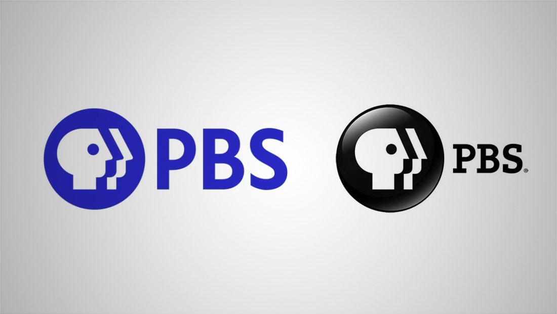
PBS unveiled an updated logo, brand guidelines and custom typography Monday, Nov. 4, 2019.
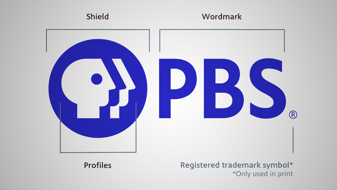
The new logo retains the iconic “everyman” profile design — with some minor tweaks that enlarge and refine the shapes within the circular shape (which PBS calls the “shield”), spaces out elements a bit and makes the “noses” of the figures tilt upward.
The “profile” is meant to represent a row of people and doubles as a symbol of the diversity of PBS’s audience, according to the brand guidelines.

Meanwhile, a new logotype uses the custom designed PBS Sans font — a design that PBS bills as “highly legible.”
It replaces a slab serif typeface that previously spelled out the letters “PBS.”
PBS also has removed the embossed effect on its black shield and switched to a brighter shade of blue — what it calls “PBS Blue.”
Navy blue, medium blue and white are also designated as the brand’s primary colors, with bright teal, yellow and coral available as accents, according to the brand guidelines the network released.

PBS also released simulated examples of the new logo and font in use, including a “PBS Charlotte” branded graphic listing upcoming programming.
However, PBS notes that each member station will still maintain their own brand guidelines, though they presumably will need to update with the new logo.
The new guidelines also include provisions for using the logo as a “bug” on video applications — with either the black or white version set at 25% opacity considered standard.
The new logo was created by Lippincott with Nathaniel Howe Studios executing the on-air design.
The groundwork for the latest PBS logo was launched in 1971, when the organization debuted a logo that used the now-familiar everyman shape as a stand-in for the letter “P” followed by “B” and “S” in coordinating shapes. The look was designed by Ernie Smith and Herb Lubalin of Lubalin Smith Carnase.
In 1984, the logo was updated to only feature the “everyman” P in the iconography and switching the actual name to a pure workmark. Tom Geismar of Chermayeff & Geisma redrew the everyman to face the opposite direction in addition to refinding the shape.
Since then, PBS logos have all drawn on this basic icon.
Subscribe to NCS for the latest news, project case studies and product announcements in broadcast technology, creative design and engineering delivered to your inbox.


tags
Lippincott, logo design, Nathaniel Howe Studios, PBS
categories
Branding, Broadcast Design, Broadcast Industry News, Heroes