How the opening titles for ‘The Morning Show’ keep things open ended
Subscribe to NCS for the latest news, project case studies and product announcements in broadcast technology, creative design and engineering delivered to your inbox.
When creating an open for a TV show about a TV show, the design team at Elastic could have gone in any of several directions.
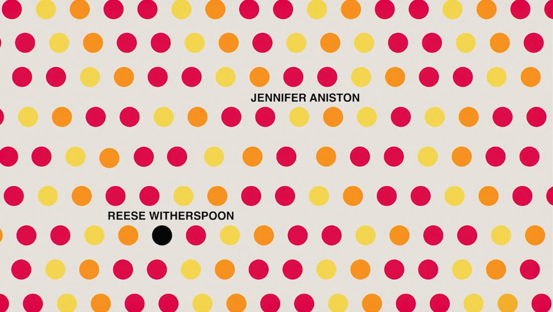
Ultimately, however, the team created a colorful open for Apple TV+’s “The Morning Show” that managed to combine a variety of emotions, attitudes and situations experienced by small, animated spheres that often seem to take on a life of their own.
At the start of the design process, Apple was very open to hear design firm Elastic’s ideas and didn’t want to give a strong direction, according to the firm.

“They explained about where the show was going, how it was going to be a female-led show and that they were going to include the #MeToo in the storyline. But that was pretty much it,” said Elastic creative director Hazel Baird.
Viewers first see a yellow and black ball — which, interestingly, wasn’t part of the original color scheme.
“We were originally following different colored spheres but realized we needed to follow one journey. Since our palette was very colorful we needed our hero to stand out and black was the obvious choice,” explained Baird.
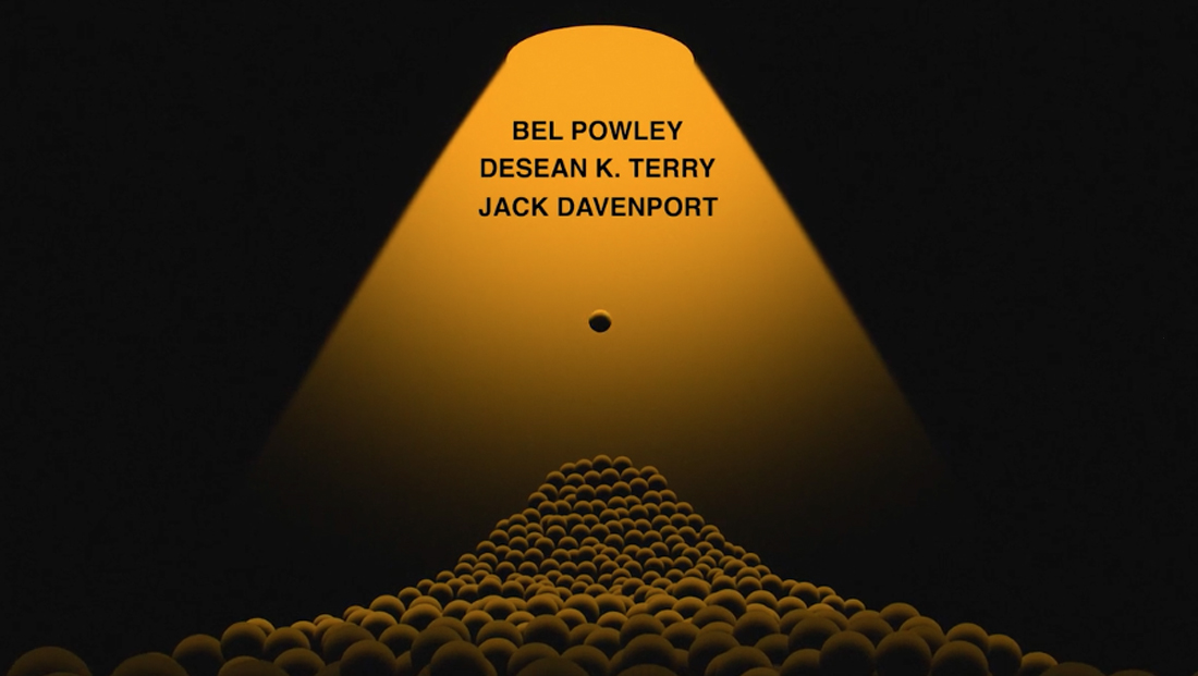

The often playful spheres were meant to represent the interplay of people and their lives, professional and personal. The team explored a variety of themes, including bucking the system, taking control, feminism and more and, in turn, interpreted them each in several different ways.
“We landed on colored spheres, as it was a lot more abstract and gender neutral and easier to tell our story,” said Baird.
Once the spherical concept was selected, it was time to decide on a color palette.
Baird explains, “When I was initially designing, the colors were carefully selected so I was approaching it from a graphical point of view: What color works best with the other ones?” She added that she and her team quickly realized green wasn’t a good fit.


Practicality also played into the decision to use a simple ball.
“We … needed these spheres to interact and move around. It’s a lot harder to do that with a shape that has corners and hard edges. We never once thought of using another shape. It was one of the first decisions we made,” explained Baird.
The open also has a lot of distinct “scenes,” and Baird says that one of the goals of the approach was give viewers a chance to come up with their own interpretations. She also noted that each scene does not necessarily represent a character.
“We strove not to do (that), as people change.”
She did, however, give a few of her own interpretations of some of the elements, while emphasizing that viewers can still come up with their own ideas as well:
- “The first scene of the spheres moving from left to right is a very simplified way of symbolizing the sun animating (and) rising on. It’s also reminiscent of early morning shows, which were an influence as well.”
- “The next scene where we first see our heroine/hero black sphere, it pushes its self through the colored spheres and purposely moves in a different direction and abruptly stops, so it’s ‘going against the grain.’ It has stopped following the other spheres and is making its own decisions.”
- The sphere explosion could illustrate anger or frustration.
- “Further along where we see the black sphere getting larger then falls into the floor. The pitfalls of gaining a big ego!”
- “The punching of the sphere as it reduces could interpret someone’s flagging career…or being beaten down, degraded.”
- “The blue sphere passing over the black sphere where we see an x-ray of what that sphere feels inside. Scared, nervous, panic attacks.”
- “Sphere going up the hill and then forced down by the weight of the white spheres. Uphill struggle, then when you arrive at the top, your hopes are dashed and you fall back down again.”
The selection of “Nemesis” as the theme song happened very late in the process, but, luckily, Elastic knew from experience that musical selections are often last minute.
The team initially animated based on temporary music, then fine-tuned the animation to match the beat of the song that was ultimately selected.
Baird worked with a team of designers and animators throughout the process, including Emanuele Marani, E.J. Kang, Peter Murphy, Erik Righetti, Kenneth Robin and Lucy Kim.
“Sometimes their dedication and hard work is ignored or doesn’t get as much exposure, but it would never have looked the way it did without them,” Baird said.
Subscribe to NCS for the latest news, project case studies and product announcements in broadcast technology, creative design and engineering delivered to your inbox.




tags
Apple TV, Apple TV Plus, E.J. Kang, Elastic, Emanuele Marani, Erik Righetti, Hazel Baird, Kenneth Robin, Lucy Kim, Peter Murphy, the morning show
categories
Broadcast Design, Broadcast Industry News, Exclusives, Featured, Graphics, MoGraph