
CBS AR Washington Monument graphic was cool to look at — but confusing
Weekly insights on the technology, production and business decisions shaping media and broadcast. Free to access. Independent coverage. Unsubscribe anytime.
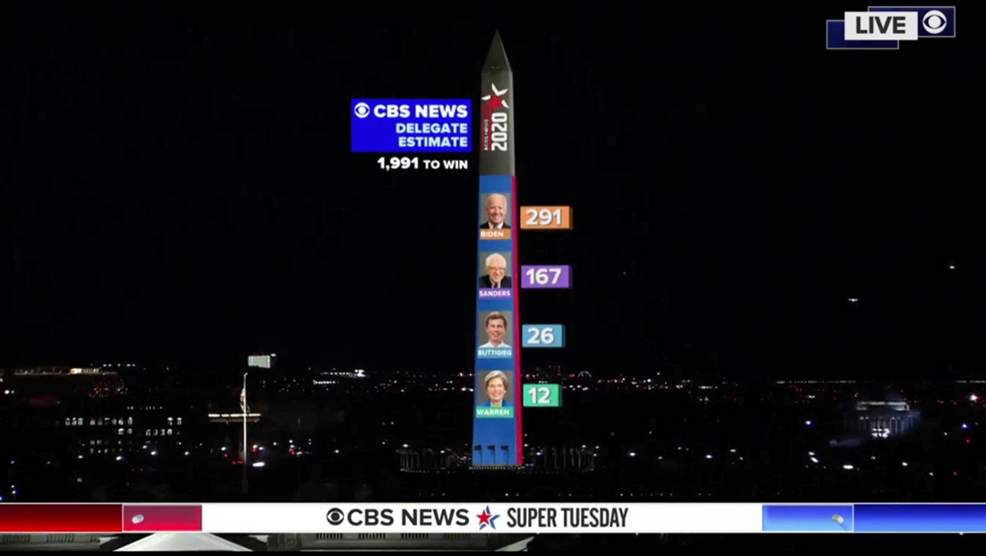
CBS News turned the Washington Monument into an augmented reality delegate tracker on Super Tuesday March 3, 2020 — but the overall effect was a bit confusing and gimmicky.
While the data used was correct and CBS never reported inaccurate information, stacking delegate projections next to the monument wasn’t the best way to use the obelisk and created a bit of a mathematical conundrum.
One would think that the tall, narrow monument would be a natural element to turn into a bar chart or “thermometer” showing the numbers and percentages of the delegates each candidate has received (NBC News has done this in the past with both real and augmented “ribbons” running up the side of 30 Rock representing electoral vote tallies).
However, CBS’s graphic showed four candidates, including Pete Buttigieg, who has dropped out, but didn’t offer any clear indication which segment of the blue overlay added, if any, represented his or her delegate count.
Each candidates’ photo was roughly the same size as well, so it doesn’t make sense that those somehow represented the proportion of delegates.
The blue highlighted area that could have read to indicate the portion of the delegates projected ran approximately 75% up the side of the monument, which would mean that, if the blue bar was representing the percentage of the total delegates need to win a nomination, it would mean approximately 1,400 to 1,500 delegates have been decided.
In reality, however, according to the same numbers that appeared on the screen show above, only 496 were projected at the time — and those numbers never got anywhere close to over 1,000 during the night.
The graphic would become even more disparate if the top of the monument actually represented the percentages of the total 4,765 Democratic delegates available.

In fairness, CBS never actually indicated on air what the blue area represents (if anything) — or that it was somehow supposed to be proportionate.
In fact, given that the network’s 2020 election logo took up the remaining space on the side of the stone, it appears the design was simply meant to fit within the overall vertical axis and for a way to work in the network’s new home base for “CBS Evening News.”
Although it does take a bit of an assumption on the part of the viewer to think of the monument’s height as being representative of the total number of delegates — it’s certainly not an unreasonable leap to make.
That said, once you take away the notion that it’s supposed to be showing current delegate projections as part of a whole, adding this layer over the monument doesn’t make a whole lot of sense.
Removing the idea of percentages means the graphic was basically just a list “tacked on” to the Washington, D.C. skyline.
In many ways, this is a good example of why augmented reality shouldn’t just be used for the sake of using it — and a reminder that thought needs to be put into making sure the look actually represents information accurately, even at a glance.
Correction: An earlier version of this story listed the incorrect date for Super Tuesday. It has been corrected.

tags
Augmented Reality, CBS News, Dot Connector, Super Tuesday
categories
Augmented Reality, Virtual Production and Virtual Sets, Broadcast Design, Broadcast Industry News, Elections, Featured, Networks