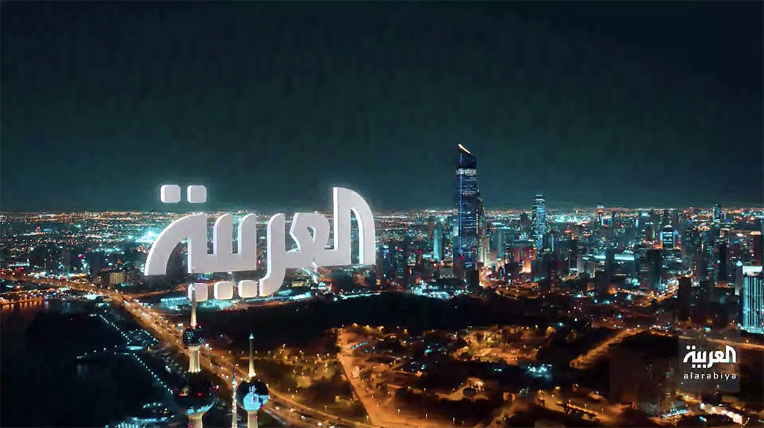
Al Arabiya launches new logo, custom typography and on-air look
Weekly insights on the technology, production and business decisions shaping media and broadcast. Free to access. Independent coverage. Unsubscribe anytime.
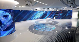
Along with debuting a new broadcast studio and newsroom facility, Al Arabiya also introduced a new logo, graphics and on-air sound.
The new logo design, created by Mourad Boutros, keeps the familiar Arabic glyph design from before but refines the “dots” with curved edges and adds curved tips and accents, in addition to displaying the network’s name spelled out in lowercase letters below, according to Fadi Radi, head of creative for the Al Arabiya Network.
Boutros notes the new logo design “provides a coherent overall look and to mimic the notion of broadcasting.”
Previous logo design of Al Arabiya
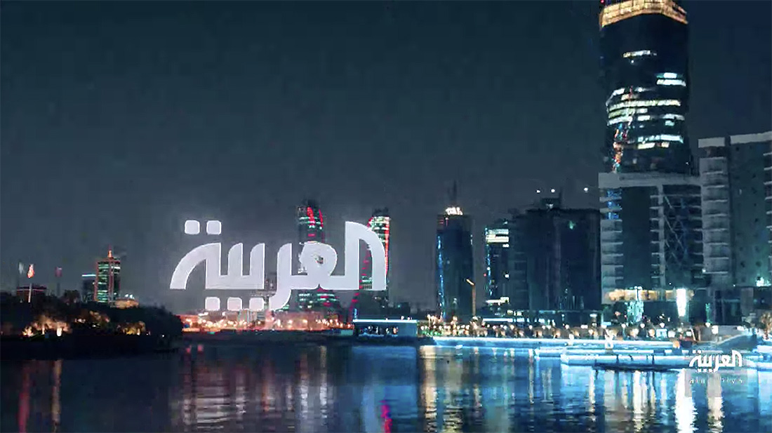
New logo design of Al Arabiya
Boutros also designed a custom font in five weights for the network which includes both Arabic and Latin versions, with designers Dave Farey and Richard Dawson helping develop the Latin editions.
The typeface is designed in a modern geometrical style with soft round edges, designed with multiplatform content in mind, notes Radi, and to fit within upper and lower horizontal graphics.
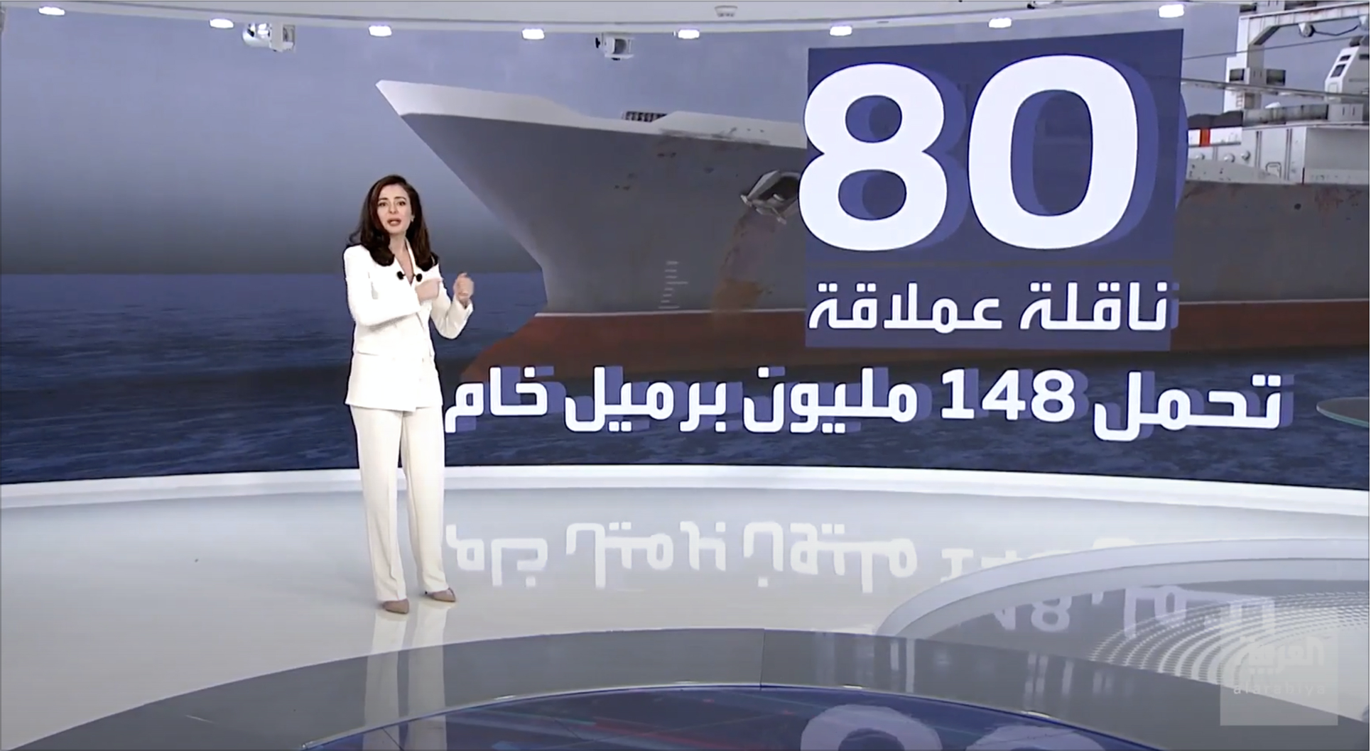
The typeface is used in the network’s on-air graphics and for storytelling on the many video walls installed throughout the studio and newsroom space.
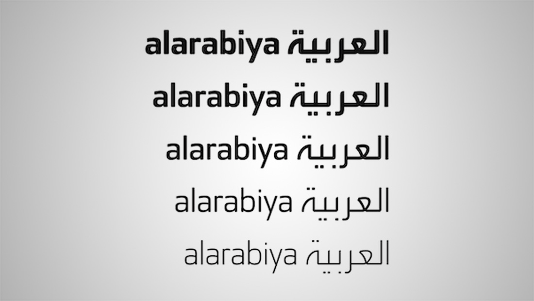

The new font replaces one used for 17 years — but which had since become widely used outside of the network.
Al Arabiya’s in-house creative team used those fonts as a base for the network’s on-air look along with Myreze who was tasked with creating idents and opens.
“These on-air graphics channeled the famous … golden ratio to give the eyes of our audience the most comfortable look and feel where they can read clearly the news and get the most of the screen layout,” said Radi.
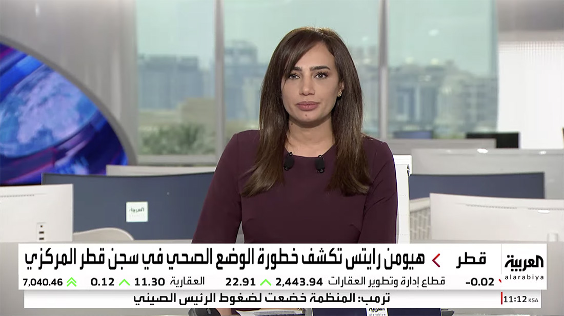
For on-air graphics, a slate blue with contrasting white and black to showcase the Al Arabiya brand values of credibility, integrity, objectivity and balance.
On-screen looks were meant to create “wider” areas of the screen that can maximize the viewership experience.
“This was a great challenge because we wanted to create the look and keep the brand consistent on all platforms,” explained Radi, including the network’s existing Vizrt systems.

tags
Al Arabiya, Arabic News Studio, Dave Farey, Dubai, logo design, mbc, MBC Dubai, MBC Group, Mourad Boutros, Myreze, Richard Dawson, Saudi Arabia, Vizrt
categories
Branding, Featured, Graphics, Network Branding, TV News Graphics Design