Tampa station unveils dizzying new logo design

Subscribe to NCS for the latest news, project case studies and product announcements in broadcast technology, creative design and engineering delivered to your inbox.
WTSP, Tegna’s CBS affiliate in Tampa, Florida, has done away with its longtime wavy logo in favor of a linear one that tricks the eye and almost causes a moiré effect (just try scrolling).
The station’s new logo, shown above, was unveiled earlier in May and features the numerals one and zero drawn out using five lines, which could be read as “signals” or “lines of communication.”
“We started by establishing a unique and ownable position for the station. In a noisy market filled with disjointed stories, they would offer ‘deeper dives and sharper insights.’ But that wasn’t the only change. Since news wasn’t the only type of programming they offered, we helped the team rally around a more appropriate name: 10 Tampa Bay,” reads the case study of the project from Matchstic, the design firm that worked with WTSP.
The two numerals are spaced tightly together so that two of the outer concentric rings of the zero intersect with those in the one.
A quarter of the zero shape is used to form the “cap” of the one, which intersects with the five vertical lines that form the lower part of the upright numeral.
In addition, the station dropped its longtime red hue in favor of a teal-ish seafoam green and bold black.
Though the style has been radically altered, the logo has a similar footprint as that at several other channel 10 stations, including WBNS, KWTX and WPLG, as well as Australia’s Channel 10.
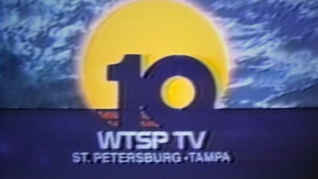
The general shape of the numbers was also found on WTSP’s air previously — quite some time ago, and as solid numbers instead.
Meanwhile, a bold, extended typeface spells out the city name with the CBS eye logo.
The station is also attempting to rebrand itself as not just telling the news — but also explaining it and making it relevant.
Although the new logo has been added to all opens and other news graphics, the station still uses the same Tegna graphics package and music.
Overall, the new logo design is certainly eye-catching but also might be a bit too “edgy” — though its sister station, WXIA in Atlanta, also underwent a just as jarring, though decidedly blockier, redesign in January 2019.
The new design is also a bit problematic in that the multiple lines appear to “vibrate” even at larger sizes — and those lines quickly break down and can seem to merge when at low resolutions — including on the station’s website, as shown below.


WTSP had used an oval-shaped icon, with a sweeping wave, dating back to 2002. It briefly dropped it from 2008 to 2010 during a social media-driven newscast branded under “10 Connects” — but that iteration still used a bold red oval and italic numbers.
A bit of that wave is still hinted at in the uppermost stroke of the one — as well as the repeating line concept overall.


As a way to make the logo work a bit better with Tegna’s flat, geometric and pattern-based graphics package, the logo was simplified in 2017 by blowing it up and reversing it out of a solid rectangle — along with the CBS eye in the upper left.
The new logo manages to incorporate the circular footprint of the eye logo better.


As part of Tegna’s efforts to simplify station logos along with its redesigned graphics package, WTSP switched to an outsized version of the logo reversed out of a solid rectangle.
Overall, viewers have mixed opinions of the look on social media — some like it, and some hate it.
Subscribe to NCS for the latest news, project case studies and product announcements in broadcast technology, creative design and engineering delivered to your inbox.




tags
logo design, Matchstic, tampa, tampa bay, Tegna, wtsp
categories
Branding, Broadcast Design, Broadcast Industry News, Featured