Notable Channel 10 TV station logo designs

Subscribe to NCS for the latest news, project case studies and product announcements in broadcast technology, creative design and engineering delivered to your inbox.
Here are our picks for some of the most notable Channel 10 TV station logo designs.
WBNS-TV

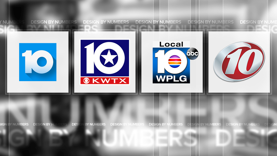
Though it’s changed over the years, WBNS-TV in Columbus, Ohio, has used the same basic “10” icon for years.
The logo includes a circular zero and “1” with a curved serif. The the lockup, the two numbers are merged together, along the right side of the “1.”
The latest renditions of the logo include a simplified look that sometimes includes the “long shadow” effect that has become popular online.
KWTX-TV

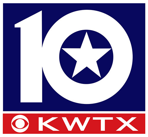
Waco, Texas‘ CBS affiliate, KWTX-TV, uses a similar look, though the numeral strokes are slightly less thick and the top of the one is angled with a small accented point rather than curved.
The negative space created by the circular zero, meanwhile, is used to house a star, a not-so-subtle reference to the Lone Star State nickname.
Below the “10” is the CBS eye along with wide lettering for the station’s call letters. The strokes in these letters have been carefully customized to match each other, especially the right side of the “K” and “X.”
WPLG-TV

Another similar design is found at WPLG-TV in Miami, Fla. The station’s numbers are more similar to WBNS-TV but uses the negative space in the zero to hold four colored bands that create a stylized globe look.
WTSP-TV

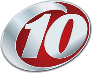
Tampa, Fla.‘s CBS affiliate WTSP-TV uses a twist on the “circle” logo design. The logo itself is housed in a sort of distorted oval with a thin border on the right side. The left side’s border, however, becomes thicker and, at the top, veers off into its own flourish that’s distinct from the thin border, creating a wave-like element that’s a reference to the station’s waterfront market.
The “10” inside the oval appears in a dramatically italicized typeface, with an exaggerated curve on the upper left of the “1”‘s serif that serves to both complement and contrast the curves found elsewhere in the logo.
The right side of the zero, meanwhile, matches the curve of the logo for a good portion of the right side, but then gently swerves away from the border.
WCAU-TV

The NBC O&O in Philadelphia, WCAU-TV, uses a simple “10” glyph next to a stacked peacock on network name.
The “1” has a distinct pointed and angled serif and top, while the zero’s vertical strokes are coordinated with that weight.

It’s worth noting that the station’s previous logo was a bit more distinct, with the “10” cut out of the negative space of a dark blue box, with the peacock and “NBC” letter stacked to the right.
In this version of the logo, the left and bottom of the “1” and all but left side of the zero bumped right up against edge of the box, creating a stencil-like look.
This version of the logo also contains a pointed tip on its “1” that’s somewhat echoed in the new logo, thought he curved stroke has been removed.
KAKE-TV

KAKE-TV, the ABC affiliate in Wichita, Kan., is included here although it often omits the “10” from its logo.
The station, which brands on air with its call signs pronounced as the word “cake,” is worth noting here, however, because of its thick letters that mix capital “K”s with full-height but lowercase letters “a” and “e.”
The result is a strong and memorable logo that also has a sort of friendly, approachable attitude.
The logo designers also utilized extremely condensed letter spacing between the “K” and “a’ and second “K” and “e” — to the point where the letters overlay each other.
The space between the “a” and “k” subtly remains, giving the logo a nice balance and enhancing the readability of the second “K.” The lower right of the “a,” however, features a subtle “point” that connects it — ever so subtly — to the “K” to its right.
The angle of the point, meanwhile, matches the angels of the “legs” of the “K”s. The point motif is echoed in between the “K” and “a” as well as between the second “K” and “e” — two other examples of careful attention to detail in the design.
This post is part of a semi-regular series on NewscastStudio that takes a look at TV station and network logos that include the numbers 1 and up. These posts aren’t meant to be a comprehensive list of all logos featuring the number in question, but rather a look at notable logos with creative, historic or an otherwise significant impact on branding design. If you have other logos with the number featured in this post, feel free to share it in the comments and stay tuned for a “reader’s favorites” version of this post coming soon.
Subscribe to NCS for the latest news, project case studies and product announcements in broadcast technology, creative design and engineering delivered to your inbox.


tags
columbus, design by numbers, kake, KWTX, logo design, philadelphia, tampa, Waco, wbns, wcau, Wichita, wplg, wtsp
categories
Branding, Design By Numbers, Heroes, Local News