
‘NewsNation’ look uses color and brackets to stand out, frame storytelling
Subscribe to NCS for the latest news, project case studies and product announcements in broadcast technology, creative design and engineering delivered to your inbox.
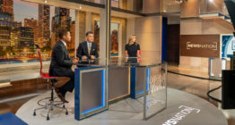
Just like the set WGN America built in its Chicago studios, the dynamic graphics created for the upstart three-hour primetime cable newscast “NewsNation” are grounded heavily in the concept of the “bracket” along with a flat, clean design that also gives the team plenty of flexibility now and in the future.
Launched Sept. 1, 2020, “NewsNation” is Nexstar Media Group’s answer to MSNBC, CNN and Fox. It airs seven nights a week from 8 to 11 p.m. eastern on the WGN American cable channel it acquired, along with the WGN broadcast station in Chicago, from Tribune Media in 2019.
Nexstar worked with Troika to create the dynamic creative assets that drive both the brand’s “no bias” branding and newscast storytelling.
Troika, along with the creative team at Nexstar, landed on the decision to use a deeper blue than the brighter shades that are more common in other TV news graphics today. That was paired with a blend of a lighter blue and shades of tan and beige.
These earthy, heartland-inspired beiges provide clean contrast to the deep blue. All told, the color language developed by Troika also coordinates well with the studio Nexstar and Clickspring Design created for the newscast.
“It’s really about putting focus on the story,” explained Josh Lynne, Troika’s creative director, when explaining the thought process behind leveraging the bracket theme and more subtle color palette.
That motif of “opening up” and “telling various stories” is incorporated throughout the graphics package, explained Lynne, comparing it to how windows and apps move around a device screen, opening and scaling to give various views and perspectives.
![]()

![]()
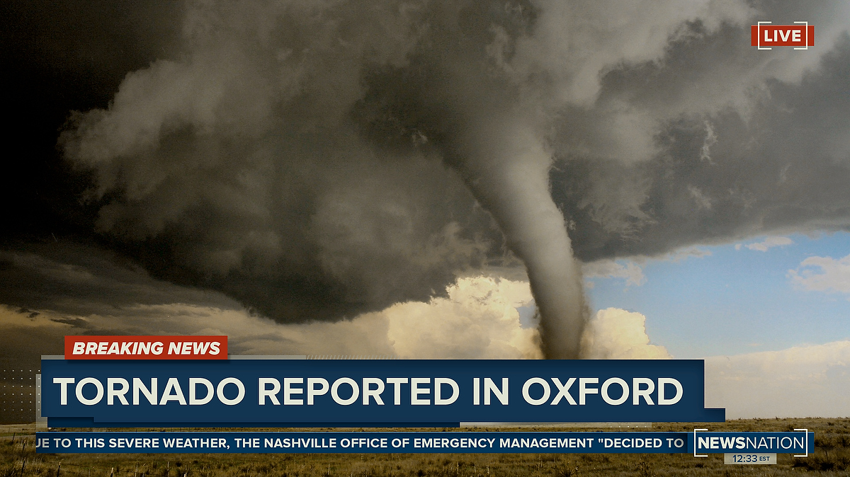
To add visual interest, Lynne also worked to add in subtle accents and textures, including an angled hash mark line that matches the strong angles in the logotype, matrices of dots, thin lines, viewfinder-like corner accents — with dark shadows and subtle transparency effects used to add a bit of depth to the look.
Jumping off the theme of strong straight lines and right angles, many on screen elements are framed in a “stepped” rectangular box that often lays the groundwork for the package’s animation.
The animated elements latch on to the theme of revealing parts of a story — with heavily horizontal, opening motions in the form of wipes, transitions and other elements.
When a horizontal reveal or wipe isn’t practical, the design has elements appear in a phased reveal that originates from a center axis.
The lower third banners, for example, often pop on screen before expanding horizontally outward. A similar effect is used on the text in locator lines that frequently appear in the lighter top tier of the banners.
Another animation effect includes using the “corner” elements to move diagonally across the screen revealing elements in a particular corner.
Banners also morph to accommodate the size of the typography and other graphic elements — such as topical coverage for stories such as COVID-19 or when switching between reporter and VSOT lower thirds and story headline banners.
Those typically state-based locators, along with generous use of state outlines and maps throughout the show, help to drive home the concept of a national newscast while also giving viewers context to the current story as the newscast jumps around the country.
Another key part of Troika’s strategy was giving “NewsNation” producers the flexibility to create a myriad of iterations while still respecting the overall look and feel of the brand.
To do this, Lynne and the Troika team created what they call “design recipes” that give the graphics team the starting points for creating a look that can be translated into any number of storytelling elements.

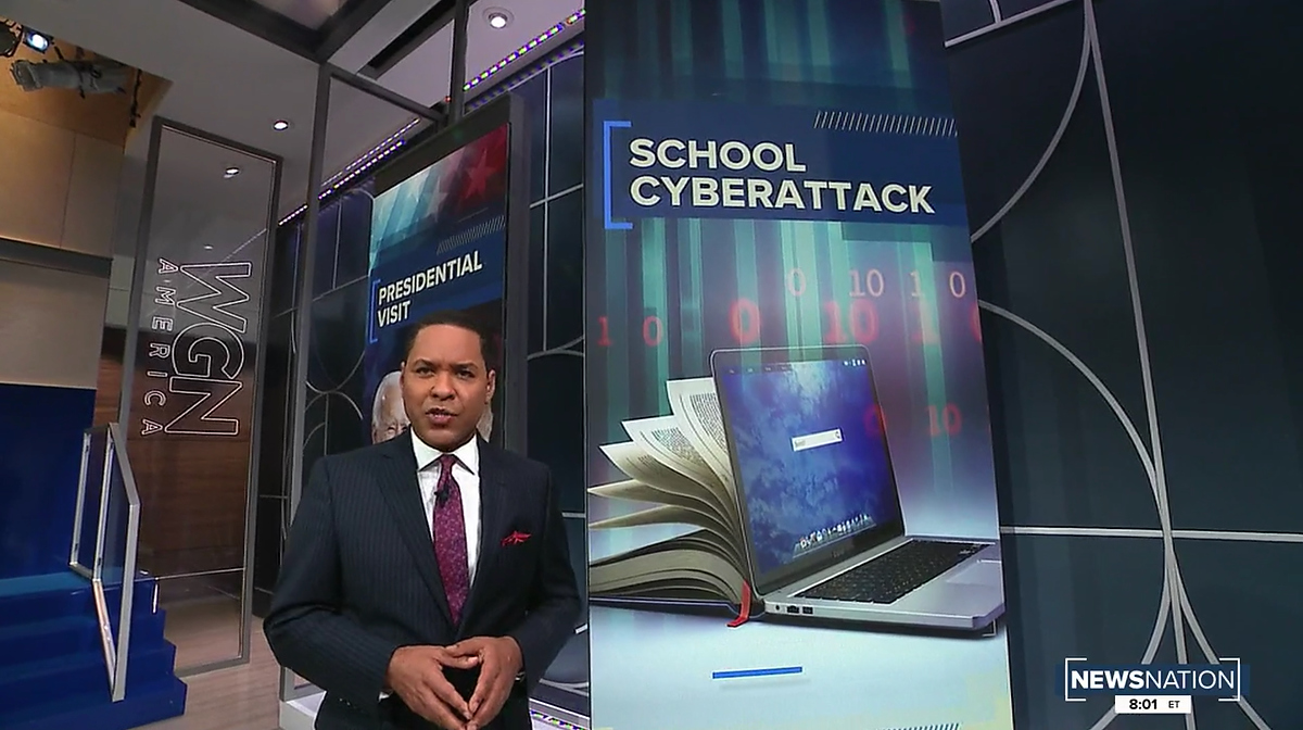
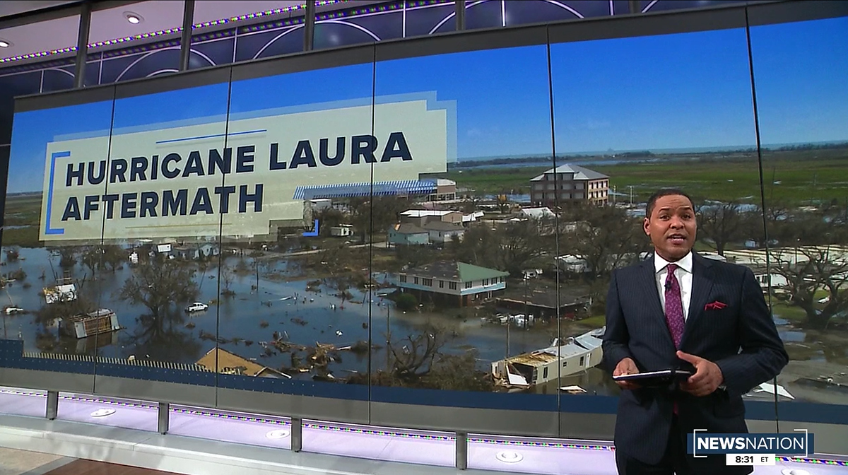
This includes fullscreen graphics, maps and timelines as well as sidebars and OTS elements — in addition to the imagery fed to on set monitors and video walls.
One particularly large footprint that needed to be covered is the six-panel motorized array that has multiple physical configurations and, therefore, numerous graphic recipes.
These recipes are outlined in a standards manual that “NewsNation” designers work off of.
Although the Sept. 1 debut newscast made generous use of the variety of venues throughout the studio and their accompanying graphics, expect to see more as the show settles in, notes Blake Russell, Nexstar’s executive vice president of station operations and content development.
Subscribe to NCS for the latest news, project case studies and product announcements in broadcast technology, creative design and engineering delivered to your inbox.

tags
Blake Russell, Josh Lynne, NewsNation, Nexstar, Nexstar Media Group, Troika, WGN America
categories
Broadcast Design, Cable News, Featured, Graphics, TV News Graphics Design, TV News Graphics Package