‘The View’ is getting a new logo for its new season

Subscribe to NCS for the latest news, project case studies and product announcements in broadcast technology, creative design and engineering delivered to your inbox.
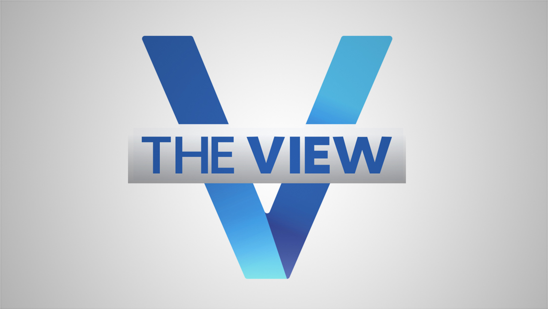
ABC’s daytime talker “The View” is getting a new logo for Season 24, according to updates made to its social media accounts in September 2020.
The show is also preparing to welcome back a former co-host.

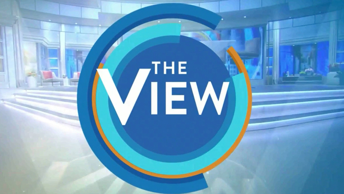
Logo used in previous season.
The show, which airs from 11 a.m. to noon eastern, updated its social media profiles to use a new look featuring a ribbon like, gradient “V” behind the show’s title in a white or white-gray gradient box.
In the new lockup, the word “The” is slightly lighter, while “View” is bolder. The “V” fades from a deep blue similar to the one used on the full title to a brighter, electric shade.
The old logo draws its roots back to 2014 when the show’s look was overhauled — though back then the primary color was teal.
The teal quickly shifted to blue and the simple circle would eventually make way to one with multicolored ring “segments” around it. This took place during a period of a lot of set and graphics tinkering.
‘The View’ readies for Season 24 https://t.co/WBWuIayXSK #TVNews #BroadcastNews
— TVNewsMix (@TVNewsMix) September 4, 2020
The show did stick with the general concept introduced in 2014 — a more humanist sans serif that retained the larger “V” in the form of a rather poorly scaled “drop cap.”
In more recent years, the logo would also appeared boxed in some applications, most notably the bug.

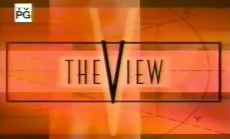
The original ‘View’ logo
With the new look, the font switches to a more straightforward sans serif and also returns to putting the larger, exaggerated “V” in the center of the design — and also gives it a bit more prominence.
However, the new logo favors a wider typeface instead of the rather extreme condensed font used at the show’s start and until 2014.
In a promo for the new season, the old, square bug was used, but the typeface in the on screen graphics appear to have been updated to match the new font in the redesigned logo.
While the new logo is straightforward, it’s not exactly groundbreaking — there are numerous other V-shaped logos that use a similar concept.
In some regards, it also also lost some of the informal feel the old look had.
While the diagonal lines could also be read as forward and backward slashes, perhaps a nod to progressive vs. conservative, that theme isn’t super clear.
It also would have been interesting to see the design explore more the use of angles that could have been symbolic of different perspectives or “view”points that the show was created around.
At the very least, the logo does at least correct the now six year old trend of having a “V” that is completely out of scale and proportion of the other letterforms.
Subscribe to NCS for the latest news, project case studies and product announcements in broadcast technology, creative design and engineering delivered to your inbox.


tags
ABC, ABC Studios NYC, logo design, Studio TV1, The View
categories
Branding, Broadcast Design, Broadcast Industry News, Featured