
Asharq graphics transform pulses of communication into dynamic visuals
Weekly insights on the technology, production and business decisions shaping media and broadcast. Free to access. Independent coverage. Unsubscribe anytime.
For Asharq News (الشرق), an Arabic language financial and business news service that launched in November 2020, the design team at branding and virtual production studio Myreze developed a visual language based on communication methods to distill the idea of information into a clean look.
The team started by looking at the network’s logo and quickly spotted the strong straight lines and five dots, which led to Morse Code and its ability to “turn text into a dynamic design language and waveforms.”
Although Morse Code was developed for the English language (and, therefore, the Latin alphabet) in the 1800s, it has since been adapted for multiple character sets, languages and even specific uses.
The International Telecommunication Union also publishes a standard that has key differences from the original — and it’s that that Asharq appears to use.
Morse Code was developed around the idea of transmitting combinations of short and long electrical pulses, each of which represent a letter, numeral or punctuation, which become visual in the form of dots and dashes, respectively.
Myreze took those dots and imagined them as both spheres or short cylindric segments — while the dashes became longer, tube like modules, often with rounded ends to match the dots.
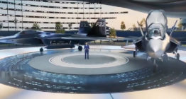
Visually, Morse appears on screen in a variety of applications, including vertical and more blocky interpretations as a circular arrangement — as well as working its way into on set graphics and the virtual studio Myreze also developed.
Idents
Internally known as “Patterns,” this ident features a “mix and match” of design elements, including an emphasis on circles. “It starts with one of these circles rolling along and bumping into another part of Asharq’s logo before all separated parts seem to be magnetically activated, and join together by floating slowly falling into place for a satisfying finish. The result is a clean and memorable image for Asharq,” explained Myreze.

The name for the “Blocks” ident is pretty clear — it’s name for the “wall” the network’s logo sits on in the scene. “It is also the ident that takes most inspiration from our (Morse Code) design concept, evidently shown in streams of them flowing into a surface completely made of white blocks, almost as if to collect all the information and sealing it within its logo, ready for the viewers to see,” said Myreze.
This ident leverages what Myreze calls “Morse tubs” that glide up and down, revealing the logo hiding in plain view. There are also translucent bubble like spheres standing in for the dots.
Opens
Myreze’s open for Asharq’s news coverage is based on the idea that information is fragmented.
“A bird’s eye view of a city reveals the chaotic nature of life that we’ve all come to adapt and get used to. When viewing civilization from above, it becomes clear that it’s almost a miracle that anything functions at all. It’s organized chaos,” the studio says.
“We began our concept of the Asharq news opener by envisioning those people in their cars, jetting about, as informational fragments, rushing to get to the next destination to further share that information,” it continues.
The Morse Code concept is used heavily in the news opener, both in the dashes and dots zipping around the view like people hurrying to their next designation but also in a more abstract way with the cityscape.
For the more lighthearted “Colours of the East,” Myreze created a distinct look that still channeled the primary brand elements.
The opener starts with “islands” and begins with a globe shooting toward a horizon that’s interpreted as the ocean’s surface.
“Upon impact, a huge shockwave sends tides of scattered particles across the surface that combine to create the structure of Asharq’s island studio in a spectacular display of colour. The view then turns to the interior of the virtual studio, showing off intense details reflecting off the floor before giving a near 180-degree turn of the set before shooting towards the center of the room and zooming out to reveal the lively ‘Colours of the East’ logo,” the studio explains.
Asharq’s “What Happened” revolves around the concept of time — and using that time efficiently, so Myreze opted to illustrate that concept with the Morse Code concept.
“The opener starts above the circular center of the What Happened studio as its outer layer unfolds and disperses morse codes into the air, representing information being released into the world in an unorganized manner,” Myreze says.
The Morse elements then circulate around the interior of the studio signifying the process of Asharq gathering nformation and organizing it for viewers.

At this point, the view changes to the exterior of the studio and viewers are treated to a view of “Morse Codes being sent out into circulation after being categorized in the studio, before zooming upwards and showing the greater picture of the information being dispersed back into the world.”
The open pauses for a view of the aerial view of the island formations and the bursts of information with the show logo finally entering via a blur effect.

tags
Asharq News, Bloomberg Asharq, Myreze, Saudi Research and Media Group, الشرق
categories
Augmented Reality, Virtual Production and Virtual Sets, Branding, Broadcast Design, Cable News, Graphics, Graphics Systems, TV News Graphics Design, TV News Graphics Package, TV News Motion Graphics Design