
CNBC’s ‘TechCheck’ combines network’s traditional 3D look with unexpected elements
Weekly insights on the technology, production and business decisions shaping media and broadcast. Free to access. Independent coverage. Unsubscribe anytime.
CNBC’s new show “TechCheck,” designed to cover the intersection of tech and business, blends the network’s trademark glassy, 3D look with more subdued textural elements.
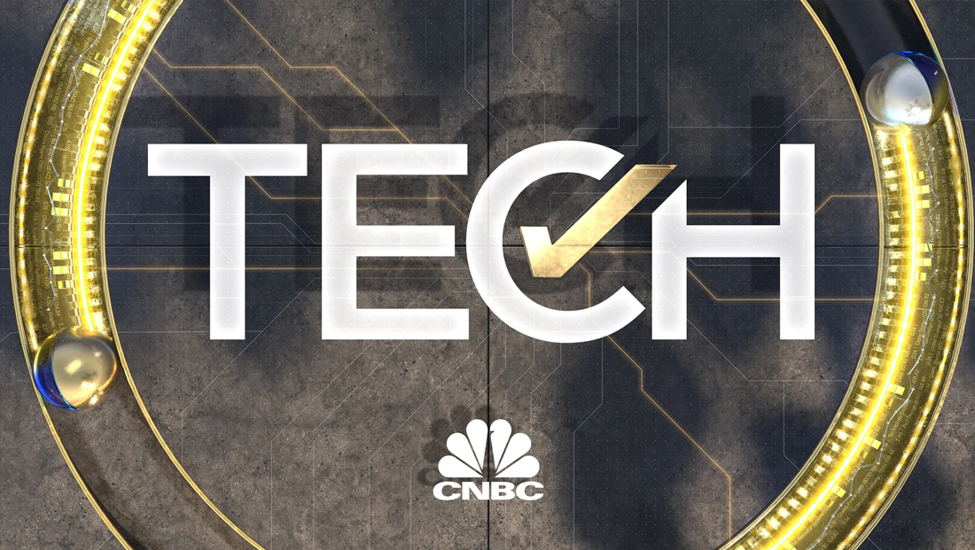
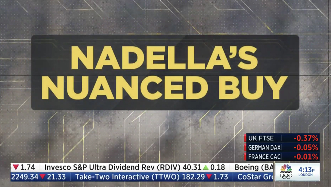
The centerpiece of the show’s look is a dramatic gold checkmark that stands in for the word “Check” in the show’s name in graphics.
In the primary lockup, in fact, only the word “Tech” is ever shown, spelled out in all caps in a clean, geometric typeface.
The checkmark is tucked into the negative space in the “C” in “Tech,” traveling diagonally northwest and taking a slice out of the upper left part of the “H” next door.
The checkmark is often displayed as in that glassy look at the start of animated sequences or backgrounds, but also can become more textural when viewed from “above,” such as in the show open and key art, where a gritty brownish-gray background features glints of thin diagonal lines.
All of these elements are included in the highly detailed open, which starts with a “glitch” effect when “Squawk On the Street” anchors toss to the show.
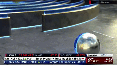
There’s another burst of interference and two stone columns (think Wall Street architecture) with spiral “ramps” wrapping around them are shown as metallic balls roll down and then bounce down a set of stone steps and then blaze past a bull leaving an electric blue trail.
The ball also leaves behind a row of glassy blue graph bars while a thin fever line with silver spheres at datapoints “draw” out above, also borrowed from graphs. Additional silver balls on thin vertical “supports” rise up to meet the gold thread, creating the look of a roller coaster, likely not a coincidental metaphor.

A bronze-y State of Liberty is depicted as a ball blazes a circular path behind while the words “New York” appear on screen before quickly transitioning to a segmented recreation of the Gold Gate Bridge, a reference to the bicoastal nature of the show with one anchor in San Fransisco.
There is then a series of gently rolling ramps (perhaps a rather literal translations of Silicon Valley) before the ball rolls on to a flat, open “space,” forming a circle around the “C,” with part of the “floor” pivoting into place while clear segments of the “C” drop into place from above and the checkmark rises up from the depths of the 3D space.
A larger iteration of the checkmark serves as a transition to a “birds eye” view of the title card scene as two spheres roll counterclockwise in “channels” on either side, creating a circular frame around the logo. This look is also used heavily in rejoins and key art.
The idea of spheres rolling through spaces is reimagined in other parts of the show for franchise stingers, including a “RealityCheck” look with a circular labyrinth with a sphere rolling through, eventually entering the central ring of the lockup and rolling into the curve of the “C,” causing the entire screen to pulsate slightly.
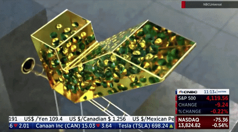
For “CrowdSource,” the show’s viewer feedback feature, the spheres are shown rolling through an intertwining kinetic sculpture, with each eventually popping into place in the center of the two “O”s. In this animation, the gold checkmark hovers above the typography and is depicted with gold and green marbles inside of it, almost as if the “crowd” is funneling downward.
There are numerous other design metaphors embedded in the look, including the highly glassy and metallic looks that give off a clean, sleek look, paired with the grittier background, perhaps a reference to some of the more fringe parts of business tech, such as cryptocurrency, NFTs and even the dark web.
Spheres, meanwhile, are an obvious nod to the idea of moving forward and forging new paths, and the dual color nature of some of them could speak to the duality of technology innovation — the more traditional ideas represented by the metallic while new schools of thought channeled via the glassy color half. The use of multiple spheres also created the idea of a “race” to the next big thing.
Paths, such as the bounce down the stairs and rolling along stepped and rotating segments of the Gold Gate Bridge, are a likely reference to both literal “steps” taken during business ventures as well as the ever shifting nature of the foundation of the tech industry.
Like all weekday dayside programming on CNBC, “TechCheck” carries the network’s iconic ticker but mixes in its own take on a lower third banner.
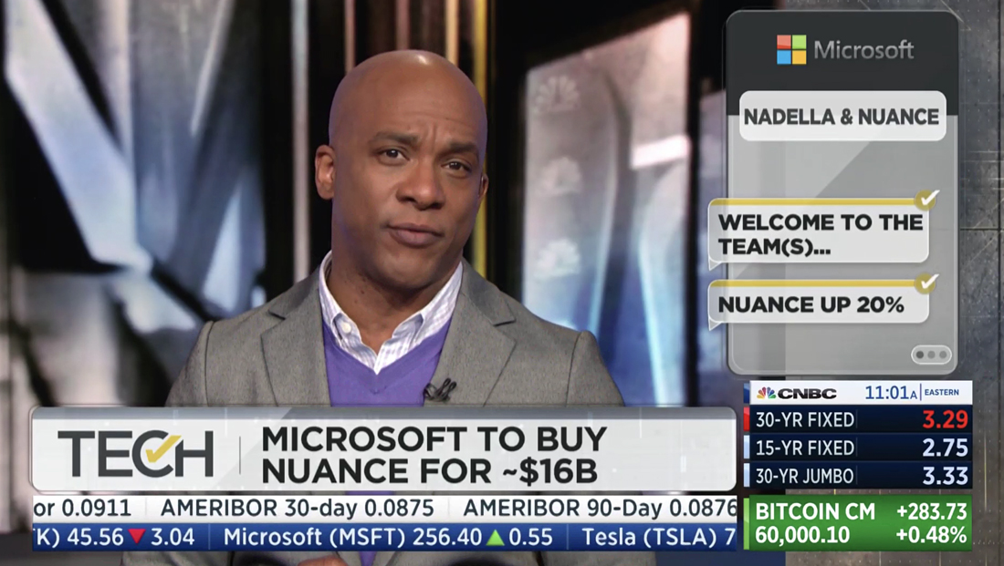
The space above the additional financial information parked in the lower right of the screen can be filled with an OTS-style graphic with a shape that mimics a messaging app, while key facts and previews appearing in the speech bubbles.
Heading into the first break, a popular music song is played as fullscreen text based teases are shown against elements from the show’s graphics package and video and still imagery, but sans any VO from anchors.
The show also leverages some of CNBC’s augmented reality technology to showcase data, while also making use of a wild video panel placed in front of the large video wall in the network’s Englewood Cliffs, New Jersey headquarters.

First announced in February 2021 for an April 5, 2021, debut, “TechCheck” ended up getting pushed back a week, debuting April 12, 2021.
CNBC’s Jon Fortt and Carl Quintanilla anchor on the east coast (though it appears, likely due the pandemic, from separate spaces) and Deirdre Bosa joins from the west coast.
CNBC’s Senior Media & Entertainment Reporter Julia Boorstin contributes from Hollywood.

tags
CNBC, TechCheck
categories
Branding, Broadcast Design, Broadcast Industry News, Cable News, Graphics, Heroes