This is CNN+: How a plus sign was created using the iconic cable news brand’s logo look

Subscribe to NCS for the latest news, project case studies and product announcements in broadcast technology, creative design and engineering delivered to your inbox.
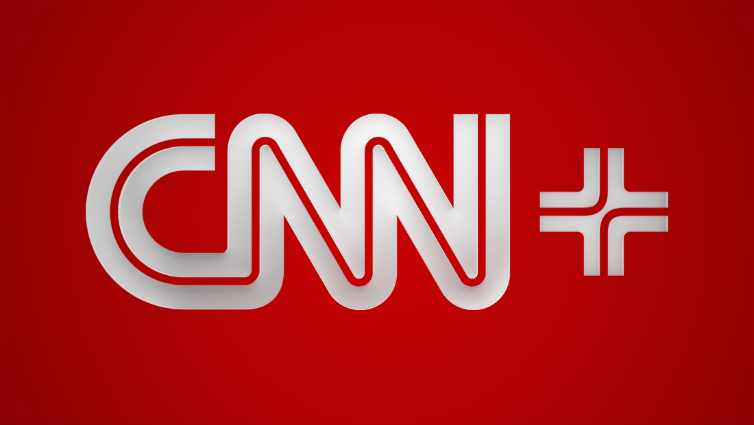
It’s finally official: CNN+ is coming in early 2022 — and the network released the service’s logo design that incorporates an interesting take on the “plus” symbol that’s becoming somewhat of a tired branding element in the cluttered streaming market.
The logo released July 19, 2021, not surprisingly, uses the main CNN logo but adds a “plus” symbol (some early reports about the service spelled out the word “Plus”).
The “+” branding is a favorite of streaming providers — think “Disney+,” “Discovery+,” “AMC+,” “Paramount+” and “Apple TV+” — which has the advantage of nearly instant consumer recognition of what the service is but also leads to a cluttered landscape of “pluses.”
CNN finally announces its streaming service plans https://t.co/Fc19Gi2sTO #TVNews #BroadcastNews
— TVNewsMix (@TVNewsMix) July 19, 2021
CNN at least made an effort to make its plus sign look a bit unique by echoing the two lines approach found its primary logo to form a plus sign with a different take, especially near the center.
All told, the “plus” element includes three distinct segments: An L-shaped one in the upper left with a slight curved corner (much like the tips of the “N”s in “CNN”) with a reverse one in the lower right.
The symbol is finished off with two additional L-shaped elements but joined together in the center thanks to a skinny line that curves out of their respective corners.
The result definitely reads a plus sign, but also conjures images of transit maps or a hospital logo.
The four endpoints of the icon have the advantage of looking almost identical to where the two interlocking lines of the CNN logo start with the “C” and end with the second “N” (the CNN logo has been described rather inelegantly, described as two snakes engaged in a reproductive act).
Since most plus symbols are naturally square (or at least square-ish) in footprint, the design could also fit well with CNN’s practice of boxing its logo — not to mention fitting well on app or social media icons.
CNN did note to make the strokes in the symbol a bit thinner than those found in the main logo, while the space between lines is identical — but such a design approach isn’t uncommon.
Among the other major streamers, Disney+ and Paramount+ both made subtle efforts when crafting their plus symbols (the vertical line in Disney’s is curved slightly to match its “shooting star” path and Paramount italicized its match the angle of its iconic script logotype).
Discovery, Apple and AMC stuck with more straightforward plus signs — and Discovery uses the plus symbol as a dominant graphical element throughout its look, including in animated snipes reporting the service on its linear channels.
In some ways, it would have been interesting to CNN stylized its streamer as “CNN Plus” or “CNNplus,” with the latter matching the mixed case approach of its “TV everywhere” service “CNNgo” (though it’s possible that brand could not be long for this world if the network decides to consolidate its streaming efforts under single banner).
Subscribe to NCS for the latest news, project case studies and product announcements in broadcast technology, creative design and engineering delivered to your inbox.


tags
CNN, CNN Plus, logo design
categories
Branding, Broadcast Design, Broadcast Industry News, Cable News, Heroes, Streaming