
GB News celebrates 10th week on the air — but gets the U.K. flag wrong
Weekly insights on the technology, production and business decisions shaping media and broadcast. Free to access. Independent coverage. Unsubscribe anytime.
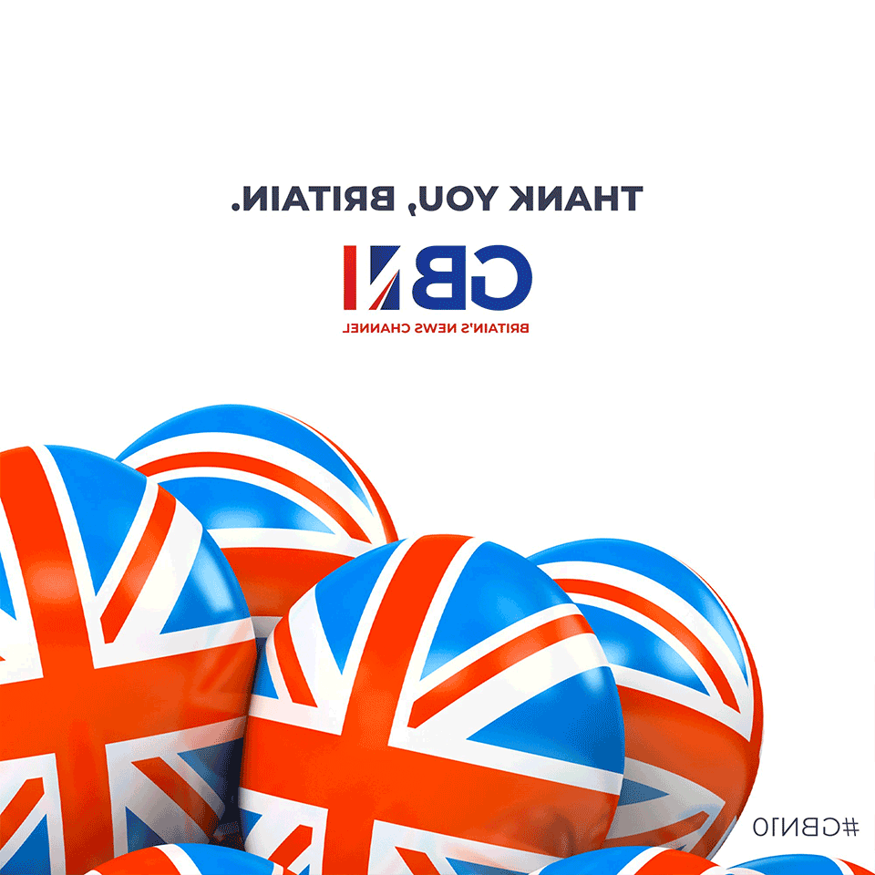
Upstart GB News spent much of the weekend of Aug. 21, 2021, celebrating its 10th week (yes, week) on the air using a series of graphics that use a rendition of the Union Jack flag that’s not quite accurate.
The network, which proclaims itself “Britain’s News Channel,” launched June 15, 2021, gaining considerable attention for a series of technical issues.
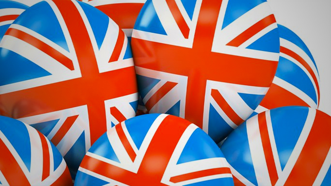
Starting over the weekend, the network began updating its social media posts with imagery that used 3D, circular shades emblazoned with the United Kingdom’s flag on it.
Tomorrow we reflect on our achievements during our first 10 weeks on air! #GBN10 pic.twitter.com/xjqj5h2mnP
— GB News (@GBNEWS) August 21, 2021
It’s not quite clear what they are supposed to be — perhaps candy, painted eggs, pet rocks or just rounded semi-spherical items.
However, if you look really closely at the sides of whatever those objects are supposed to be that feature the front of the Union Jack, you’ll notice something’s a bit off.

First, the exact shades of the colors don’t match either the actual flag or the channel’s graphics package — though that error could perhaps be written off as a stylistic choice.
The real issue: Those red diagonal lines don’t match the actual design of the real flag.
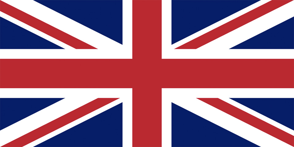
For those of you without a Sheldon Cooper-level memory of flags, here’s what the Union Jack should look like:
However, this animated GIF illustrates the problem. When the text is “correct,” the red and white lines are incorrectly placed. When the image is flipped horizontally, the lines are more in line with the correct design.
To guide you more, look at the diagonal line in the upper left of the “real” flag image above. Notice how the thicker white part is above and to the right of the red line. Compare that to the imagery GBN used where it’s below the the left of the red line.
At least one of the diagonal lines (the upper left one when viewed the way it was posted) ends with the red part awkwardly “cut off” rather than ending in the sharp point on the real flag. Finally, it appears that the entire flag was “squeezed” horizontally to fit into the circular footprint, which significantly skews the angles in the design.
It’s not clear how this error happened. It appears in instances where the circular elements are on both the left and right side of the screen, which lessens the chance it was a case of someone horizontally flipping the original image to make it fit the design (though it’s possible that a “master” version was flipped and then all subsequent designs stemmed from it).
Is it subtle? Sure. But for a network who is billing itself as a “Britain’s News Channel” using a flag with such an odd discrepancy, let alone a color shift, is a bit odd.
It would essentially be akin to hanging an American flag either upside down on a wall or flying it upside down on a flag pole (without there being dire distress or peril as permitted in U.S. flag code) — or performing some other “flip” or transformation in Photoshop.
The elements of the Union Jack, incidentally, found themselves into the channel’s graphics package, though in a more abstract, “deconstructed” way that makes it clear it isn’t meant to match exactly.

NBC Sports also used the Union Jack’s signature angular look in its graphics during the 2012 Summer Olympics in London.
The Union Jack has quite an interesting history that included merging elements from various countries within the kingdom. There’s also quite a few countries and cities that incorporate the U.K. flag into their own design.

tags
GB News
categories
Branding, Broadcast Design, Broadcast Industry News, Featured, Graphics