
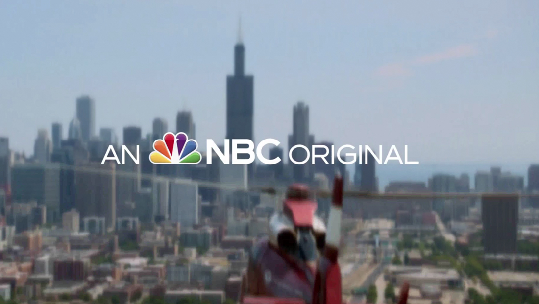
‘An NBC Original’ title added to first few moments of most network promos
Weekly insights on the technology, production and business decisions shaping media and broadcast. Free to access. Independent coverage. Unsubscribe anytime.
Starting earlier in August 2021, NBC began adding its logo and a brief line of text at the beginning of most promos for its entertainment shows.
The graphic is typically overlaid atop a clip from the show, stylized beauty shot or purposefully blurred image and reads “An (peacock logo) NBC original.”
The letters “NBC” sit next to a full color version of a slightly glossy peacock logo and are set in bold, with the height of the letters about at the level of the top of the orange and blue feathers, while the words “An” and “original” are in lighter, slightly smaller lettering.
The font matches the Sweet Sans NBC began using in place of its longtime custom geometric logotype several years ago and the same font is used throughout promos, with the key exception being the show title, which typically appears in whatever logo it uses.
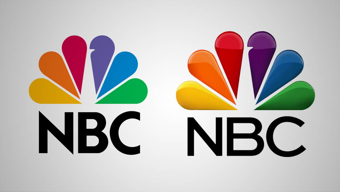
For years, NBC used the version of the logotype shown at left, a custom geometric typeface notable for its sharp ‘points’ on the ‘N.’ It then switched the version on the right, with the letters set in Sweet Sans. During both designs’ lives, there have been numerous variations of how the peacock and lettering were stylized, including different levels of gloss and other textural touches.
So far the promos using this format have been airing for both shows airing now and ones planned for the upcoming fall TV season.
The use of the label “original” follows a trend begun by streaming services to help subscribers identify exclusive TV shows and movies available on that platform.
CBS began incorporating the word for the 2020-2021 season as a way to categories its programming types: “CBS Originals” for, just like NBC, its entertainment offerings, “CBS News,” “CBS Sports” and “CBS Presents,” for specials.
The move followed an overall rebranding effort that included the network, its various divisions and other ViacomCBS properties adopting the TT Norms logotype, dropping the longtime Didot across the board. Previously, CBS had used TT Norms for just the news division and other typefaces as well.

CBS, however, doesn’t lead off each promo with one of the labels and most of its promos end with the network’s new logo and a line reading “Live + On Demand + Streaming,” as a way to emphasize its multiplatform approach (and offer perhaps a subtle hint to Paramount+, its streaming service).
What NBC has not updated, at least as of yet, is the “NBC presents” card that appears before most of its original entertainment programming.
This was added at the start of the 2018 TV season and morphs between one of the network’s classic peacock logos to the present day one along with the three note “chime” mnemonic.
For comparison, here’s a promo for “Good Girls” that aired in July 2021, before the new format was rolled out. The final screen does include the show logo and Sweet Sans typography.
In the promos noted so far, the NBC peacock is also not recolored like how it’s yellow in this “Good Girls” one to match the color of the show’s logotype in the final screen, so NBC may be clamping down on allowing its famous multicolor logo from being recolored for consistency’s sake.

tags
logo design, NBC, nbc peacock, promos, TV Promos
categories
Branding, Broadcast Design, Broadcast Industry News, Featured, Network Branding, Networks