
‘Wheel of Fortune’ spins up set, music and graphics updates
Weekly insights on the technology, production and business decisions shaping media and broadcast. Free to access. Independent coverage. Unsubscribe anytime.
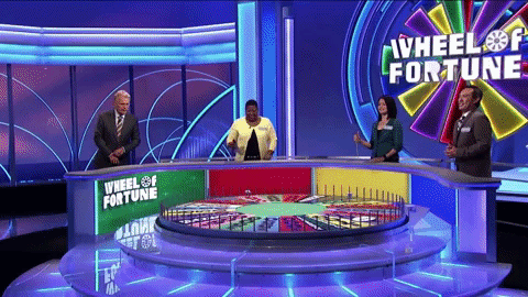
Sony’s syndicated game show “Wheel of Fortune” returned for its 39th season Sept. 13, 2021, with some on air updates and a rule change that sent some fans reeling.
![]()
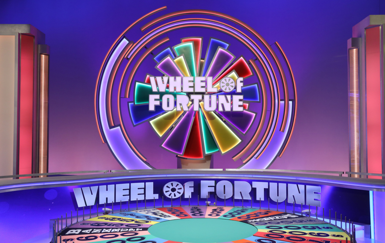
The show introduced an updated logo — not exactly a new one, because it still uses the same custom drawn lettering with a simplified version of the namesake wheel as the “O” in “of” but it’s now typically set in silver-gray in front of a burst of colorful wedges, also inspired by the segments of said wheel.
The wedge shape has rightfully been a graphical element on the show throughout the years, including last season — whether it be as a background texture or “fan” like application. Because the wheel is, quite literally, the center of most of the show’s gameplay, it makes sense that designers would look to it and its components for inspiration.
What’s slightly different, however, is that the colors on the new logo are bolder than most of the ones used on the actual wheel, which have used mostly pastel shades for decades. They are also displayed at varying sizes and overlaying each other, which obviously isn’t possible on the physical wheel.
“Wheel” has used a variety of logos over the years, including the two line version used in the middle of the new lockup as well as a circular one with “Wheel” curving over the top and “Fortune” along the bottom with “of” in the middle inside of the wheel icon.
Paster iterations also included a similar “burst” with the circular logo in the middle, but with wedges alternating between two sizes as they wrapped around.
The logo itself is drawn from the sculptural element that the show introduced as part of its primetime “Celebrity Wheel of Fortune” series during Season 38, when it was lit mostly in a gold tone to match that iteration’s graphics and placed behind the contestants in favor of a video wall that would often showcase imagery to match whatever the week’s theme was.
For “regular” shows, color changing LED lets the show change the colors of both each wedge as well as each character in the logotype.
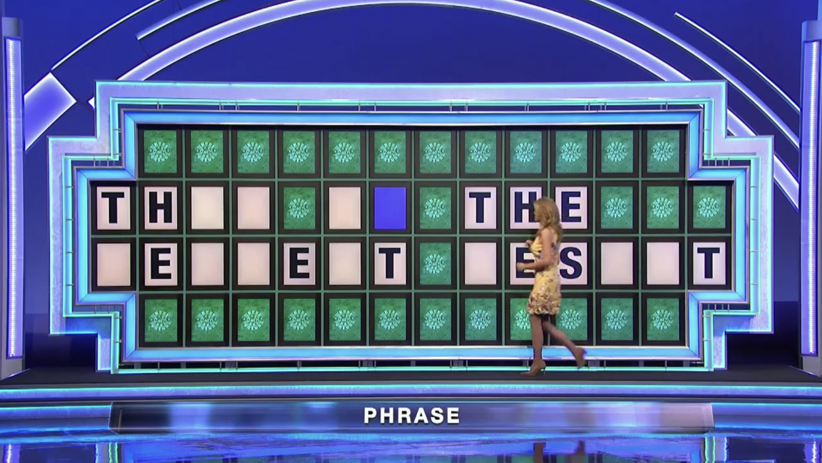
Additional ring elements with lighting effects surround the design and similar ones have been added above the puzzle board as well.
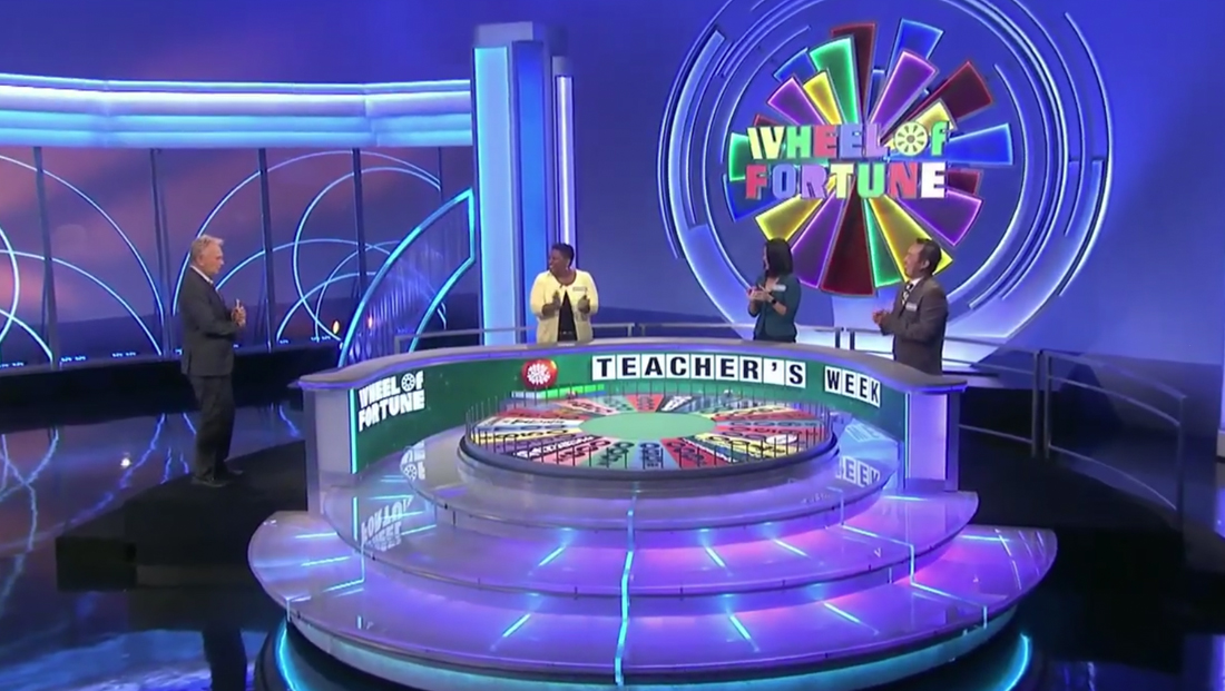
The new background provides a colorful look behind the contestants, but the “yellow player,” or center position, typically gets the most colorful (and busiest) background.
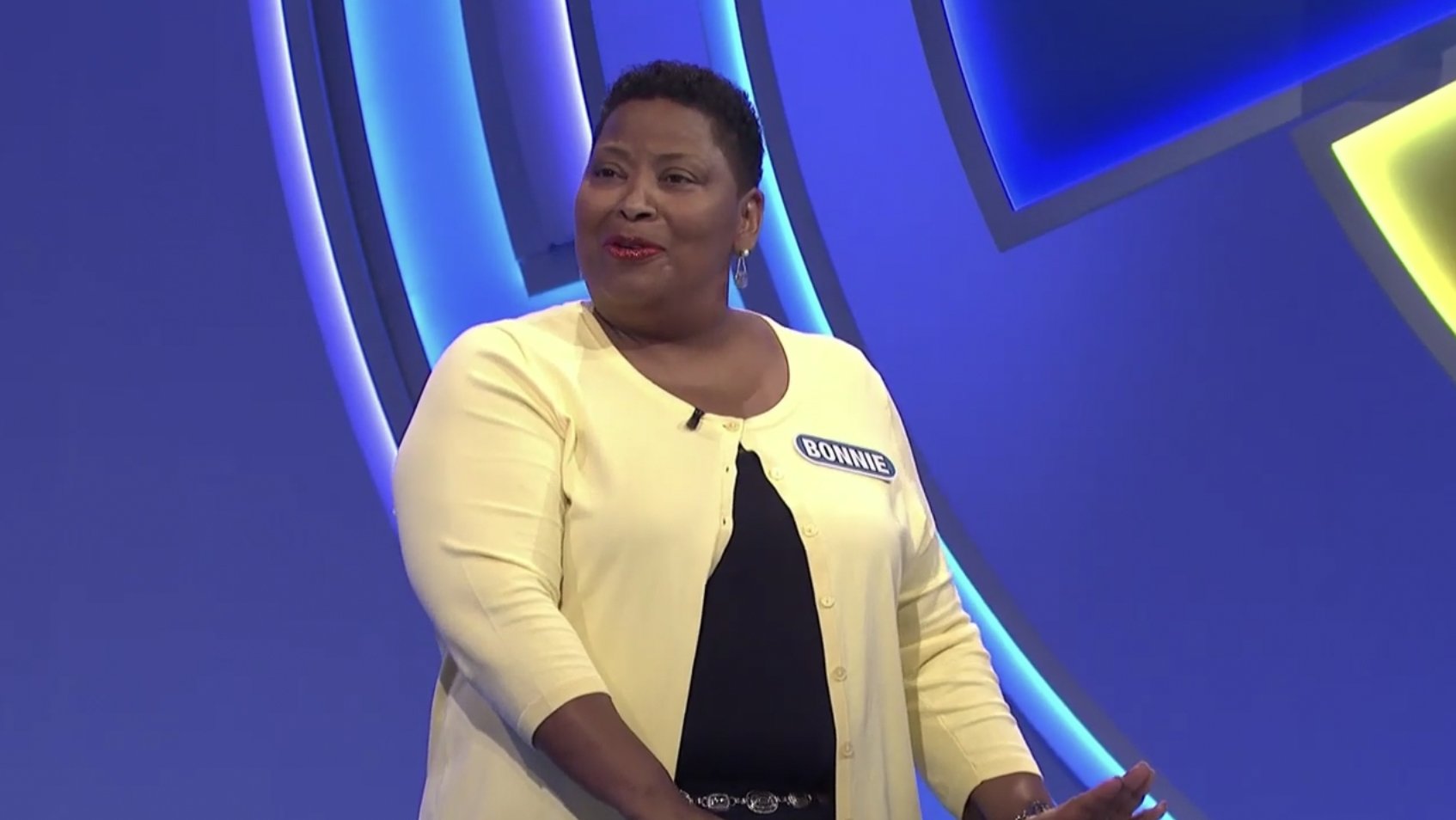
Contestants to the left and right are placed more in front of the curved ring around the main portion, typically with just a small portion of a color wedge visible.
This issue could be at least partially due to the wider spacing being used to enforce social distancing protocols.
Previously, the show had a large video wall installed behind the contestants area and used that to display any number of themed or branded graphics, which were often scenic video loops related to the show’s theme.
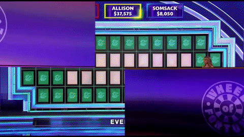
The rest of the studio, at least for the premiere week — which also happened to be “Teacher’s Week” — is filled with a mix of hard scenic elements that have been used for at least several years, some with minor modifications.
The show also received an updated open featuring curved arch elements that rotate along with “blocks” that rise and fall.

Meanwhile, the segments created by these elements are filled with imagery from the show, including historical shots. Also included are a variety of show logos and dollar figures.
The view then changes to the show logo floating in the middle of a curved “walls” before the viewport zooms through the lettering to a wide view of the studio, with announcer Jim Thornton standing in the audience risers behind a lectern.
The show appears to taping without an audience (or at least a full one), a change initiated in 2020 due the coronavirus pandemic.
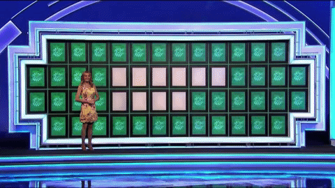
The in-show graphics have also been updated, including a new category “lower third” that features a subtly 3D blue-violet “bar.”
A similar look issued for stingers such as the “final spin” used near the end of the show.
The show retained the same toss up animated wipe from Season 38.
A similar version of the wheel appears as the reveal animation for the contestant’s image during the bonus round.
The show also received updated musical cuts used throughout the show and credits, switching back Merv Griffin’s “Changing Keys” (in a new orchestration) that was used from 1983 to 1999.
The theme still contains some notes similar to the previous “Wheel of Fortune” signature, but now has a slight upbeat in the middle. It also lost its “jazzier” elements.
Season 39 long credits with music
Season 38 long credits with music
Additional music changes include updated beds that are sort of the “Wheel of Fortune” version of the “Jeopardy!” “think music” that plays during bonus and toss up rounds.

Season 39 bonus round music
Season 38 bonus round music
Season 39 toss up music
Season 38 toss up music
There’s also a slight update to the music played when a puzzle is solved — it’s a bit more dramatic than last season.
One sound element that hasn’t change is the recording of a crowd yelling “Wheel … of … fortune” at the top of the show, giving the appearance that fans, not the announcer, actually say the name of the show.
The show also didn’t change the familiar ‘chime” that plays as letters are revealed on the puzzle board.
This new Wheel of Fortune set/music pic.twitter.com/pVsR7KPqjT
— Daynah Singh (@Daynah_Singh) September 13, 2021
Meanwhile, many fans aren’t thrilled with the changes — with some taking to social media to complain about the music and “dizzying” look of the set. One fan said the new show is “super game show-y” — an interesting comment considering it is a game show, after all.
Wow I hate the changes Wheel of Fortune made this season. The set and music are awful. Super game-showy.
I have very strong feelings about this.
— Mandy (@Mandnificent) September 13, 2021

tags
Game Shows, Sony Pictures Television, Wheel of Fortune
categories
Broadcast Design, Featured, Game Show Set Design