‘Noticias Telemundo’ gets bolder look along with new anchor
Subscribe to NCS for the latest news, project case studies and product announcements in broadcast technology, creative design and engineering delivered to your inbox.
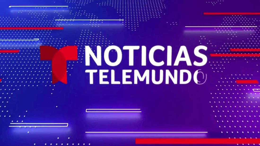
As part of an anchor shakeup that included Julio Vaqueiro taking over the network’s signature evening newscast from José Díaz-Balart, “Noticias Telemundo” unveiled updated graphics Monday, Sept. 27, 2021, that include brighter colors and a swap of bars to dots.
While much of the broadcast’s general look remains the same, including lower third insert graphics and banners, many of the fullscreen graphics have been updated with a bolder palette and other slight adjustments.
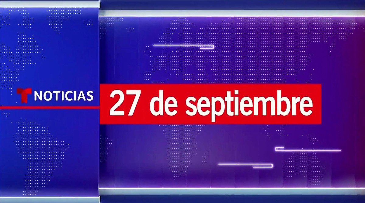
Instead of the glassy, light blue, off white and red, fullscreens now use a bright blue, white and red, especially in the tease headlines, wipes, open and bumps.
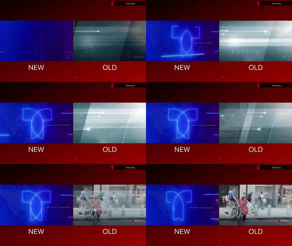
The open itself retains the same viewports and animation, with just the colors changed out. The logo shown at the end has been adjusted slightly smaller.
That said, the old open’s shiny blue-gray background is now accented with a dotted pattern and many of the 3D lines that race around the screen to form the outline of the logo are brighter and appear to give off more a “glow” inside the space.
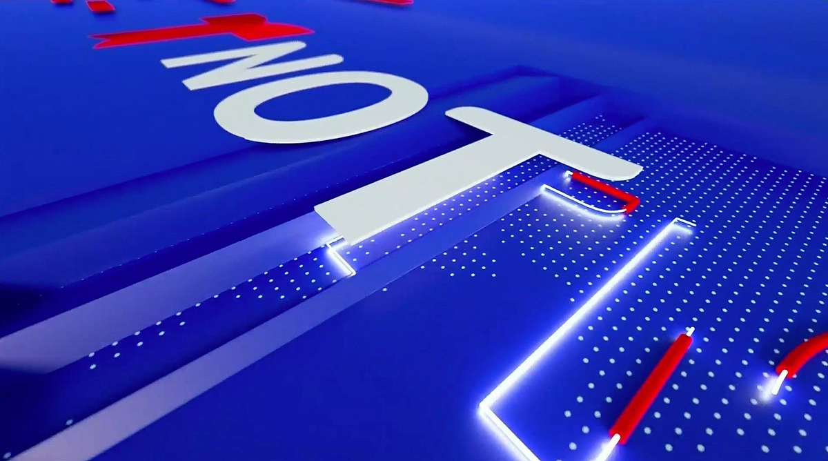

The rectangular bar motif has been toned down slightly, especially as segments “roll” by the viewport and others reveal the logo in the final scene.
Instead, the logo “traces” itself in before settling in amid a background of blue, a dotted world map look and a mix of sold and outlined lines and line segments.
Previously, the world map appeared frequently as well, but was created using horizontal bars.
The program also switched to a more subtle “reveal” effect for the top story tease, with tighter framing on the anchor and, while the bars remain around the “cutout,” they are less 3D and more transparent and outline based.
Another key change was a more branded animated wipe used during “coming up” teases — the previous look featured a blue-gray animation that matched the open but no obvious network references, where the new look has a “neon” version of the “T” icon on screen.

Throughout the show, the broadcast continues to use large, dramatic photography behind the anchor desk on its curved video wall.
Subscribe to NCS for the latest news, project case studies and product announcements in broadcast technology, creative design and engineering delivered to your inbox.


tags
Noticias Telemundo
categories
Branding, Broadcast Design, Broadcast Industry News, Graphics, Heroes, Network Newscast