Subscribe to NCS for the latest news, project case studies and product announcements in broadcast technology, creative design and engineering delivered to your inbox.
The Harry Potter franchise has become such a worldwide phenomenon that it’s been depicted visually in everything from movies and books to amusement park rides and theatre sets. With this in mind, production designer John Janavs and his team were tasked with the challenge of creating something new — a quiz show set that remained true to the films’ aesthetic and attention to detail the brand is known for.
“Harry Potter: Hogwarts Tournament of Houses” on TBS draws on “super fan” contestants to answer some often amazingly obscure questions about the world that the world’s most famous wizard occupies.
Janavs was already familiar with the films and books thanks to his kids, and set decorator Heidi Miller and art director Robert Frye are “serious” fans of Harry Potter, so the project gave them all a chance to push their imagination in ways that both complemented and stretched the looks those who had created before them had done.
“It was easy to appreciate the level of detail that not only J.K. Rowling gave the series, but also the work that the film production designers had done. They are really high quality, beautifully detailed, and immersive environments,” said Janavs.
To get started, the team took a look back at a bookstore in Portugal, Livraria Lello & Irmão, that reportedly inspired Rowling’s writing.
“Hogwarts Tournament of Houses” isn’t meant to be set within the Harry Potter universe, notes Janavs, but rather out in the “muggle” world.
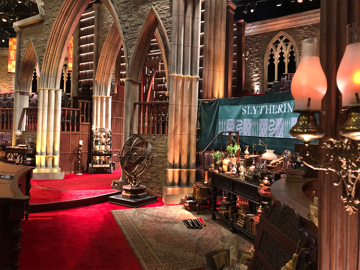
As such, its architecture and layout are inspired by numerous aspects of visuals used or described across the franchise, which were created in cooperation with Rowling and her team.
At the heart of the set the team built on Stage 1 at RED Studios Hollywood is a forced perspective passageway crowned with gothic arches and backed with a window and “magical” floating candles inspired by the ones that light the Great Hall at Hogwarts school.
Unlike the film, CG wasn’t an option so the candles are battery-powered units suspended using monofilament, a common “trick” used by production designers to make things seem to the floating in mid-air.
The challenge, according to Janavs, was tweaking the installation and studio lighting to keep them invisible in this shot behind Dame Helen Mirren, the show’s host.
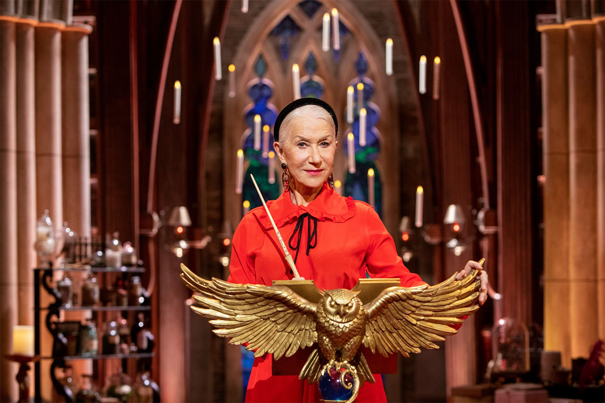
Dame Helen Mirren on the set of ‘Harry Potter: Tournament of Houses’ with the floating candles and archways behind her.
Not only does this provide Mirren with a way to enter the set atop bold red carpeting, but it also serves as her primary background, so special focus was given to making this as rich, layered and, as Janavs puts it, “lush,” as possible.
The archway also serves as a way to bisect the space and create a physical separation between the two audience areas.
Gameplay revolves heavily around the Hogwarts houses, a key element of the plot involves students at the school getting “sorted” by a magical hat into one of four groups who live together and form the basis of the social structure at the school.
Much weight is given to how the personality of each student may or may not determine what house assignment is handed down. Many Harry Potter fans classify themselves into one of the same four houses — Gryffindor, Hufflepuff, Ravenclaw and Slytherin — again, often based on their traits.
As the show’s name suggests, the show pits fans who identify as a potential member of one of those four houses against each other — two per show.
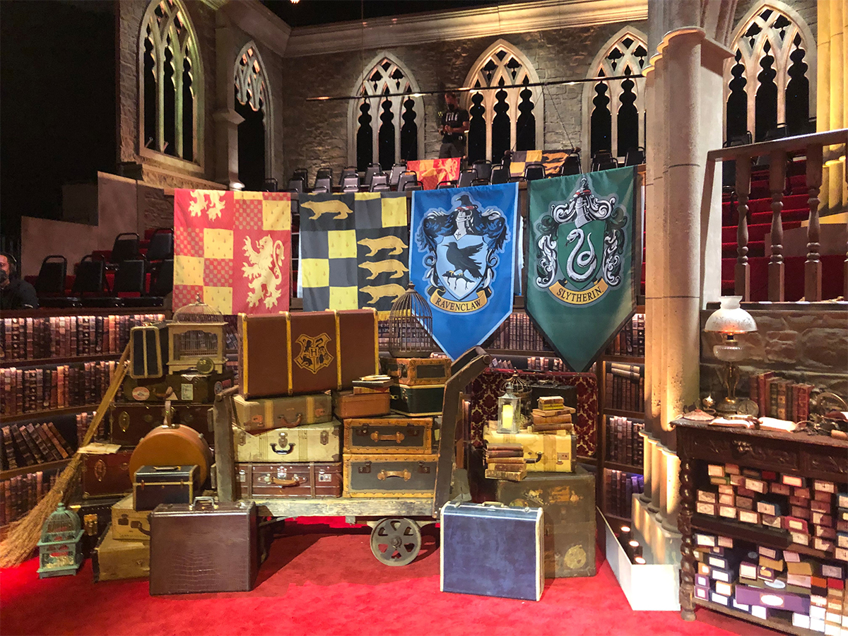
This photo, taken between filming, shows a lowered batten, top, that allowed the crew to change out the house flags between shows. Additional banners representing the Hogwarts houses are draped over the railing that separates the contestant lectern area from fans. Meanwhile, numerous decorative items ranging from luggage to wand boxes to brooms are shown as part of the elaborately detailed background behind contestants.
These houses sit in two separate seating areas, complete with house flags and, yes, coordinating house face masks, this being 2021, after all. Both sides of the audience area have arched stone “window” openings.
The players competing are situated in front of their respective house’s seating area, allowing the audience to cheer their house on. However, Janavs also felt it was important to not have the audience be in the background of every shot.
“That dictated that the audience start about feet above the lower deck and led to the curved line of the audience face that dips back to create depth behind the three contestants,” explained Janavs.
…hundreds of letters are forced out of it using a high velocity pressurized blower managed by Warner Brothers Special Effects
This allowed for the background immediately behind the contestants to be filled a plethora of decorative items inspired by the world of Harry Potter, many of them created by prop master Randy Taylor and arranged by the set dressing team led by Jim Labarge, adding depth and richness to contestant shots while also keeping the focus on them.
Meanwhile, the audience areas sit on a step riser setup that feels a bit like the Quidditch stands in the films — and their respective areas are decked out with their house colors and banners with the house name and symbols, which are changed out depending on which teams are playing.
Contestants are “invited” to play using another very Potter-esque approach — Mirren stands in front of an oversized fireplace and hundreds of letters are forced out of it using a high velocity pressurized blower managed by Warner Brothers Special Effects.
The idea of a flurry of letters as an “invitation” is taken directly from the first Harry Potter book and film, when, unable to contact Harry via the post, Hogwarts uses some magic to send hundreds of letters through the fireplace in his home.
Mirren picks envelopes and reads off names — and those audience members are invited to play. The show’s producers have pre-screened a selection of fans in groups of three to play, but Mirren and the fans don’t know for sure if they will be chosen until their name is called.
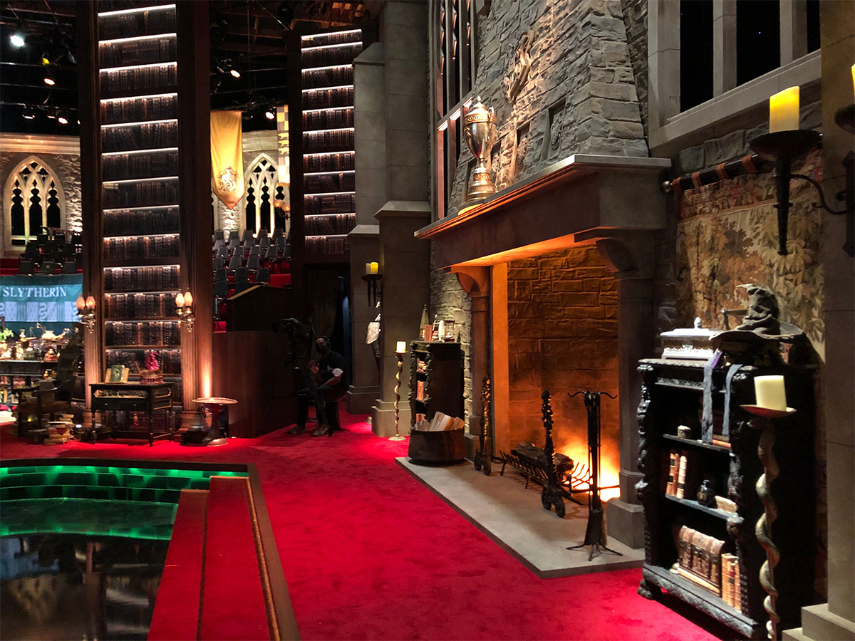
The oversized fireplace, right, uses a ‘cold fire’ effect allowing it to also serve as an entryway for contestants, when it is bathed in a green light, as shown in the separate image below.
The contestants then change into matching outfits during a pause in taping and enter the lower part of the set via the fireplace as well, an entrance that’s reminiscent of the “floo network” in the series that allows characters to transport themselves via fireplaces.
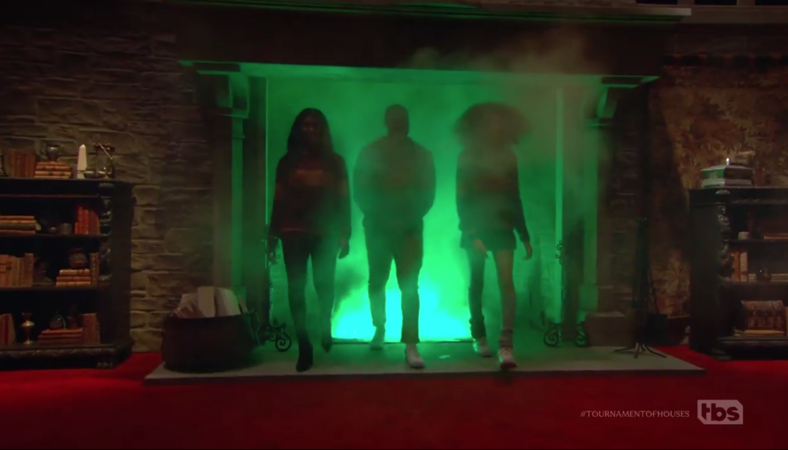
This entryway posed a bit of challenge, however: Mere muggles can’t walk through a hot fire without getting seriously injured, obviously.
“We couldn’t find anyone that felt they could do it and our producers were ready to give up on the idea. It felt so critical to find a solution that I did a quick demo in my office of a cold fire idea with smoke machines and then convinced my regular pyro specialist, Giuliano Fiumani to develop a cold fire that we could change color of with embedded LED lights,” explained Janavs.
This dramatic entrance has the contestants entering the main part of the set directly beneath the prize cup, a custom, three-foot trophy created by Greg Aronowitz.
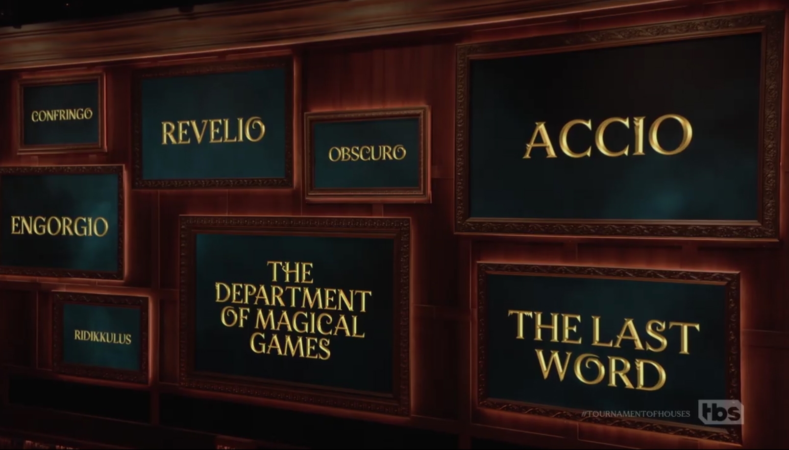
Much of the gameplay takes place using the “portrait gallery” (that’s pronounced “poor-trate,” for you non-British muggles) created using eight 16:9 LED panels that are, quite literally, framed to look like paintings.
Using video panels here was a natural choice to not only display imagery, categories and elements used for gameplay, but also another reference to the world of wizards where the subjects of paintings can move, talk and even “leave” their frames.
Created using four different screen sizes, there’s still a dominant one near the center of the wall, with the rest arranged in a purposefully haphazard way to fill out the space.
The screens were provided by NEP’s Sweetwater with a 1.8 mm pixel pitch.
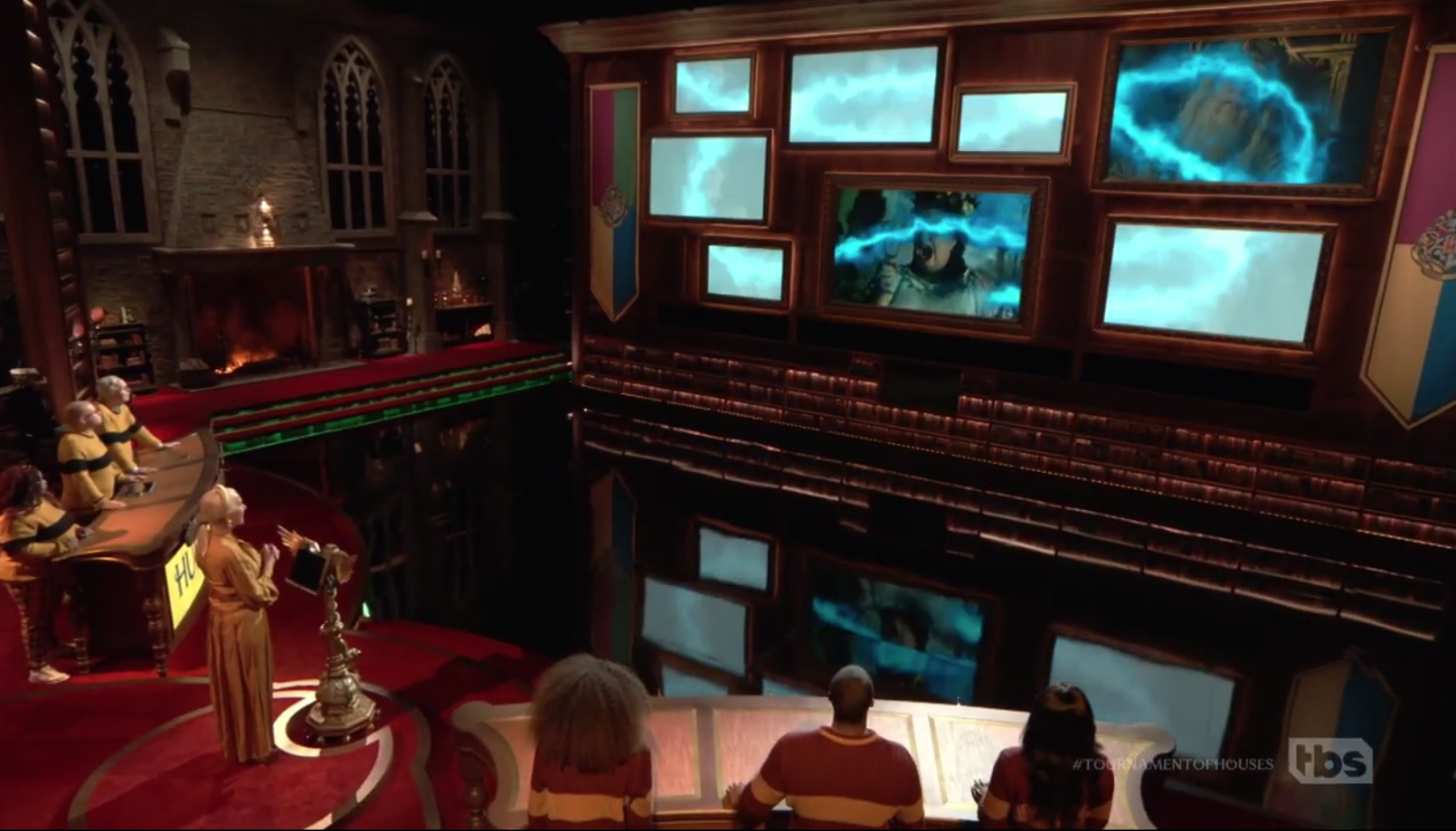
Behind the frames is a border of hidden LED, which can be triggered along with an animated effect of blue lightning flashing across the screens, to create the effect that the bolt exists somewhere between the “virtual” world the screens lead to and the real world of the set. The LED can also be used to create subtly, pulsing glows behind one or more of the frames.
Most of the graphics displayed on set uses a bespoke font inspired by the “Fantastic Beasts” sub-franchise, though it’s worth noting that alternative glyphs, such as the “O” that curls at the end of its round instead of complete the oval isn’t used consistently.
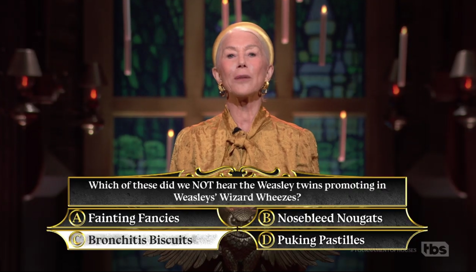
Insert graphics and on-screen questions are set in Bluu Next, a font that has some similarities to the bespoke one, while the logotype of “Harry Potter” featuring a lightning bolt at the end of the “P” used in the U.S. books and films is used in the opening title. Lumos, a font commonly associated with the franchise and used as a display font in the U.S. book editions, is not used.
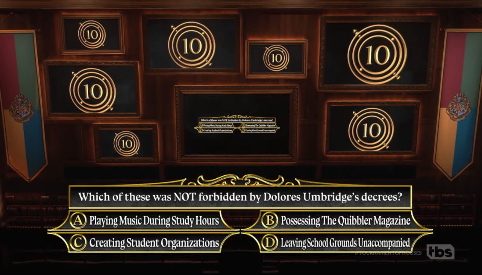
In this image, seven of the eight portrait wall screens show a countdown timer, set inside of a series of rings that appear to be inspired by the ‘Time-Turner’ device from the series, an appropriate tie-in.
On set and insert graphics are typically accented with gold borders and flourishes, a common element in Potter universe looks.
Directly across from the fireplace wall is the “fourth wall” of the space, which is mostly open to allow crew and equipment such as a jib, technocrane and pedestal mounted cameras to capture the action.
Game shows have very tight camera lines with very limited flexibility for camera positioning to be able to get good shots of all the different cast members at the same time.
The show also has the option to use an ever changing selection of foreground vignettes set up in front of the fourth wall to showcase a variety of Harry Potter-inspired props (mixed in with some used in the films) going to and from breaks.
“Game shows have very tight camera lines with very limited flexibility for camera positioning to be able to get good shots of all the different cast members at the same time. Unlike a movie, where you can shoot the perfect shot of each actor one at a time if need be, we have to shoot everything at once, simultaneously, so we design for the shots with the first line on paper,” said Janavs.
There’s also a camera port running along the bottom of the portrait wall that provides eye-level, straight-on shots of the contestants and Mirren.
Handheld cameras could also be used to capture sweeping shots of the set using carefully plotted pathways that kept them from showing up on air.
The nature of game show production — along with the unique nature of the set — required some artful lighting design from Simon Miles, who was tasked with bringing out the richness of the gothic scenic elements and decorative items using lighting effects.
Miles opted to accent many of the faux stone walls with warmer shades and textural accents. The portrait gallery wall, meanwhile, had to be carefully lit to both keep the imagery fed to it rich and vibrant and also to allow the camera port to “sink” into the background.
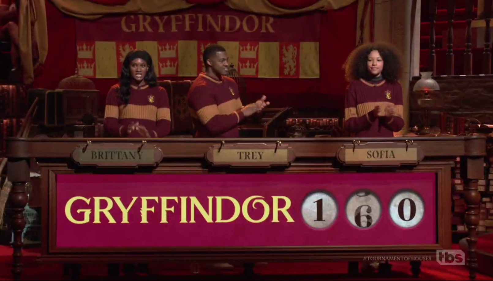
Each of the teams’ three contestants stands behind a wide, low counter that is fronted with a ribbon of seamless LED built into a highly detailed wood-toned frame evocative of a desk.
Unlike other game shows and set design in general, Janavs’ strategy was to use more hard scenic than video panels, except where needed for practical, gameplay-related reasons, hence the portrait gallery and contestant lecterns.
For the contestants, the LED in front is used primarily for labeling which team is which through the use of house colors and for scorekeeping.
As each team’s how name appears on screen, an animation creates the appearance of colored marbles “filling” the white background, eventually turning the entire panel the house color; the effect looks a bit like sand pouring from an hourglass. This element is inspired by the magical marble chutes that were used to track behavior and good deeds at the school.
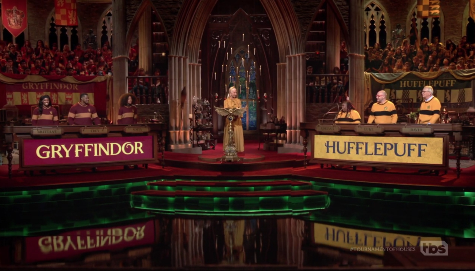
Contestant names were, notably, not displayed on the LED, much like many game shows today do. Instead, they received good old fashioned plaques that could be swapped from their spots just above the LED ribbon. This, along with the change out of house themed decor, occurred during breaks in taping.
During gameplay, the team name gets smaller to make way for two (or three, in some cases, if point totals go over 99) circles, that show the current scores. When a team earns points, the number changes as though it’s a physical manifestation of a mechanical instrument.
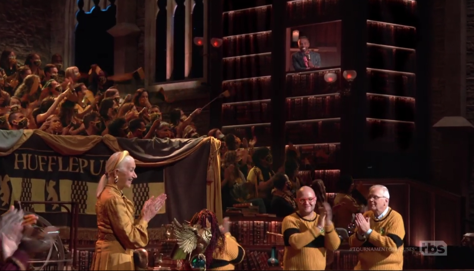
Mirren, lower left, consults with Luke Youngblood, upper right, the show’s official scorekeeper, from behind his ‘hidden’ station built into the tall walls of bookshelves. Two contestants, lower right, are also pictured.
Just in case those pesky muggle video contraptions mess up the scoring, the show brought on actor Luke Youngblood, who played Lee Jordan in the film series, as “scorekeeper,” an appropriate role given that he was the Hogwarts Quidditch commentator and later went on to host a radio show for wizards.
Youngblood was a late addition to the show, which also features taped cameo appearances from some of the more minor Harry Potter actors. This forced Janavs to find a place for him to sit fast.
Centerline Scenery, who fabricated the entire set, rose to the occasion to make some quick modifications.
He ultimately ended up being positioned high above the camera right audience area behind one of the multistory bookshelves with dramatic downlighting that also filled in the wraparound scenic.
Youngblood would open a sliding panel when Mirren consulted with him on the score. He spoke using an old fashioned radio mic and had some books and other props behind him in his perch.
This position also allowed great sightlines between him and Mirren, as well as an ideal position to capture interaction shots between the two.
Back down on the floor, the contestants and Mirren stand in a riser with green lighting integrated under the lip, a look inspired by the sets for the Ministry of Magic in the films.
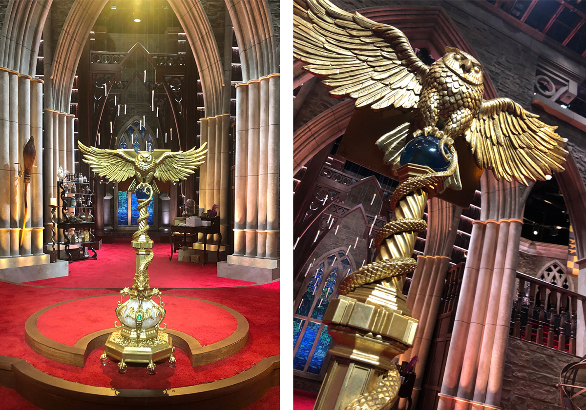
Mirren herself stands behind a recreation of Prof. Dumbledore’s owl lectern, also a custom creation from Aronowitz.
The floor between the contestants and portrait gallery is black and glossy and can also be used for displaying objects for contestants to examine, such a selection of full-size sofas on the first episode.
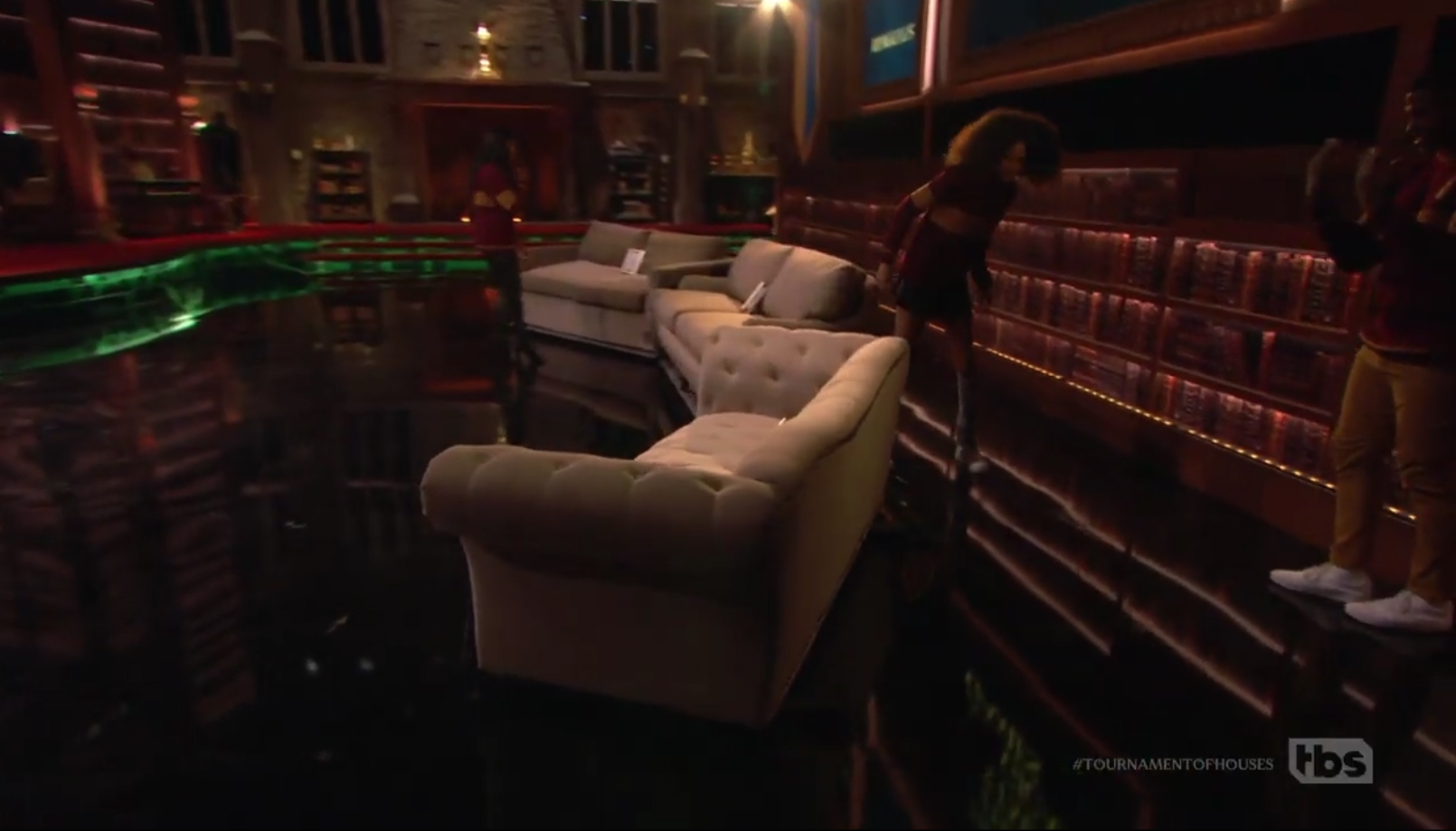
Contestants walk around three sofas, one of which was used in a scene in one of the Harry Potter films. The set’s camera port is visible on the right just above the bookshelves as a black horizontal band. This was used to capture head-on shots of contestants and the host.
This was done in conjunction with a question that asked contestants to pick out which one of the items appeared in the film for a short scene that lasted for only a few seconds.
Questions of that level of detail not only challenged the contestants and viewers but also speak, again, to the level of complexity and nuances that fill a fantasy universe such as Harry Potter’s.
“Everyone working on it was a real Potter fan and understood that this little TV show needed to measure up to the level of the films and that it was really a unique opportunity to be able to do this,” said Janavs.
Photos courtesy John Janavs.
Subscribe to NCS for the latest news, project case studies and product announcements in broadcast technology, creative design and engineering delivered to your inbox.


