St. Louis station completes the ‘arch’ in 75th anniversary logo design

Subscribe to NCS for the latest news, project case studies and product announcements in broadcast technology, creative design and engineering delivered to your inbox.
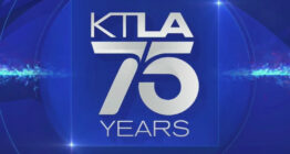
St. Louis’ NBC affiliate KSDK is marking its 75th anniversary with a special logo that’s similar to how KTLA in Los Angeles reimagined its channel number as part of its big milestone year.
Like KTLA, KSDK used its normal “5” glyph as the back half of “75.” KSDK will turn 75 Feb. 8, 2022.


The logo KSDK used from 1993 to 2017.
The KSDK “5” was last overhauled in 2017, when it dropped its rather generic “5” accented with a gray box and arch element, a reference to the famous St. Louis Gateway Arch, in favor of a more stylized number.
The new number “5” appears to have been hand drawn or modified with a slightly exaggerated round portion that also allowed for a “sliver” of a suggestion of the arch to be added in the negative space.
Similar to what KTLA did, KSDK didn’t just tack on a “7” and call it a day — instead, a “7” that appears to have been modified to continue the illusion of the arch was added in outline form.
If you look carefully, the upper right part of the curve on the right side of the “7” links up almost perfectly with “notch” in the “5.”
The curve of the “leg” of the “7” continues to the baseline along a similar path — and, when viewed as a whole, the entire outlined curved element could also be taken as the left side of the arch as it slopes toward the ground.
Taking advantage of its “On Your Side” tagline, the anniversary logo also features the slight variation of “Years On Your Side” so the entire logo design reads as “75 Years On Your Side.”
KSDK is also featuring a collection of videos from its archives marking the station’s and city’s history as well as a promo, which also uses the tagline “Focused on you.”
WNBC, which was then known as WNBT, is considered the first commercial television station licensed in the U.S. (there were experimental stations well before that 1941 date, however, though most stations use their original license date as their “birthday” even if, like WNBC, it was under a different call sign or even channel number).
However, like with most technologies, it took a while for television to become popular, but we’re hitting the time when many TV stations are going to start hitting 70 or 75 years on air, depending on when they were founded, so it wouldn’t be surprising to see more of these types of logos pop up, especially with stations that have the channel number “7” or “5” where a number can either be added before or after the channel number to read as “75.”
Likewise, younger stations with “6” as a channel number could do something similar when they hit 60 or 65 years old. “7” channels could also create “70” logos in a similar fashion. The possibilities are endless as the years march on and the station’s channel number happens to be contained in whatever birthday it’s celebrating.
Many TV stations mark significant anniversaries on air even if the numbers don’t “work out” to let them create a logo like this.
One common method is to add a ribbon, circle, badge or other appropriate accent or other accent to the logo with “(number) years” or similar designator. This element can use the station’s existing logo as inspiration in terms of color and styling, or it could opt to use metallic shades to add a sense of elegance or a purposefully contrasting look to make it stand out.
Thanks Joshua in the Broadcasting Logo Memorabilia Facebook group for the tip.
Subscribe to NCS for the latest news, project case studies and product announcements in broadcast technology, creative design and engineering delivered to your inbox.


tags
Anniversary Logos, ksdk, logo design, St. Louis
categories
Broadcast Design, Broadcast Industry News, Featured, Local News