
Pa. station starts switching to new ABC globe
Weekly insights on the technology, production and business decisions shaping media and broadcast. Free to access. Independent coverage. Unsubscribe anytime.
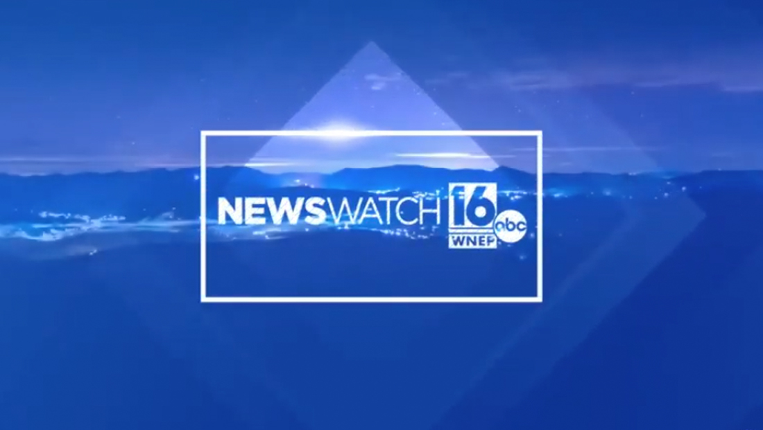
WNEP, the ABC affiliate in Scranton/Wilkes-Barre, Pennsylvania, has started to updated its logo to incorporate the new ABC globe.
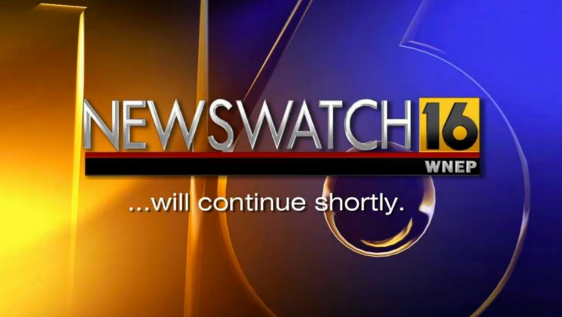
For years, the station has used a yellow, red and black logo design with a distinctive “16” at the top, a red bar and black box below for the call letters in white text.
The logo was frequently moved to the right with the black and red lines extended to the left and additional branding added to the left, such as this Newswatch 16 graphic. Other variations included Stormtracker 16 for its weather, Healthwatch 16, Action 16 investigative and consumer franchise and Skycam 16, its former helicopter.
After Tegna took over, it was one of the few stations acquired in that deal not to get a complete logo redesign, though the extended bar look was mostly eliminated and the typography of “Newswatch” was updated to match the group graphics package.
There was also a period, during the time the station was owned by Dreamcatcher Broadcasting, it used the Tribune group graphics package (Dreamcatcher was owned by a former Tribune exec and frequently followed Tribune station standards) and awkwardly modified the normally rectangular yellow square to be a square to fit better as the bug.
The Newswatch 16 logo in 2020 when the stations witched over to the Tegna graphics package. In some variations, including the bug, ‘News’ and ‘watch’ are broken into two lines and stacked.
The station, which is now owned by Tegna, has a reputation as being one of the top performing ABC affiliates in the country, having once had the highest rated local newscast in the country.
For many years, the station didn’t include the ABC logo in its news graphics or primary station logo, instead using just number and call sign box or tagline “The News Station” set in a geometric gothic font.

However, it would eventually add the “old” ABC logo to the design, tucked just to the right of the red line.
One of the disadvantages of the switch was that elements such as mic flags and icons became a bit unwieldy in some applications.
For example, the yellow, red and black box had the advantage to be a bold, eye catching mic flag on its own — whereas the full logo with ABC globe doesn’t fit as well unless the station opts for custom cut ones similar to the ones many ABC owned stations use, but these are typically much more expensive.
Social media icons are also now a bit awkward — because the logo becomes a bit unbalanced and even the latest designs don’t quite take into account the circular cropping Facebook adds in some versions.
It previously used the “glassy” version of the ABC globe and, as of Feb. 16, 2022, has started updating social media profiles with the refined ABC logo. As of the morning of Feb. 16, however, on air graphics do not appear to have made the switch.
When ABC announced a plan to switch to a refined globe, or “dot” as some refer to it, in May 2021, it was clear the transition would be a long one, especially in getting its affiliates to make the change.
Even some of its owned stations, such as WLS in Chicago, don’t use the new logo in many of its graphics yet.
Stations that include the ABC logo in their logos are being encouraged to change to the new globe, but that triggers the need to upgrade on air graphics (which is often relatively easy) but also station mic flags, livery and signage, which are more costly.
The new lockup at WNEP does appear to meet ABC recommended scaling of making the ABC globe at least 60% of the height of non-circular co-logo applications (it goes up to 70% if the globe is used next to a circular station logo).

tags
logo design, scranton, wilkes-barre, wnep
categories
Branding, Broadcast Industry News