ABC updating its globe logo with refined typography
Subscribe to NCS for the latest news, project case studies and product announcements in broadcast technology, creative design and engineering delivered to your inbox.
First on NewscastStudio: U.S. network ABC is ready to roll out an updated logo this fall — though it’s definitely not starting from scratch.
According to new style guidelines for what it’s calling a “brand evolution” provided to affiliates and obtained by NewscastStudio through a local station source, the network is getting an updated logo along with on-air branding package.
ABC has not returned repeated requests for comment.
The current logo dates back to a design by Paul Rand in 1962, though various modifications and embellishments have been made over the nearly 60 years it’s been in use.
The revised design is from agency Trollbäck+Company.

The ‘base’ of the ABC globe logo as it’s appeared, in slightly different forms, since 1962.
Now, starting in fall of 2021, the network will be rolling out an updated look.
The circular globe motif, also known as the “dot,” is remaining. The trademark curved, all lowercase letters are also staying put, albeit with some slight modifications.
Most notably, the ascender of the “b” is being shortened slightly and the tips of the “c” are being brought a bit closer together.
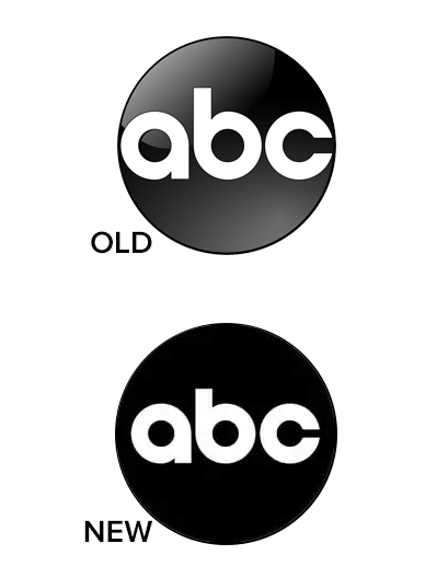

Meanwhile, both the “a”and “b” have near perfect circles in the middle, so the change to the “c” drives home that motif in all three characters.
There’s also been a slight tweak to the right downstroke of the “a,” with the notch formed by the joint between it and the neighboring circular stroke becoming less pronounced.
The size of the letters have been reduced slightly, giving them a bit more breathing room inside the globe.
The general footprint of each letter is now a circle, which will drive much of the animation in the new look.
According to the images obtained by NewscastStudio, the network also appears to be prepping to move away from its “Aperture” branding package, introduced in the fall of 2018.
The circle of the logo is still carried through via “punchouts” for local or thematic imagery as well as “windows” for episodic and key art.
Initial examples included in the branding guide also show diagonal gradient line backgrounds in grays and whites; however, these may not reflect the final usage this fall.
The guidelines obtained by NewscastStudio also show a switch to a lighter, condensed sans serif typeface along with a distinct, bold serif for titles that’s very much in line with the current typographic trend of using serifs with an attitude.


The samples in the materials do not include references to ABC Modern, the bespoke font that the network started using with Aperture’s debut and has also shown up in ABC News productions.
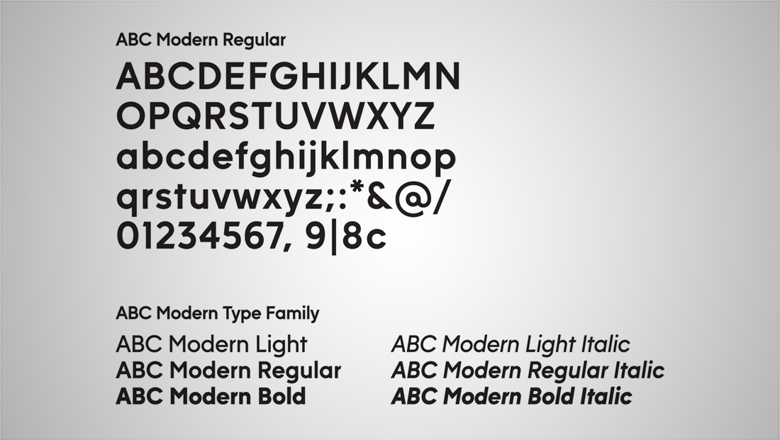

Instead, the font Heldane will be used as a serif mainly in display applications with GT America serving as a sans serif option.
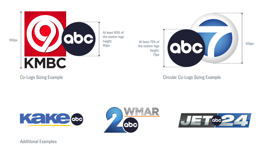
In addition to network level looks, local affiliates are also being asked to update what ABC calls “co-logos” with the new icon.
Most affiliated TV stations in the U.S. include, at least in some instances, their network logo somewhere in their own local lockup, which also often features a reference to the station’s channel number.
ABC is providing guidelines on how to proportion the new globe next to other logos: it should be at least 60% of the height of other elements in the logo design.
In the case of circular logos, such as the iconic “Circle 7” logo used by ABC owned stations in New York, Los Angeles, Chicago and San Francisco, that increases to 75%, presumably to prevent the two shapes from competing against each other visually.

It appears that ABC also also aiming to have any gradients, gel, glass, glow, bevel or similar effects removed from the globe.
The network logo is also not a “pure” black — the guidelines indicate a HEX of #202033, RGB of 32, 32, 51, CMYK of 100, 71, 0, 51 and Pantone 534U or 534C.
Although the logo isn’t a complete teardown, it is noteworthy in that ABC, unlike other U.S. networks Fox, CBS and NBC, doesn’t have a separate icon and logotype.
For example, the NBC peacock in its current form has been around since 1986, and the network has applied a variety of different effects and typography treatments for the letters “NBC.” But the icon itself has remained essentially the same.
CBS, meanwhile, has used the CBS eye since 1951, though its spacing and styling have also changed. It moved away from the sans serif Didot for both its corporate and news division logos in 2020. It now uses TT Norms.
The ABC logo is used to promote network entertainment and sports programming as well as part of the news division’s logo, which adds “News” in a sans serif.
All of these applications will likely be updated in network level graphics, though it may take more time for stations to get fully up to date, especially for livery and items such as mic flags that can be pricey to replace.
Other sources tell NewscastStudio new graphics package is in the works for some ABC owned stations in major markets, though there’s no immediate word on when that may debut.
Subscribe to NCS for the latest news, project case studies and product announcements in broadcast technology, creative design and engineering delivered to your inbox.





tags
ABC, Branding, logo design, Trollbäck+Company
categories
Branding, Broadcast Design, Broadcast Industry News, Featured, Graphics, Network Branding