
More on new ABC logo: Guide explains why it’s going flat with new brand evolution
Weekly insights on the technology, production and business decisions shaping media and broadcast. Free to access. Independent coverage. Unsubscribe anytime.
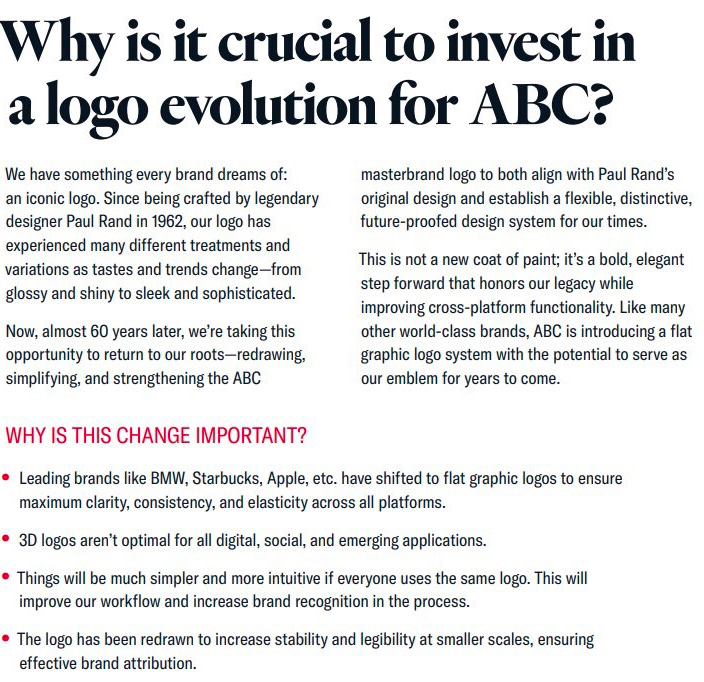
After NewscastStudio broke the story that ABC is redesigning its circular logo, a station source has provided an additional page from the “brand evolution” logo guide being circulated internally that sheds a bit more light on why the changes are being made.
On the page, which is headlined “Why is it crucial to invest in a logo evolution for ABC?,” the guide acknowledges how treatments of the logo have changed over the years as trends and tastes have changed, from “glossy and shiny to sleek and sophisticated.”
ABC, like most other major networks, has seen almost all of those applications to its look over the years.
The page goes on to say, flat out (pun intended), that the network is moving toward a flat look — a change it notes that other brands such as BMW, Starbucks and Apple have shifted to in recent years.
This appears to mean that gradient effect applied to the ABC globe logo is a no-no going forward.
Over the years, ABC has made the entire circle a glassy, obsidian like look and given it gold, blue and other color accents.
A portion of a page from the ABC brand evolution guide from a local station source.
The page goes on to note that 3D logos aren’t optimal for all “digital social and emerging applications” and that redrawn logo will increase “stability” and legibility at smaller scales, ensuring “effective brand attribution.”
The guide also notes the new logo is being referred to as a “masterbrand logo” and says the switch will make workflows simpler and more intuitive, seemingly to imply the look will also be applied across the ABC empire — including divisions such as sports, production, studios and more.

NewscastStudio has reached out to multiple ABC representatives for comment and has not received a reply.

tags
ABC, logo design, Trollbäck+Company
categories
Branding, Broadcast Design, Broadcast Industry News, Featured, Heroes