
Chris Wallace gets golden treatment for CNN+ show
Weekly insights on the technology, production and business decisions shaping media and broadcast. Free to access. Independent coverage. Unsubscribe anytime.
For former Fox host Chris Wallace’s new CNN+ show, the network created a look that sports a sort of retro vibe while also gathering guests around a desk inspired by the streamer’s name.
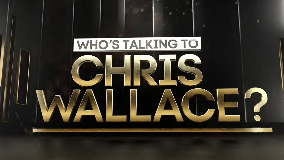
The show’s rather awkward name, “Who’s Talking to Chris Wallace?,” is a nod to its interview-driven format — though it’s pretty clear the show is essentially attempting to be a new version of “Larry King Live.”
The show is designed to feature both in-studio and remote interviews and is produced from Studio B in the network’s Washington, D.C., bureau, from the same area used by “The Source with Kasie Hunt” and “The Newscast with Wolf Blitzer.”
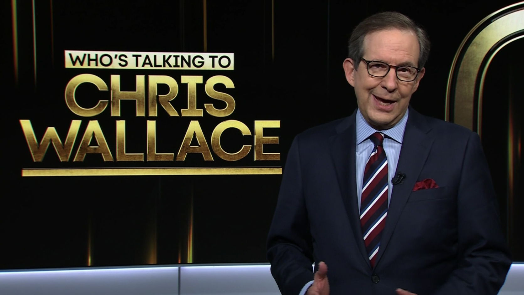
Like those two shows, the network has taken advantage of the upgraded video walls to create a unique look for “Who’s Talking” that brings golden textures and light bursts behind the host and guests.
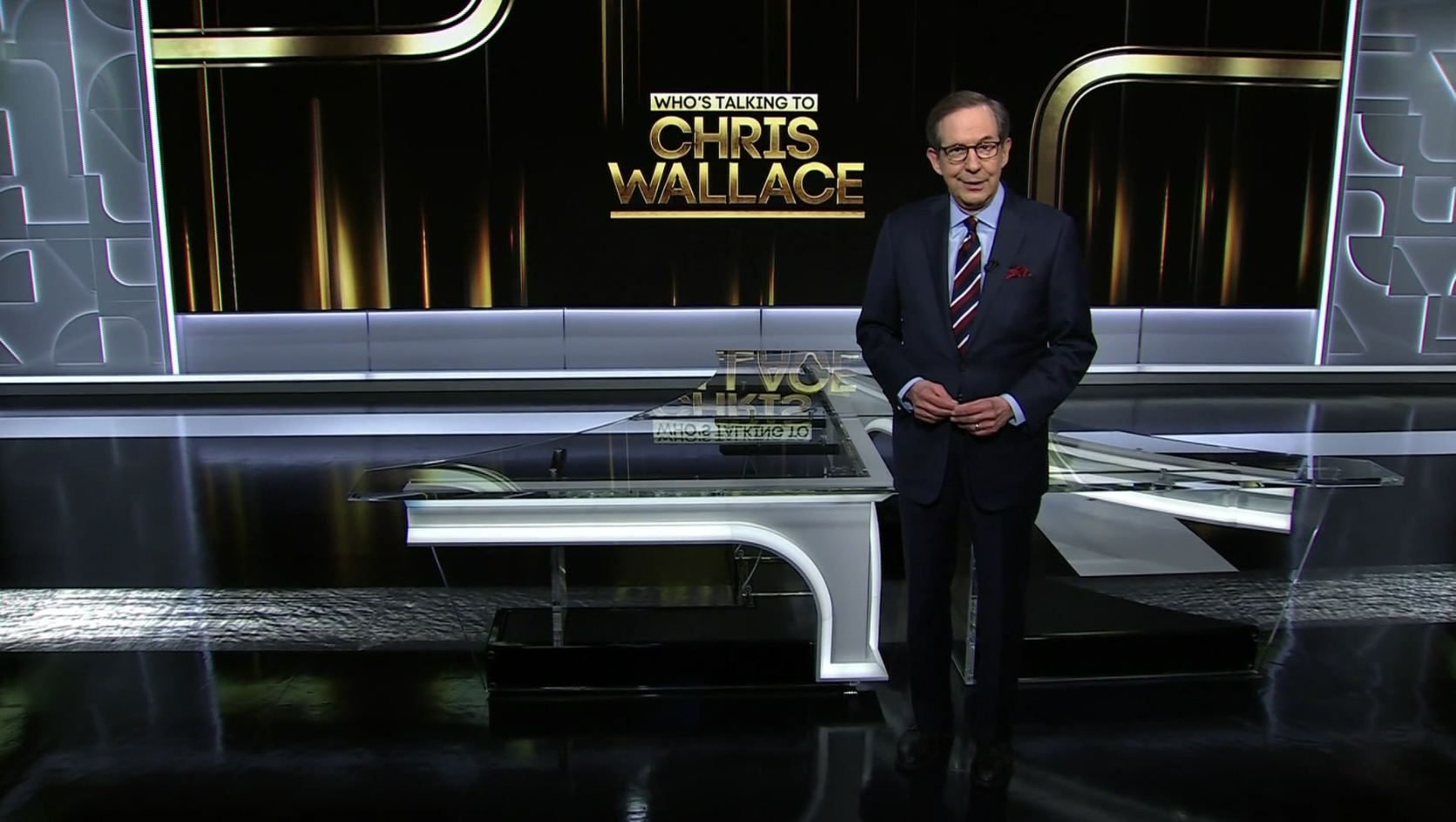
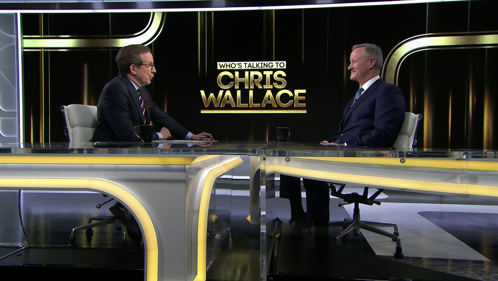
To open the show, Wallace appears on camera with the show logo over his right shoulder, standing in front of the uniquely shaped anchor desk that draws inspiration, like the side panels added to Studio B, from the network’s plus sign icon.
The desk is outfitted with color changing LED edges, allowing for it to be white in the cold open and then shift to yellow during the show itself — and also gives it the ability to be used on other CNN+ or even CNN programming if needed.

The show’s formal open combines a large version of the logo seemingly floating in a dark 3D space with white vertical laser lines and blocky rectangular gold elements suspended on either side. A similar look is used to showcase the name of the main guest on each edition of the show’s titles.
The logo uses a distinctive, geometric sans serif with a gold effect applied to it — and keeps “Chris Wallace” as the primary focal point with a thick rule under his last name. The “Who’s Talking to” part of the name is set in a significantly smaller type reversed out of a gold box above that, with a width that matches that of “Chris.”
In many ways, the combination of quirky font and heavy metallic effects gives the logo a different look and feel than many of today’s flat-style graphics.
The idea of multiple interwoven, curving lines in the CNN logo is carried through to “Who’s Talking” through the use of straight and bending gold elements with dual matching black borders that are used as both a transition wipe and background element.
![]()
In these elements, the gold effect is a bit more sophisticated — with less of a brushed look and more of a matte appearance.
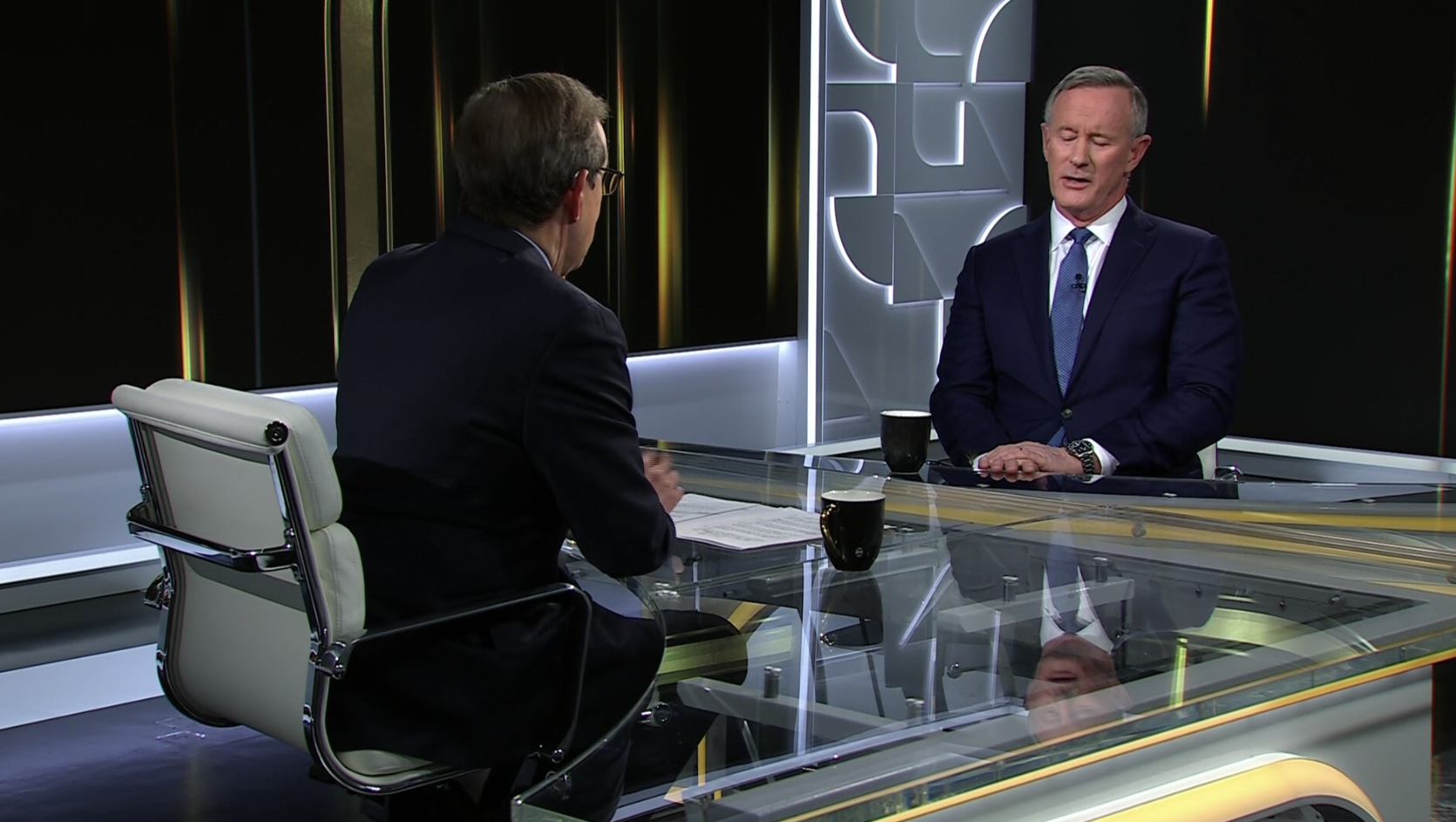
The desk is not a true, full plus sign but rather more like a “T” with exaggerated curved lines, but it also happens to form a shape that’s seemingly ideal for both in-studio and remote interviews.
Wallace sits on the camera left side of the desk while his guest can face him nearly straight on.
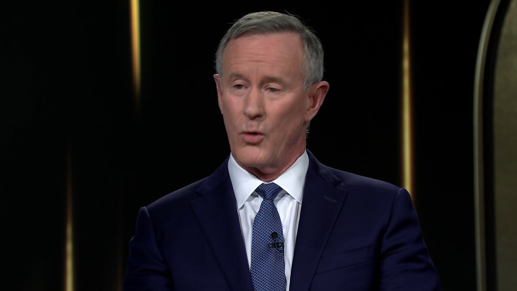
When one-shots of the guest are shown, they are primarily captured against the camera right video wall and a background that’s kept fairly simple — most of it is black with the exception of some strategically placed skinny gold bursts that come from both the top and bottom of the graphic.
Far camera right, meanwhile, is a subdued version of one of the thicker curved elements.
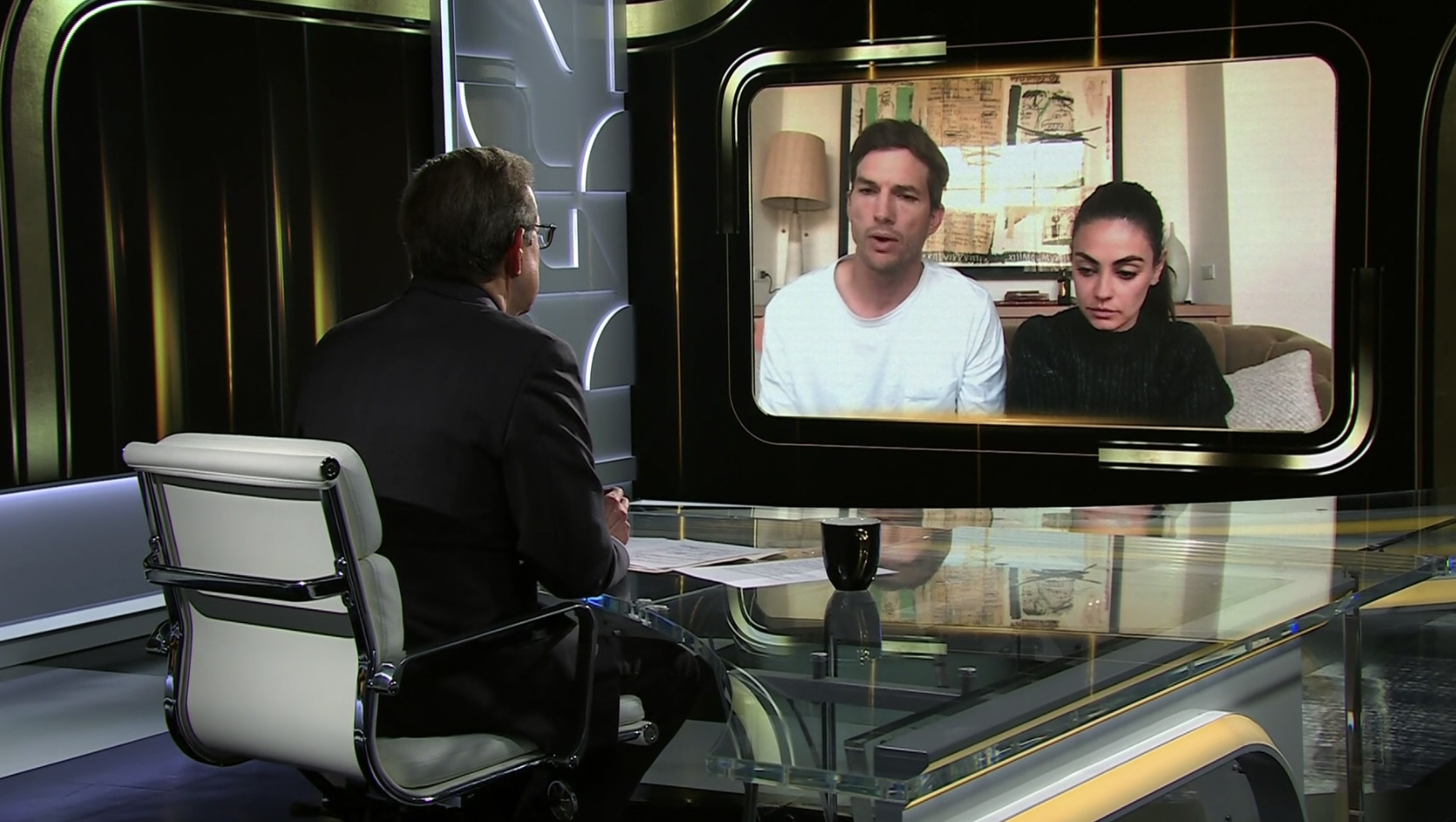
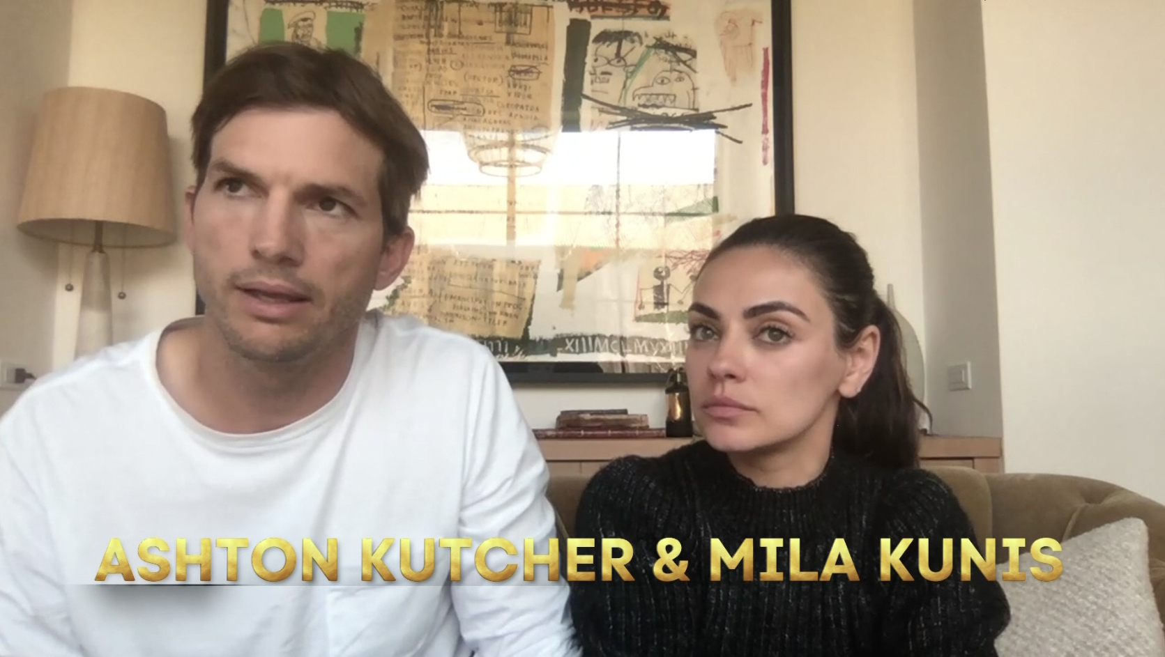
For remote guests, the chair is removed and, instead, Wallace faces the same camera right video wall with a rounded rectangle gold and black frame for the feed.
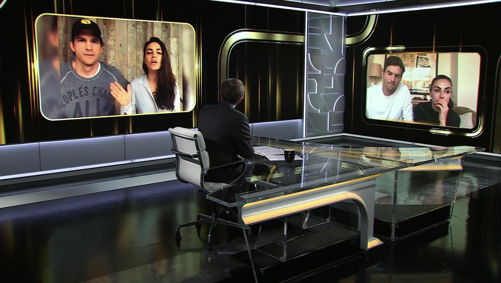
Remote interviews can be enhanced by showcasing additional imagery on the primary video wall that Wallace can look at when referring to, while also keeping the guest feed visible to capture reactions.
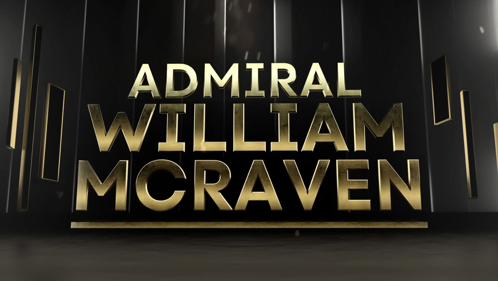
There are also fullscreen graphics to highlight key points, such as ones pulled from the career of Wallace’s first guest, Ret. Admiral William McRaven.
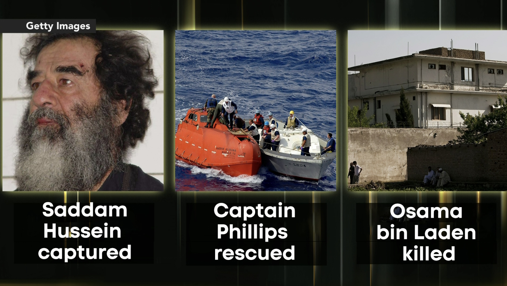
During that segment, the graphic was also displayed camera center between Wallace and McRaven, with Wallace referring to “seeing” that graphic up on the wall in the setup to a question.
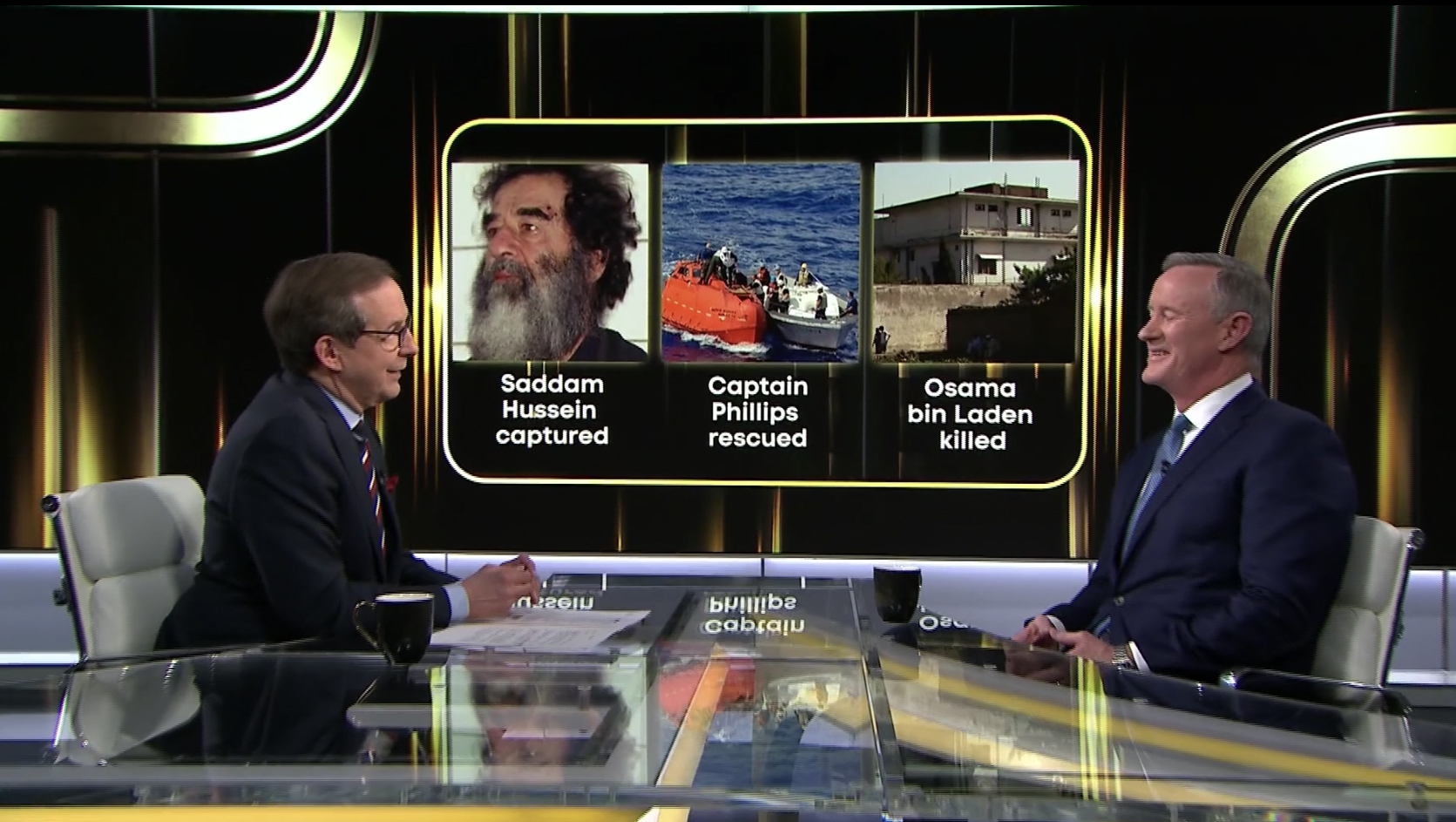
Wide two shots can also feature the show logo set between the host and guest.

The show sparingly uses lower third banners, typically only for identifying who’s appearing on screen.
These graphics take on the gold motif as well and eschew the normal boxed format of lower thirds in favor of simply typing out the letters across the screen, though there is a slight shadow effect in the lower left with a gradient background extending across the screen set in the same font as the show title.

tags
Chris Wallace, CNN, CNN Plus, CNN Studio B, interview set design, Who's Talking to Chris Wallace?
categories
Graphics, Heroes, Set Design, Talk Show Set Design