Warner Bros. Discovery is now officially a company: Here’s its logo

Weekly insights on the technology, production and business decisions shaping media and broadcast. Free to access. Independent coverage. Unsubscribe anytime.
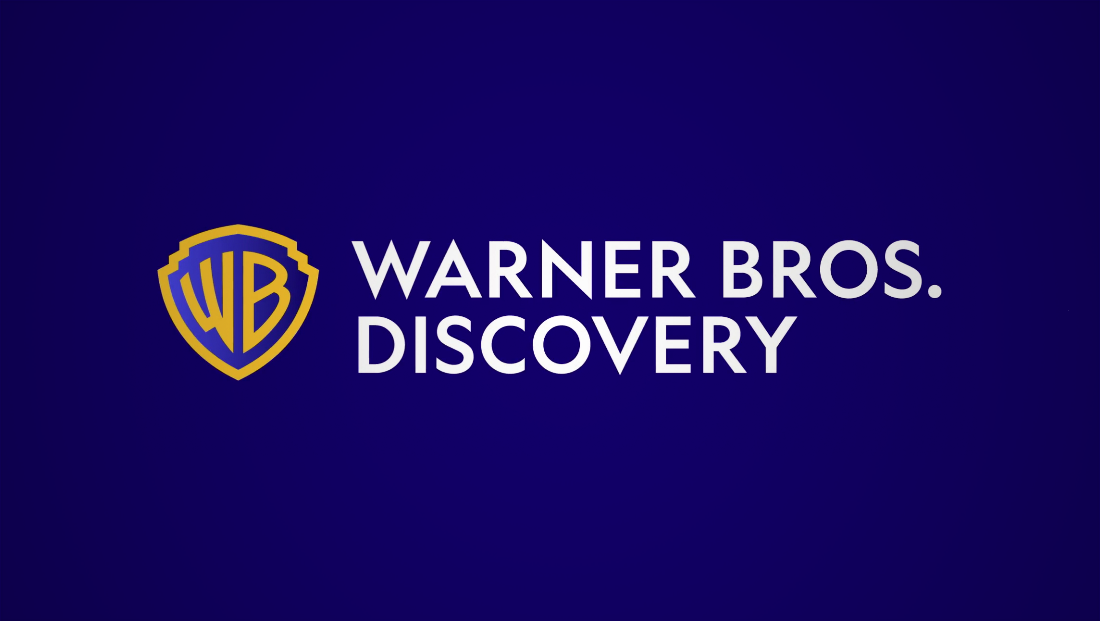
With the WarnerMedia–Discovery deal officially done as of Friday, April 8, 2022, the new company unveiled its official logo (after some speculation online over what it would look like) and corporate site.
The new Warner Bros. Discovery logo, it turns out, was the one Variety initially obtained and that was circulated on some internal communications throughout the day April 8 before the transaction was completed.
It does not, however, appear to use the purple starscape background as a standard branding element, although violet is used as one of several accent colors for the new brand.
The shape of the “WB” shield that was redesigned in 2019 appears to be similar (or identical) to the one originally circulated and also brings back the classic gold and blue color scheme that became familiar to many movie-goers thanks to the production vanity card at the beginning of Warner Bros. films.
The shield has been slightly “squashed” and the company’s full name is spelled out in a humanist geometric sans serif that appears to be Geometric 415.
This font includes distinctive “W”s and “N”s with very sharp points that peek up slightly above the top and baseline.
It’s similar in many ways to the “classic” NBC and NBC News logotype.
The shield has also been given a slight gradient effect, mimicking the gold look used in the classic version.
Warner Bros. Discovery also snapped up the three-character domain wbd.com, but also owns warnerbrosdiscovery.com, which redirects to the former. The domains corporate.discovery.com and warnermedia.com have been updated to explain the new company’s name with links to wbd.com.
It also secured the handle “@wbd” on Twittter, Facebook, YouTube and Instagram.
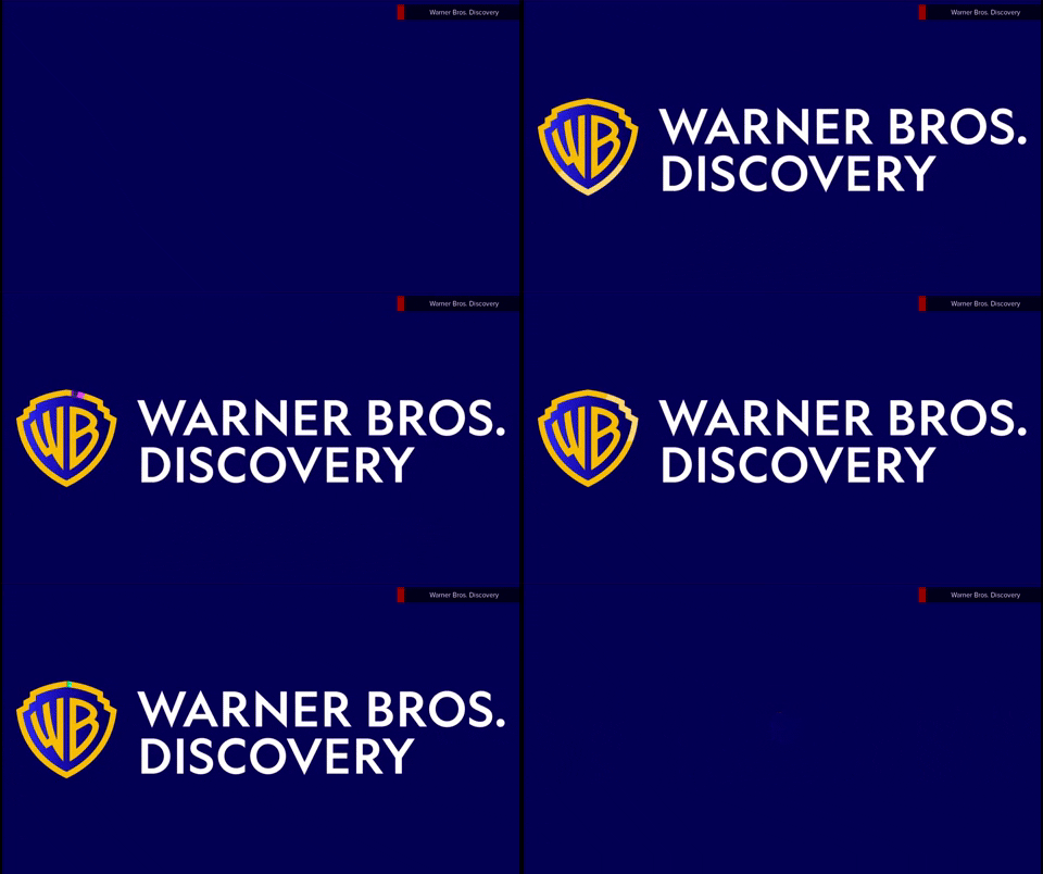
The new corporate website uses a mix of blues before transitioning to other colors and includes an animated version of the logo that also incorporates animated color effects.
Another common design element are thick borders formed from two L-shaped strokes in different colors.

The website uses a typeface called Beatrice for most text.


tags
WarnerMedia
categories
Branding, Broadcast Industry News, Heroes