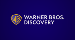
Various versions of potential Warner Bros. Discovery logo circulating
Subscribe to NCS for the latest news, project case studies and product announcements in broadcast technology, creative design and engineering delivered to your inbox.
Update: The official Warner Bros. Discovery logo has been revealed.
Images of what is purportedly the “final” logo for the soon-to-be-formed media company Warner Bros. Discovery began circulating online even before the merger closed, with Variety one of the first outlets to obtain an image.
The logo circulating has popped up on internal communications that have started going out as the deal for AT&T to spinoff its WarnerMedia division to Discovery and form the new company, according to Variety.
Variety was only able to obtain a low-resolution version of the logo, hence the rather blurry version shown with this story.
The deal is expected to close as early as April 8, 2022.
However, sources tell Variety the logo may not be the primary logo used in all cases.
The version Variety obtained appears to use a variant of the redrawn Warner Bros. shield that the company switched to in 2019. In it, the shield’s aspect ratio appears to have been either slightly adjusted or is eschew.
The design also appears to use a wide, humanist geometric sans serif — perhaps something along the lines of Brandon Grotesque.

The 2019 logo design for Warner Bros.
Meanwhile, another, slightly better quality version of the logo popped up on Wikipedia but has not be verified as being genuine.
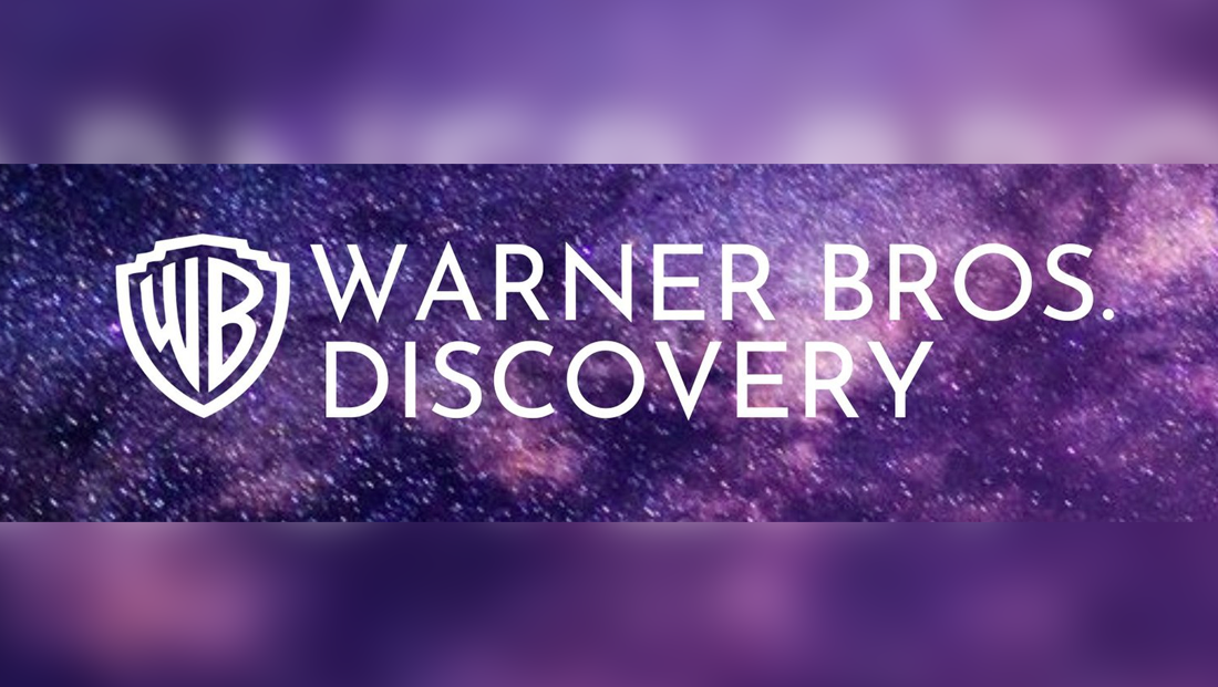

The Wikipedia version of the Warner Bros. Discovery logo, which has not been confirmed as being authentic.
This version of the logo is available in much higher resolution and appears to use a version of the “WB” icon that’s more in line with the 2019 redesign.
The font, while similar, has some distinct differences, especially in the “W,” though it does not appear to be in Warner Bros. Sans, the bespoke font also introduced in 2019.
Both versions feature the logo set against a violet starry background.
On the Wikipedia version, the background appears to be slightly blurry despite the crisp lines of the logo and lettering, which could be indicative that it’s not authentic.
There are also some places where the white letters don’t contrast well with the bursts of light behind them, something that perhaps would be more refined in the actual corporate look.
It’s not immediately clear, however, if the new company will use that font or even the Warner Bros. shield icon.
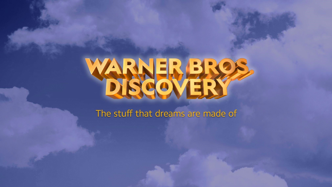

The widely mocked initial wordmark WarnerMedia and Discovery released back in June 2021.
In June 2021 the two companies released what they dubbed an “initial wordmark” for the new company at the time time they revealed its name.
That version featured the company name in extruded gold lettering set against a blue sky and featured the tagline “The stuff that dreams are made of” below, a reference to a line in the Warner Bros. classic film “The Maltese Falcon.”
This design was widely mocked in the design community, with comparisons to WordArt and the overzealous use of 3D effects.
The color scheme also didn’t match the 2019 rebranding and was more reflective of Warner Bros.’ previous branding that used gold and blue, though it is always possible that “classic” look is being brought back.
Subscribe to NCS for the latest news, project case studies and product announcements in broadcast technology, creative design and engineering delivered to your inbox.




tags
Discovery, logo design, Warner Bros. Discovery, WarnerMedia
categories
Branding, Broadcast Industry News