Election night reveals full look at CBS’s new election look
Subscribe to NCS for the latest news, project case studies and product announcements in broadcast technology, creative design and engineering delivered to your inbox.
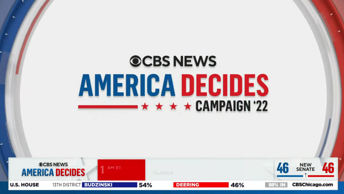
In addition to a selection of augmented reality and virtual elements, CBS News also fully debuted a new election graphics package on Nov. 8, 2022.
Like most of its other redesigns across both the news, sports and entertainment divisions, the new look is heavily influenced by the deconstructed eye approach that uses parts of the network’s iconic logo as elements in the graphics — as well as shapes inspired by it.
Also like many of these other looks, the design is heavily influenced by devoting the center of the screen to the key data, logo or other element, with it wrapped with curves on the left and right side implying an oversized ring of circles, the top and bottom of which are outside of the viewport in most cases.
This approach is used for everything from titles to bumps and fullscreens with election candidates, charts and other elements in the middle.
The rings themselves are a mix of white and off-white, often with several layers offset from each other by subtle 3D and edge effects. Other rings, appear in red and blue, often with blue on the left — as blue is the color of the left-leaning Democratic Party — and red on the right, a nod to the Republican Party’s ring-leaning politics.
Mixed in are hashmark accents along with circular segments in various shades that typically rotate subtly around the screen.
The package also has a variety of animated wipes, a distinct one that uses elements of the eye shape shown off-axis with elements flying in to form a solid plane to hide the jump cut before exiting by flying out in mostly circular segments.
A left-to-right wipe also uses an oversized version of the eye in a mostly white and gray look, with touches of red and blue.

There’s also a similar format with larger pieces in red and blue that also briefly shows the current clip through one of the matted-out areas.
There is also a version that uses the side-to-side motion and eye shape but includes an extruded start element.
Finally, there was a version that included the full “America Decides: Campaign ’22” branding that started with faint outlines of the CBS eye shapes forming solid elements on-screen and then having the typography zoom toward the viewer as its transition to black.
These animation was typically used as a bump going to breaks.
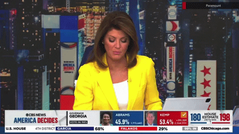
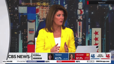
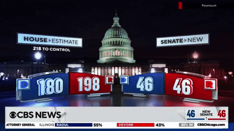
Like most networks, CBS also runs a bar along the bottom of the screen during most of its election coverage with a constant stream of information being displayed, including space for a smaller bar showcasing regional races inserted by local stations.
Like most CBS News graphics, a rather large side of the left side of the bar is devoted to branding — and it appears the same width was preserved in this layout.
During some newscasts, that element feels oversized at the expense of making the text or other elements to the right feel a bit crammed.
This was arguably the case during election night, when a varietal smonrgasborg of data visuals have to fit into the bar. That said, the network has the advantage of not having to have the bar keep the same information the entire broadcast (in fact, it’s just the opposite of that with many finding these bars to be a bit overwhelming.
Much of the on-screen typography at the network level was set on TT Norms, a typeface that’s being used company wide. For most numerals, however, the network opted to use a more condensed, bolder font, likely because Norms is fairly wide and it wanted numbers to stand out well without taking up too much room.
Because of the bar taking up much of the so-called “lower third” of the screen, CBS wisely opted to use a single line, narrow strip perched above it when on-screen identifiers for correspondents, analysts or others were needed.

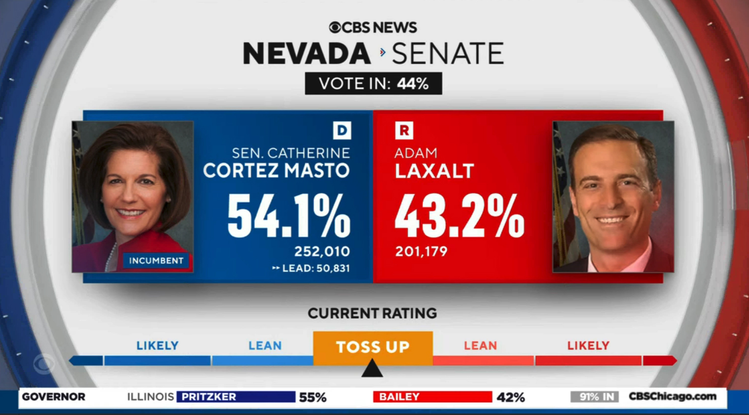
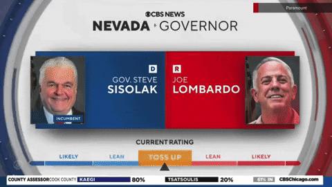
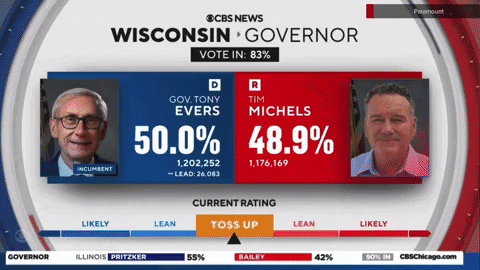
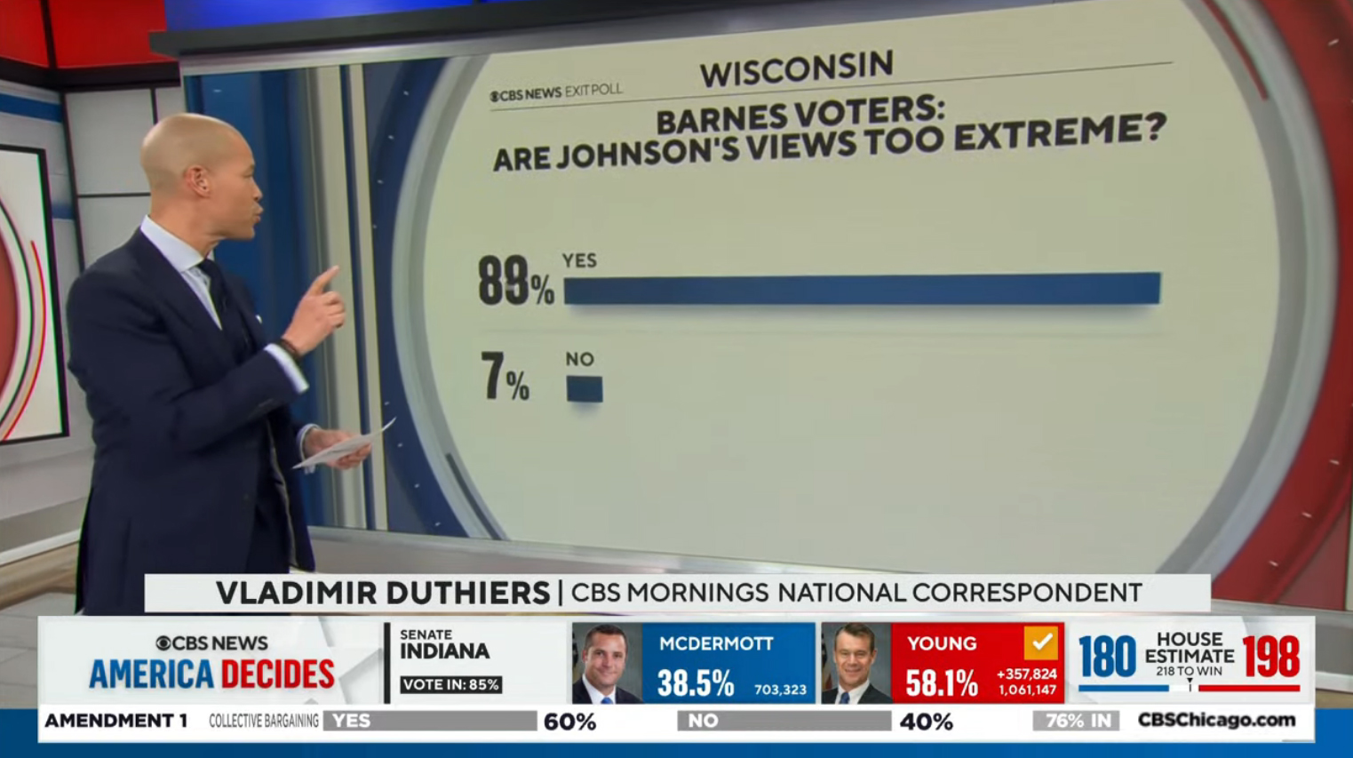
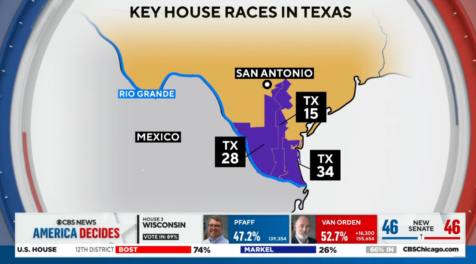
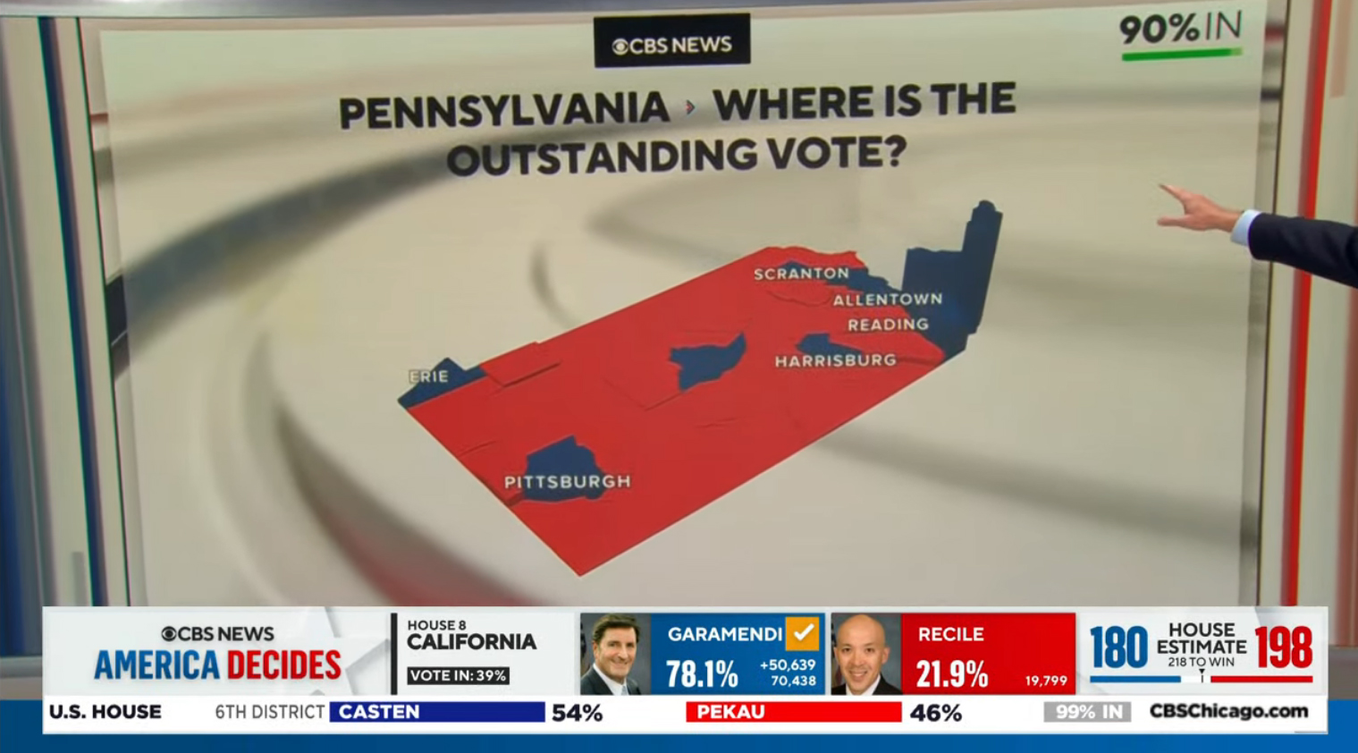
Going back to the middle of the eye serving as the canvas for information, this is mainly how CBS chose to illustrate current races.
Boxes sat behind a candidate photo along with the appropriate party designator, name, current vote count and percentage as well as, typically, a “current rating” scale running long the bottom of the screen.
Many header elements, including these types of screens, included a small right-pointing arrow separator element that features an outer blue angle with smaller red triangle.
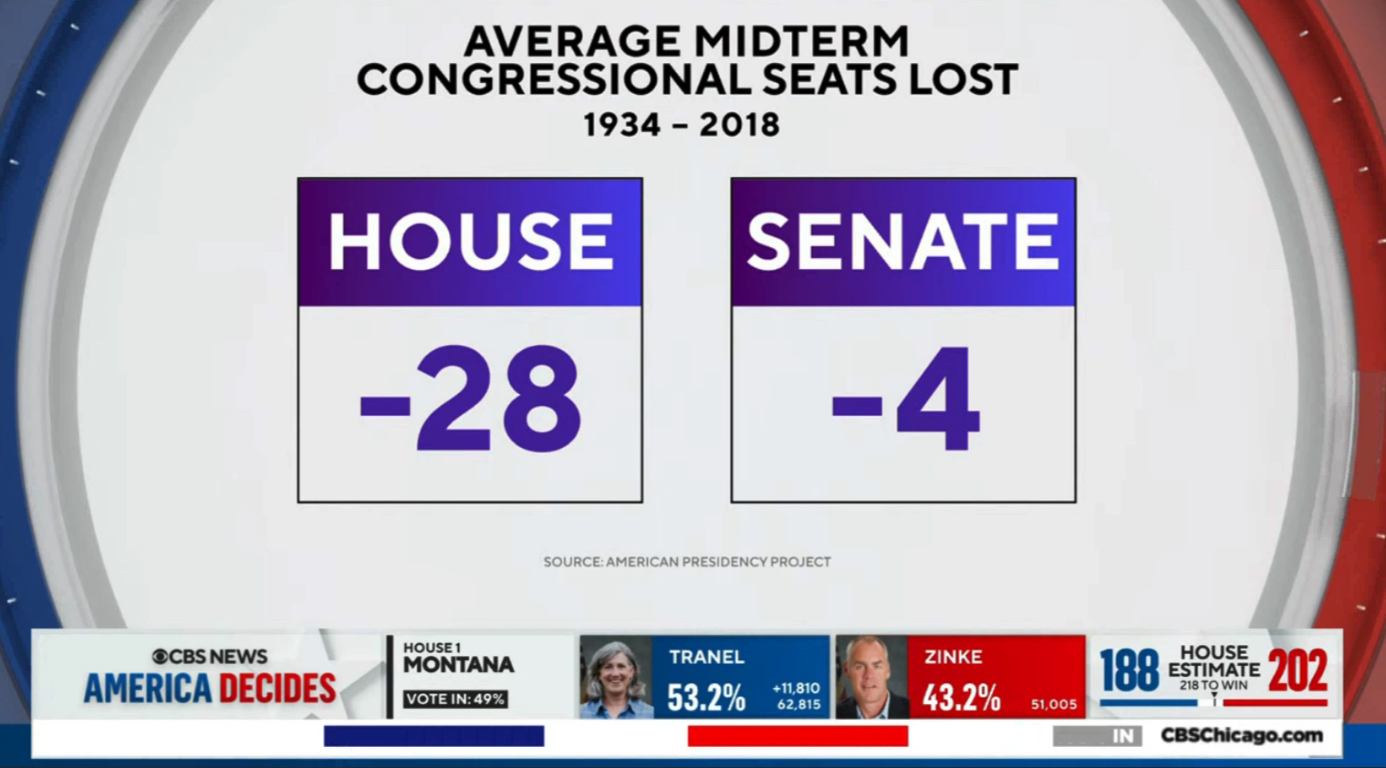
CBS also used the same basic background to multiple other fullscreen graphics, but these often had a rushed, unpolished feel to them that included oddly mismatched colors, dated looking gradients and plain black borders.
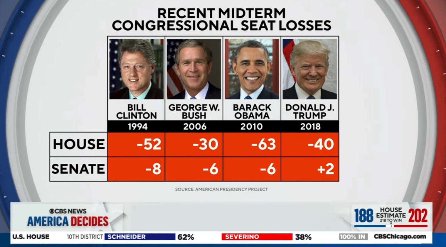
These looks could have benefited from some refinement to make them fit in seamlessly with the rest of the look.
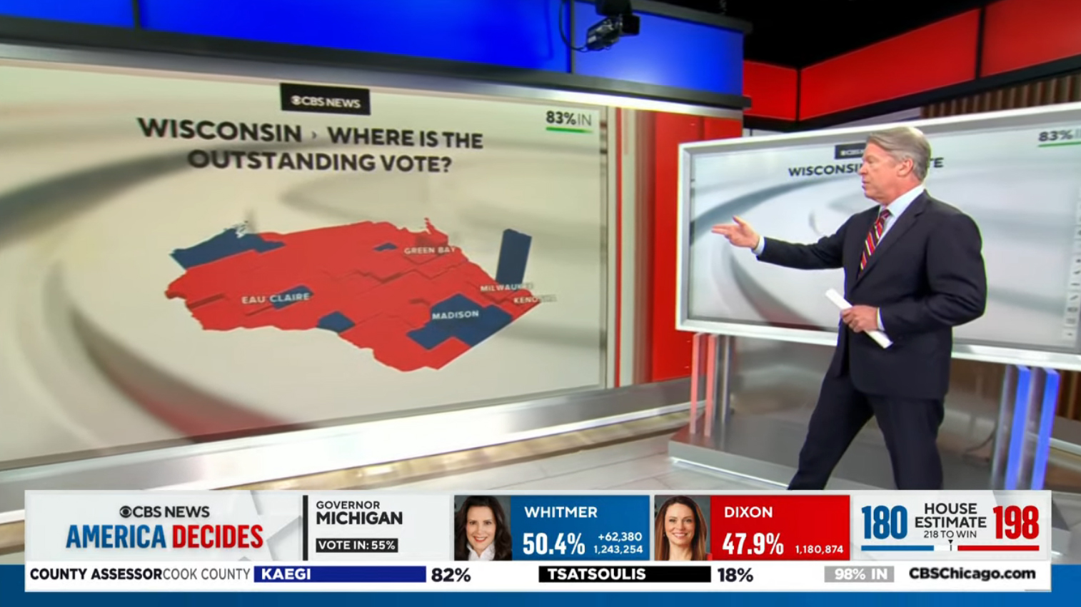
For example, compare the map above to the one below.
The U.S. map next to the correspondent features dark gray borders and an outer glow effect as well as shades of blue and red that match the rest of the package.
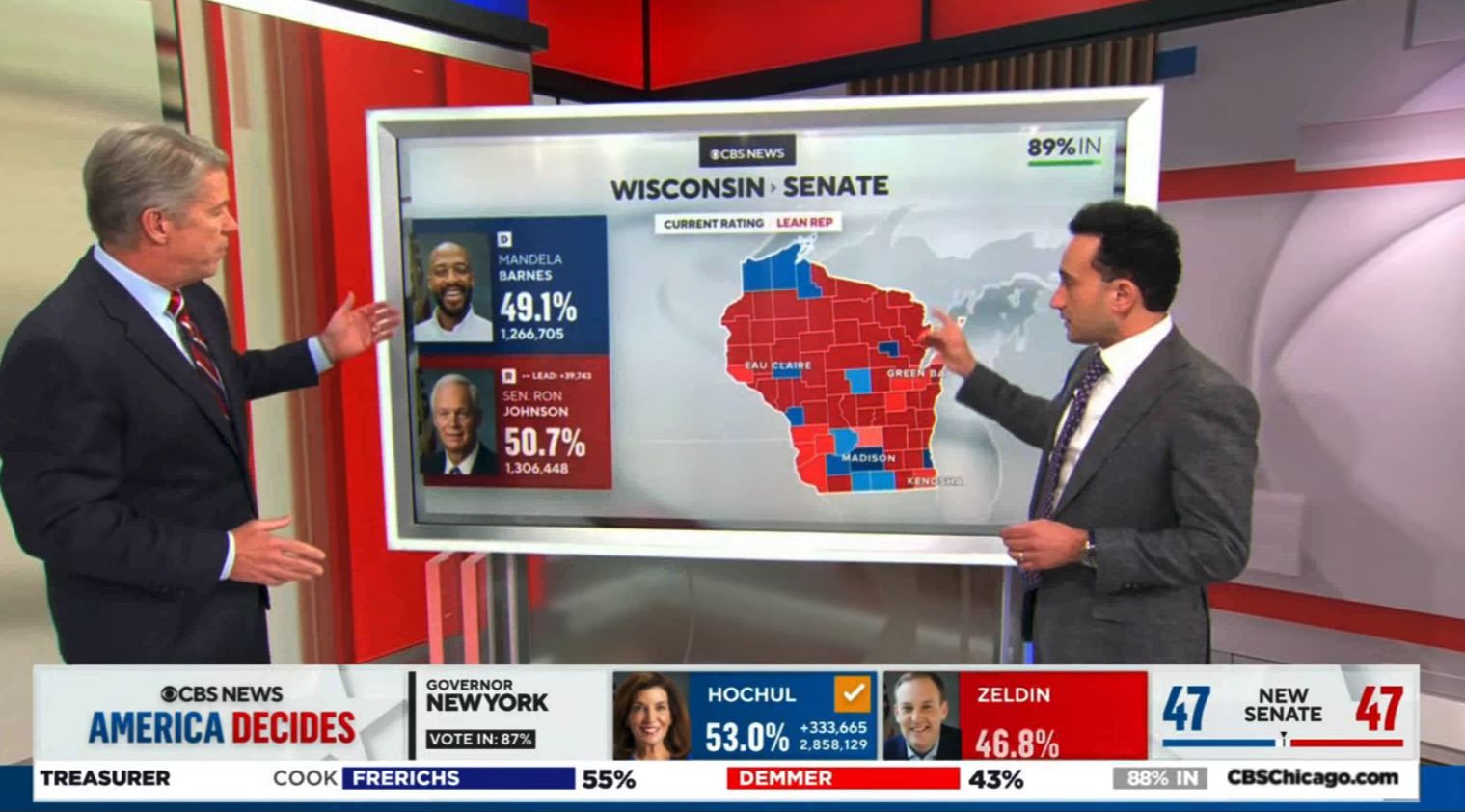
Other maps used during the evening were even more refined, with the state in question made prominent through the use of color while surrounding states were shown in a gently shaded gray, an effect that still allowed the viewer to help visualize where in the country the state is.
The left portion of the state of Wisconsin, as shown above, also features a blurred off-axis view of a 3D CBS eye and ring layout, a design decision that helped the two data boxes on the left pop as well.
Backgrounds with that blurred side-angle view had been popping up in the days leading up to the midterms and were used extensively throughout the night.
When creating this, designers wisely realized that even with the curved left and right elements restricted to the far sides of the screen, some graphics, including maps and text-heavy lists of data, could likely benefit from a cleaner background.
The look, however, still coordinated well with the rest of the package, and in some cases a small portion of a non-blurred version of the background was allowed to peek through in the margins of the screen.
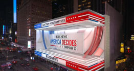
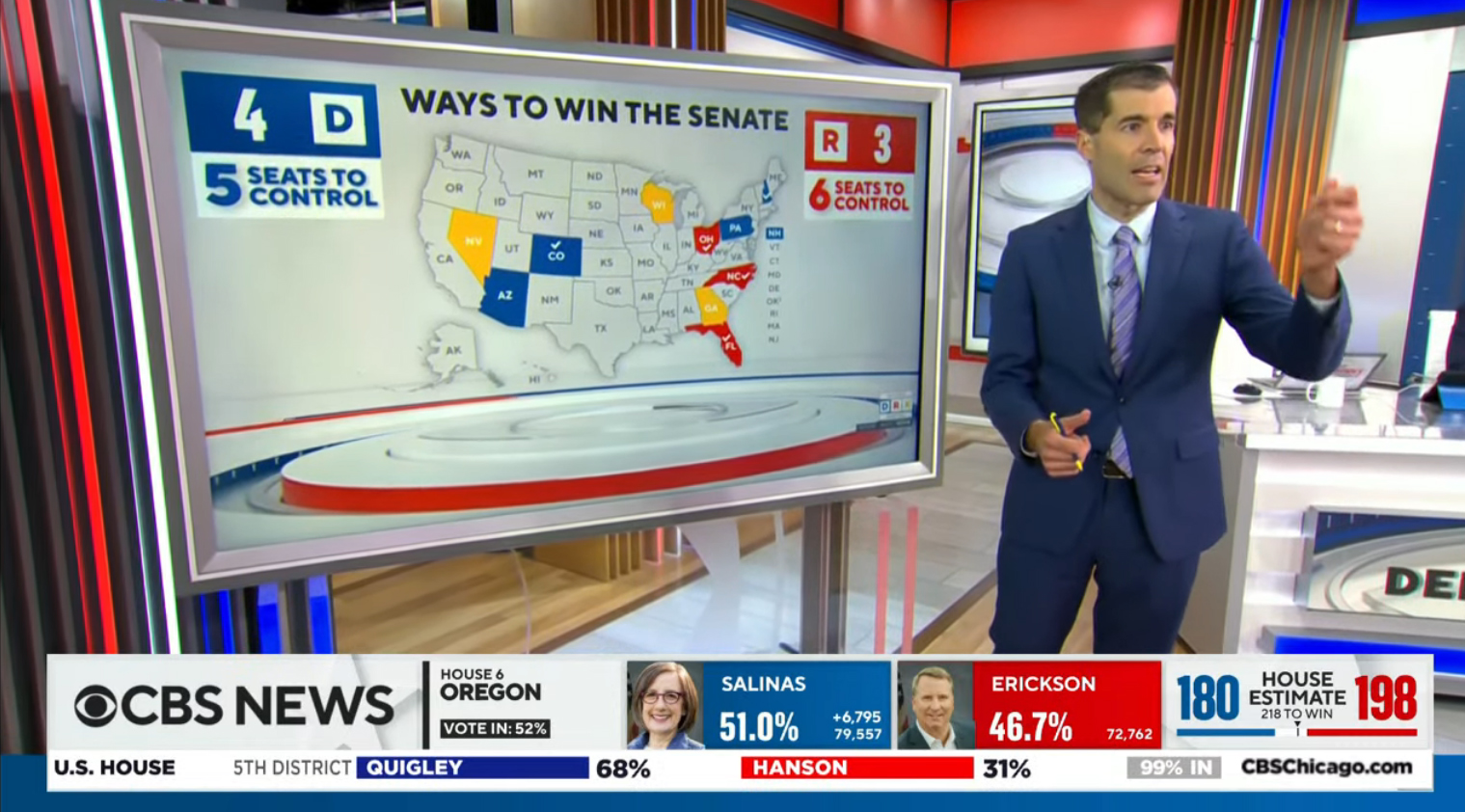
On-set video wall and panel graphics largely matched the look of the new package.
The primary background behind the main anchor desk featured a simulated view of Times Square that had been heavily stylized and edited to include faux CBS-branded virtual billboards on the sides of buildings and even simulated steam coming out of a rooftop vent.
Other video walls could also display variations of these looks, including views of the Nasdaq MarketSite sporting CBS branding and a nearly vertical video board edited to feature the Paramount logo, a nice example of “corporate synergy” since that’s the name of CBS’s parent formerly known as ViacomCBS.
Subscribe to NCS for the latest news, project case studies and product announcements in broadcast technology, creative design and engineering delivered to your inbox.

tags
2022 Election, CBS Eye, CBS News
categories
Broadcast Design, Broadcast Industry News, Elections, Graphics, Heroes