
Analysis: Will Pantone’s Color of the Year affect broadcast design?
Subscribe to NCS for the latest news, project case studies and product announcements in broadcast technology, creative design and engineering delivered to your inbox.
Pantone’s pick for the 2023 Color of the Year has some connections to colors often used in TV news graphics though may ultimately be a better fit for lifestyle and entertainment looks.
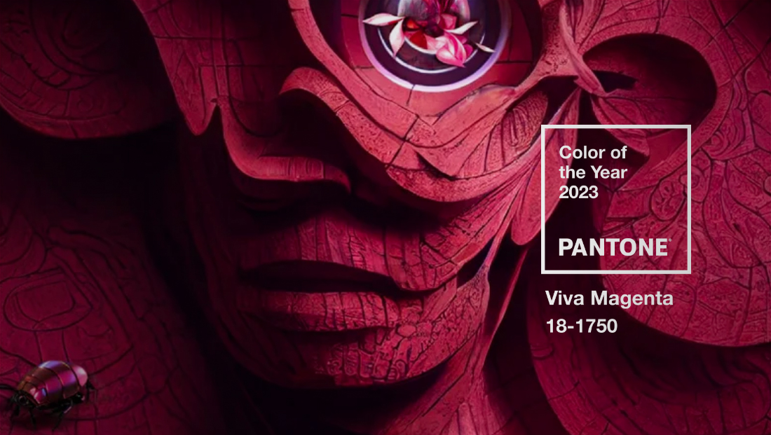
Viva Magenta (PMS 18-1750) is in the red family — though it skews a bit more toward, depending on who you talk to, the blue or violet part of the spectrum.
As Pantone puts it, the shade “vibrates with vim and vigor.” It’s also supposed to represent hope for humanity after coming off several challenging years.
“Viva Magenta is brave and fearless, and a pulsating color whose exuberance promotes a joyous and optimistic celebration, writing a new narrative,” perhaps a nod to what is hopefully an optimistic outlook after several difficult years.
2020’s color of the year, announced before COVID-19 became a pandemic, was Classic Blue (PMS 19-4052), a color that’s seen in many news graphics packages and other broadcast designs.
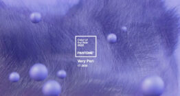
For 2021, Pantone appeared to be somewhat optimistic with a yellow called “Illuminating” (PMS 13-0467) but paired that with Ultimate Gray (PMS 17-5104) which resulted in a drastically contrasting look. 2022’s color was “Very Peri” (PMS 17-3938), a periwinkle violet that started to feel more upbeat.
Pantone’s picks for Color of the Year since 2021 had mostly limited application in broadcast design graphics, simply because many wouldn’t play well on TV screens or simply were outside the comfort zone of what many viewers expect in TV graphics.
Of course, Pantone’s pick has never been meant to be specifically for broadcast design — it’s more of a message about color and design trends combined with the emotions and feelings the shades evoke. That said, designers of all types still take notice of Pantone’s pick and may start exploring ways to use it more, especially if it becomes mainstream.

Viva Magenta is close to red, which is a common color in broadcast design for breaking news or anything needed to give a sense of urgency.
Its overall shade, however, tends to feel more friendly than urgent, meaning that it ultimately may be a better fit for key art, insert graphics and opens for lifestyle shows, talk shows and other productions that offer lighter fare.
It could, however, be a slightly less tame way to draw attention to breaking news or new information within these types of programs or, perhaps, even within morning news broadcasts, where palettes tend to be softer.
Viva Magenta also has many similarities to what are commonly referred to as “Flat UI” colors. While there isn’t a set group of colors, these colors tend to be brighter, fresher and slightly unique takes on the various common colors used in design. They’re typically available in a series of lighter and darker shades so that designers have a range of similar colors to pick from when subtle or obvious contrast is needed.

One notable broadcast that ventured into the realm of Viva Magenta is “Access Hollywood,” which uses a similar shade in its logo when it was revamped in 2019. It was also used in the show’s graphics package for a period, along with various shades of teal, though recent updates have made the show’s look skew more orange-red.
“Access” also used a collection of shades that could be seen as similar to “flat” colors, including its unique take on black-gray for its logo.
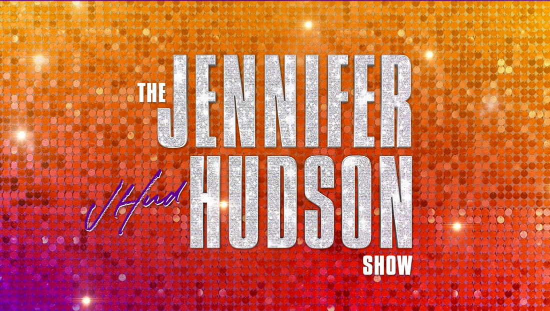
More recently, the new talker “The Jennifer Hudson Show” incorporates some hints of magenta in its look, including some of its on-set accent pillows, though it’s also mixed with purples, reds, oranges and golds.
There are also hints of magenta in NewsNation’s “Morning in America” graphics, especially the open.
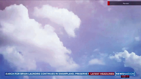
The show largely uses red, blue and yellow as its primary color palette, but then also adds in the element of gradients, meaning that magenta-like shades pop up throughout.
An old version of CBS’s “The Talk” used a shade similar to Viva Magenta.

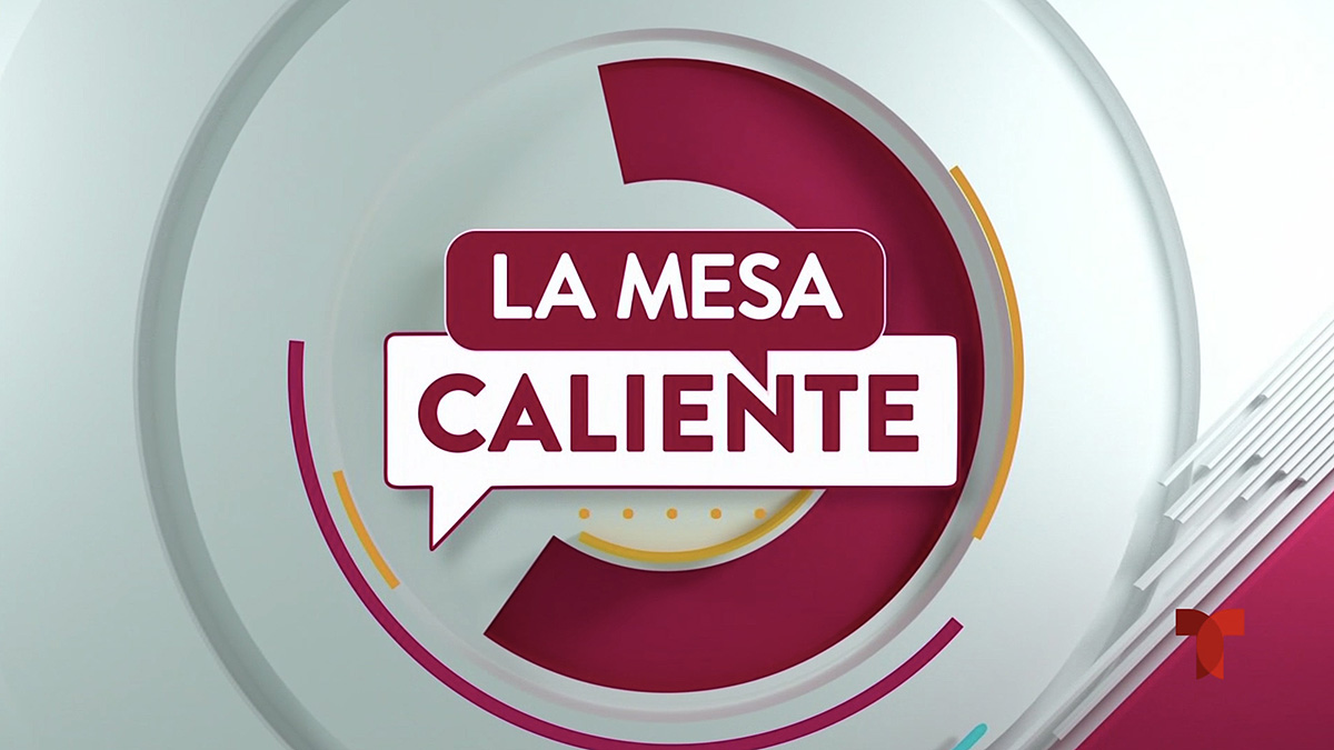
Telemundo’s “La Mesa Caliente” also uses a similar shade.
Pantone also laid out what it called the “Magentaverse” (presumably a play on the term “metaverse”) a total of eight colors that are designed to complement the shade while also speaking to color trends. These are all what most would consider pastels — lighter, muted shades that are presumably meant not to complete with Viva Magenta’s brightness.
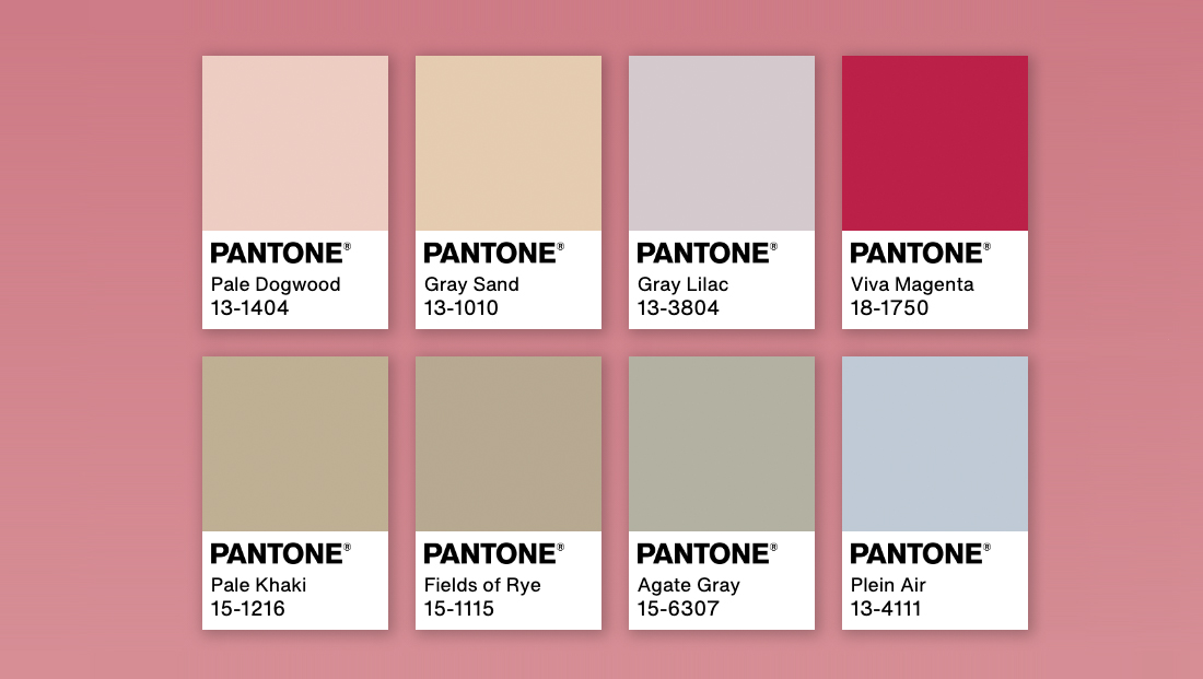
These could perhaps be worked into show opens and other fullscreens as secondary colors, especially since they are subtle and give designers a way to incorporate a member of several color families into a look that coordinates with magenta.
That said, it’s easy to see how using a color in the magenta family could be a big creative risk that a designer might not be willing to take. It’s definitely a non-traditional color of news graphics and even non-news looks. The accompanying shades are unusual for TV as well, but it’s also possible a talented designer could make the look work given the right show, creative direction and use of the colors.
Subscribe to NCS for the latest news, project case studies and product announcements in broadcast technology, creative design and engineering delivered to your inbox.

tags
graphics package, Pantone, tv news graphics
categories
Broadcast Design, Broadcast Industry News, Featured, Graphics, Talk Show Graphics Design