
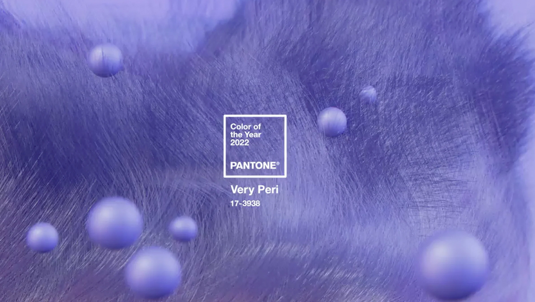
‘Very Peri’ color of the year intersects with TV news graphics design trends
Weekly insights on the technology, production and business decisions shaping media and broadcast. Free to access. Independent coverage. Unsubscribe anytime.
Pantone has picked what it calls “Very Peri” as its 2022 Color of the Year even as similar colors have popped up in various TV news graphics and could open the opportunity for more usage of similar shades.
The name “Very Peri” is presumably meant to be short for “very periwinkle,” which is most commonly associated with a species of flower. As a color, however, it is similar to lavender and is also described as “very light purplish-blue” by the Inter-Society Color Council and National Bureau of Standards, which attempts to describe colors using only 12 color terms and adjectives.
That said, the “Very” in this year’s color name seems to be apropos because the shade feels like an “amped up” version of what many would think of as periwinkle.
For its part, Pantone describes the color as “displaying a carefree confidence and a daring curiosity that animates our creative spirit.”
While it’s not unheard of for violets to be used in TV news graphics packages, it’s certainly not common either.
However, as Pantone points out, Very Peri is a “novel perspective and vision of the trusted and beloved blue color family” — and blue is definitely a go-to color for TV graphics.
Violet and purples most frequently show up in news graphics that are used for special occasions. Its historical association with royalty has made it a popular choice for coverage of events surrounding the British monarchy in the past — as well as for coverage of the Vatican conclave to select a new pope.
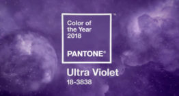
Pantone last picked a violet shade in 2018, the deeper Ultraviolet.

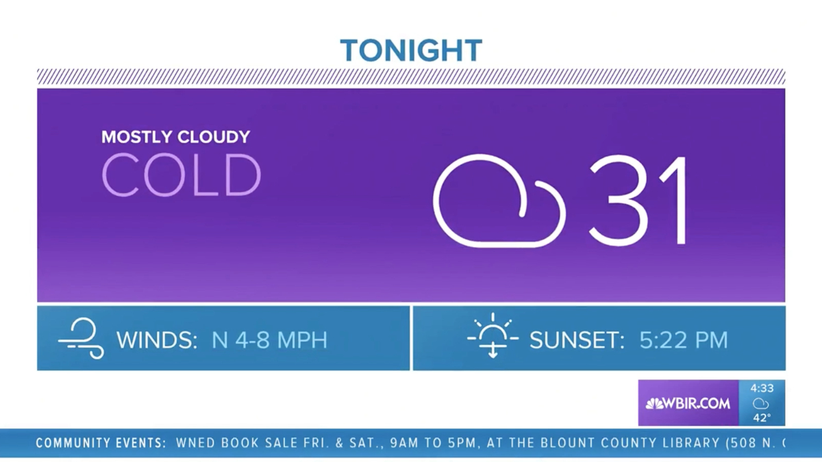
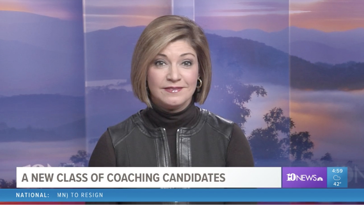
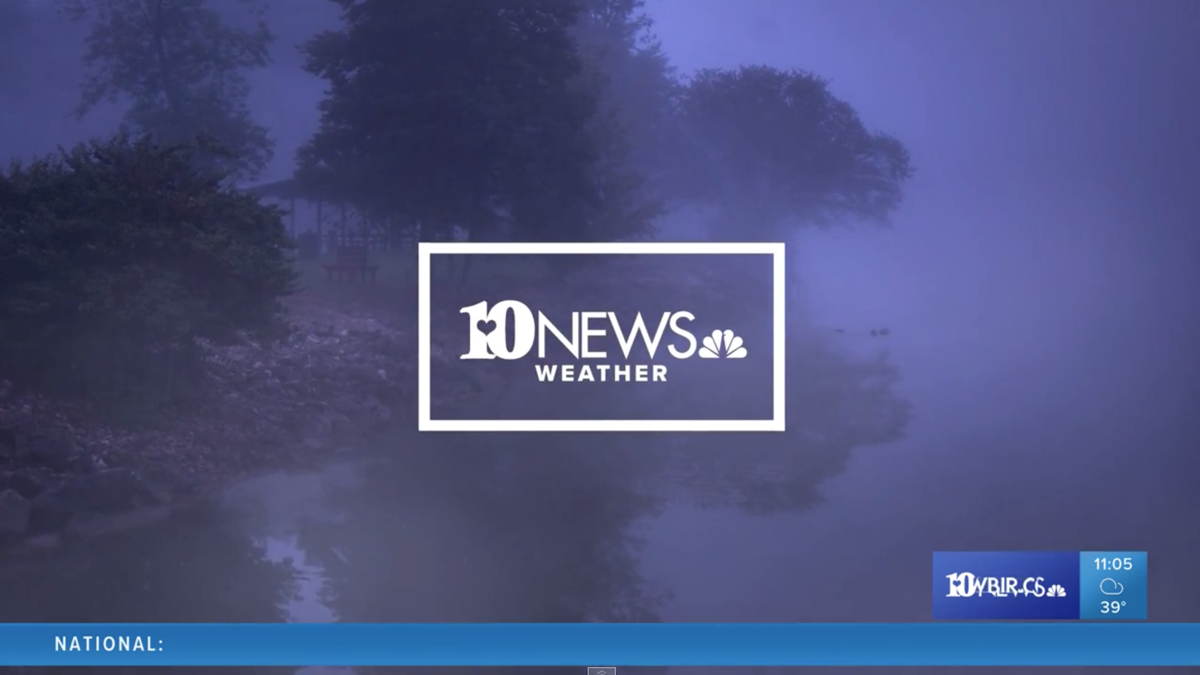
Tegna’s famous (or infamous) group graphics package is one notable example that makes heavy use of violet. Here’s violet used prominently in a fullscreen weather graphic at Tegna’s WBIR. It’s also in the bug in the lower right during evening newscasts (an orange is typically used in the morning). Blue is also used extensively. The purple here is definitely ‘more purple’ than Very Peri, however, more close to Ultraviolet.
The color palette is heavily inspired by the ‘flat design’ concept and color palette that was popular for several years, particularly in the area of digital design and notably sheds the heavy use of 3D and glassy and metallic elements that were popular in news graphics. While that 3D look hasn’t disappeared entirely, many stations have scaled back their use of the look, instead of relying more on gradients and subtle shadows to add texture and depth to their looks.
Meanwhile, some segment opens used by Tegna stations include a shade that’s very close to Very Peri.
As shown here, the red used by ABC across most of its platforms in 2021 follows a similar path of taking a traditional color and skewing it a bit to make it more unique. ABC’s take on the red feels both fun and sophisticated and is also at least somewhat aligned with the flat color palette trend.
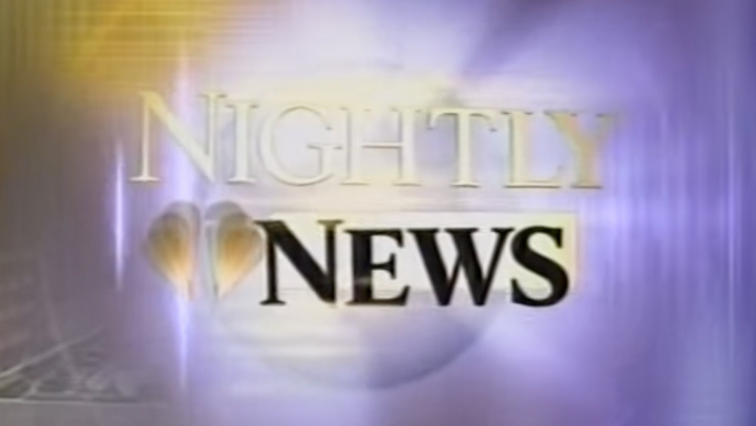
Back in 2000, ‘NBC Nightly News’ introduced a new set and graphics package that used a very periwinkle-like shade of violet prominently along with gold accents.
Of course, Very Peri can also serve as a creative jumping-off point for forthcoming design trends — so it’s possible new graphics that roll out in 2022 and in the years that follow will start to use shades of blue that skew more toward violet or are at least different than the typical rich and bright blues, a trend that already appears to be taking shape.
In some cases, blues are getting “grayer” — which is noteworthy given the explosion of popularity in “Modern Farmhouse” decor that emphasizes whites and grays (the return of Mid-Century design has also helped drive a grayer world). In fact, “Ultimate Gray” was one of the two Colors of the Year for 2021 — the other being a yellow called Illuminating.
It’s also worth noting that while Pantone’s color of the year is picked at least in part on trends and trend predictions, it doesn’t always catch on to the same extent every time. It can also take some time for the color to start appearing in products and graphics — if it ever makes it there at all.
Finally, there’s another common place violets show up on TV — weather maps. Depending on the station or network, violet typically means snowfall or wintery mix of some kind. In this case, however, the color choice is more functional than by design — given that violet is a natural choice to use among the varying degrees of blue that often represent wintery weather.

tags
color, Pantone
categories
Broadcast Design, Broadcast Industry News, Featured, Graphics