9&10 News switches to awkward and odd new logo

Subscribe to NCS for the latest news, project case studies and product announcements in broadcast technology, creative design and engineering delivered to your inbox.
WWTV, a northern Michigan station that, thanks to a vast viewing area that relies on satellite station WWUP to boost its signal, has switched to a new logo design that continues the practice of featuring both of its channel numbers.
The newscasts have long been branded on-air as “9&10 News,” a reference to the respective channels WWTV, licensed to Cadillac and Traverse City, Michigan, and WWUP, Sault Ste. Marie, Michigan, occupy.

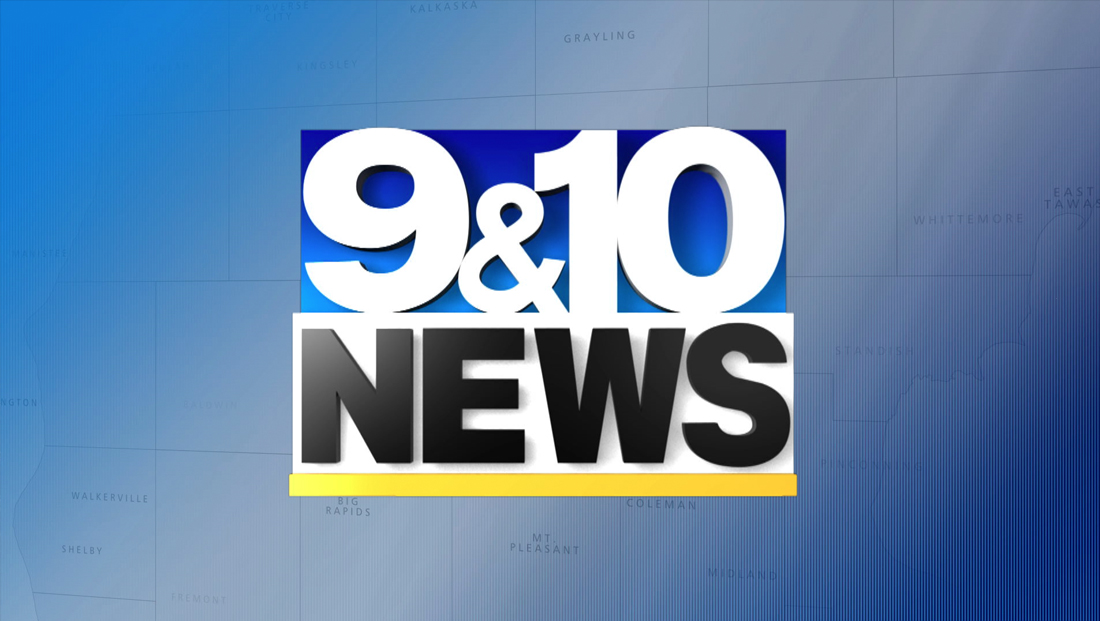
The old logo design spelled this out quite literally — styling it without any spaces between the numerals and ampersand.
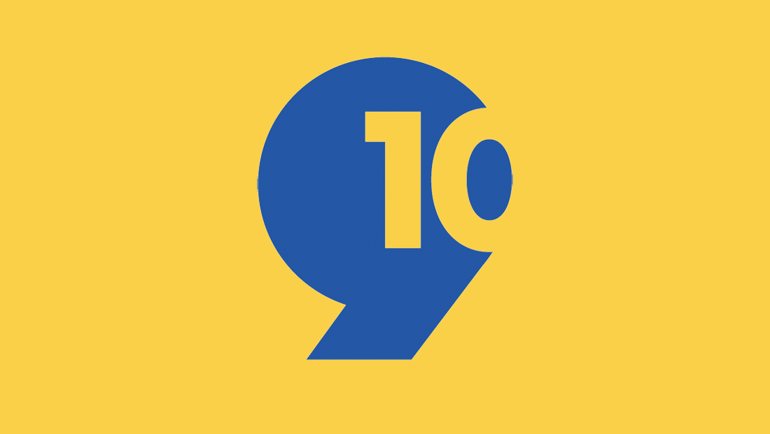
The new logo features the “9” rendered without the reversed-out circle in the middle top portion the numeral usually has with the number “10” formed with negative space off to one side.
The shape of the “9” as well as the “1” and “0” is very similar to Futura, which is the typeface the station migrated to on its website and new graphics package.
The Heritage Broadcasting Group-owned station has stuck with its general blue and yellow palette. However, the shades have been tweaked to more contemporary ones, with the yellow becoming a bit more goldenrod and the blue switching to a slightly less bright look.
The new design also sheds the ampersand or any other reference to the word “and,” which remains included in verbal versions of the branding used on-air after the redesign.
The knocked-out “10” has been positioned so that the oval shape created by the middle of the zero becomes part of the right-sided curve.
Overall, the logo is practically the epitome of the flat, brutalist design trend that’s worked its way through the design world — especially with how the “9” is converted to a heavy solid shape that looks a bit like an oversized apostrophe.
The design completely drops the ampersand or any direct reference to “and,” instead relying on the viewer to read the logo as both a “9” and “10.”
The “10” is arguably easier to read, given that about 80% of it is visible without interruption — and it seems that most people’s minds would fill in the rest of the shape.
Expecting the overall shape to be read as a “9” is perhaps a bit heavier of an ask. It seems as though the design is attempting to use the knocked out “10” to suggest the negative middle of the “9,” though this is a bit a stretch given that it’s right aligned, rather than in the middle, and the element that’s closest to where the middle would be is a “1” created with entirely right angles and straight lines.
There’s also a bit of a typographic inconsistency — the highly geometric and wide footprint of the “9” shape would lead you to believe the middle knockout should be a perfect circle, as opposed to a more oval shape like many fonts use. However, the zero in the “10” relies on a prominent ellipse in its center and is more condensed.
Of course, two numbers don’t have to use the same font (though they did in the station’s old design) in a logo, but the weight of general style of each one should be considered — and there appears to be a significant clash here.
The ultra-simple shapes in the design also have a feel of the handful of “Tegna-fied” logo designs that that group rolled out across many of its stations, including WXIA in Atlanta and WTSP in Tampa Bay, Florida.
All that said, the station deserves some credit for taking a risk with this design and it replaced a rather dated look that plenty of design issues itself.
As of January 2023, the Cadillac Telecasting Company-owned WFQX, a Fox affiliate that Heritage runs through an SSA, is also carried on 9.2 and 10.2, has kept its “Local 32” name and “9&10 News on Local 32” newscast branding, the new icon is used for the latter.
The use of two numerals in a station logo is rare but 9&10 News is not the only station that uses this approach. Another notable example is KHBS in Fort Smith, Arkansas, and KHOG in Fayetteville, Arkansas. These stations, which are considered satellites of each other, collectively brand as 40/29 News.
Subscribe to NCS for the latest news, project case studies and product announcements in broadcast technology, creative design and engineering delivered to your inbox.


tags
Cadillac, logo design, Logo Designs, rebranding, Traverse City, wwtv, wwup
categories
Branding, Broadcast Industry News, Featured, Graphics, Local News