
9&10 News switches to new graphics that emphasize accents, outlined type
Weekly insights on the technology, production and business decisions shaping media and broadcast. Free to access. Independent coverage. Unsubscribe anytime.
In addition to a drastically different new logo, northern Michigan station WWTV also debuted new graphics and music in January 2023.
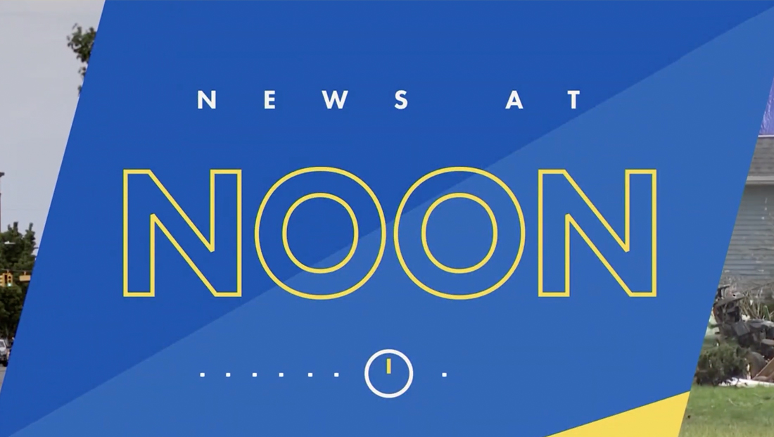
The new graphics follow the color palette the logo uses of blue and gold with a flat angular look.
The exact angles used vary from application to application but do appear to be at least partially inspired by the sharp diagonal line on the right side of the station’s new logo.
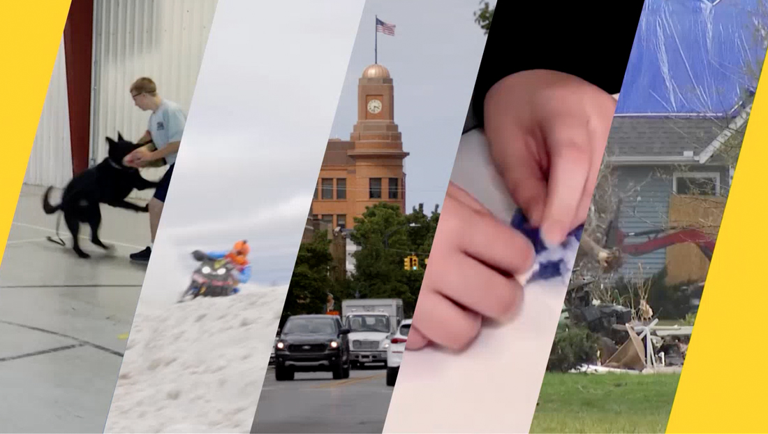
The angles are used heavily in the open to showcase a montage of regional footage that use side-to-side animation to reveal the newscast title card.
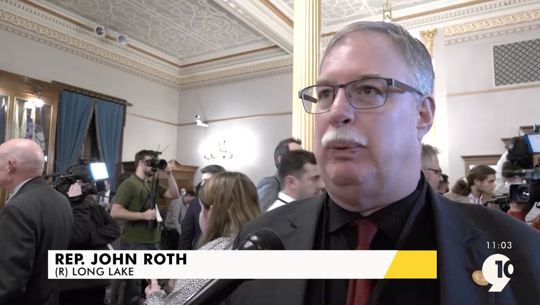
The diagonal motif continues in the updated lower thirds, which feature side-by-side white and yellow elements that are divided with an angle.
Angles are also found in other fullscreen backgrounds, with multiple lines of different shades and colors used to create triangular elements.

The package also makes use of dotted and other small icon accents, including some that are similar to the ones used by CBS News and its new owned station graphics package that is rolling out. Opens also include a small clock icon with the hands set to the corresponding start time of the newscast.
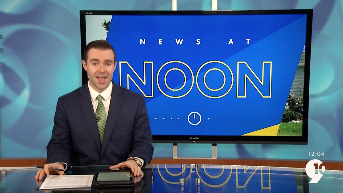
The station also updated its bug to a simple semi-transparent version of its logo with the time in a similar shape above. When displayed on top of lighter shades, the bug and time appear to have a slightly darker outline applied to them.
Like its new logo, the station is using Futura throughout its graphics package. The Web version of foundry Paratype is used on the stations’ website via Adobe’s Font service, formerly known as Typekit, according to an analysis of the underlying CSS and HTML.
Another common element in the new look is the use of outlined typography, including, most prominently in the time of the newscast spelled out in word form.
The same typographic style is also used in other parts of the new look as well as on social media graphics.
WWTV appears to be using a technique of applying an outline effect to an existing font, which results in slightly misshaped and odd angles in the strokes, such as the off-kilter “points” found in the “N.”
From a strict typographic standpoint, creating outlined type this way is essentially a “faux outline” version of the the font because it’s simply using the computer’s “best judgment” to draw an best approximation of what the letters would look like outlined.
The result is that the traced outline has to sit either inside, outside or along the middle of the original letters’ edges, so the result, especially at thicker widths like WWTV is using, is a look that can create some of the odd effects.
WWTV is hardly unique in using this approach, though it’s considered a big no-no by typography purists.
The Paratype (abbreviated as “PT”) version of Futura used on the station site does not include an official outlined version. URW Type Foundry, meanwhile, does offer an outline version of Futura, but it has significant differences from the letters shown in WWTV’s graphics.
Outlined typography has become popular in recent years, with one each being NBC’s Peacock streamer. In this case, NBC commissioned a custom font, known as Peacock Sans, that also has a separately-drawn outline version rather than relying on a faux outline effect.

A true outline font, such as Peacock’s, is drawn separately but typically based on the same letterforms its parent font has.
The station is using the same set as it did before the updates, though on-set video panels sport mostly new graphics. The station did not immediately updated its weather graphics from the previous look.

tags
graphics package, wwtv
categories
Broadcast Design, Broadcast Industry News, Featured, Graphics, Local News, TV News Graphics Design, TV News Graphics Package, TV News Motion Graphics Design