X Games gets updated look for Aspen 2023
Subscribe to NCS for the latest news, project case studies and product announcements in broadcast technology, creative design and engineering delivered to your inbox.
Already known for showcasing champs in various extreme sports, the X Games has begun reimagining its own brand and design under the leadership of new owners while still staying true to its focus.
Gameday Creative worked with the X Games, which ESPN sold in October 2022, to create a comprehensive design update for the action sports brand. The project aimed to maintain consistency with the existing design language while introducing unique elements for the renewed marketing and promotional push.
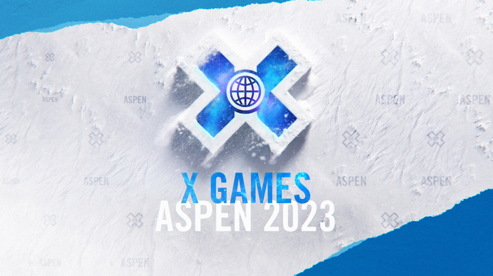
“We changed colors, textures, and backgrounds from the old package to match the new marketing look, as well as creating new hero renders of the X Games ‘X’ logo,” said Scott Flato of Gameday.
In addition to on-screen motion graphics, the new look was used across the brand’s social medial accounts, internal email banners and paid advertising. It was also adapted for large-scale use on posters, set elements, winner podiums and in-venue artwork and video displays. Collin Pisarra at Dreamwire lent a hand in creating these elements.
During the design process, Gameday opted to lean heavily on a new, carefully-crafted 3D rendition of the trademark “X” – which has been used by the games since 2004.
“The new 3D additions played a huge role in supporting certain deliverables such as the opens, bumpers and transitions and also act as their own set of transitions when needed,” said Flato.
For the final animation of these heroes, Gameday’s Eric Say directed the artists to achieve hyper-realistic renders that complemented the marketing campaign.
“We wanted the scale of the ‘X’ to feel bold and powerful, acting as the base platform for the games itself,” noted Flato.
This involved building snow particles in computer software, studying how snow might interact with wind on the scale used in the graphics and then ultimately applying those effects to the animation.
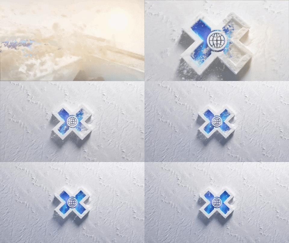

“Some of those first renders felt too fast and unrealistic, so we dialed it back to give a more elegant, sensible feel,” explained Flato, explaining that the team used a variety of tools including X Particles, Cinema 4D, Redshift and Adobe After Effects for the project.
The final result is a bold rendition of the logo with its white parts made from tightly compacted snow, typically situated as if it’s been left out on a barren snowy field, which doubles as a neutral background element to allow the glowing blue and even white border of the logo stand out.
The logo is typically revealed as if viewed from above, with shadowing effects added as if a cold winter sun is beaming down on the scene somewhere slightly off-center from the top middle of the screen.
Even as much of the logo scene becomes frozen, Gameday opted to make it appear as if the logo is made from tightly compacted snow that is being disturbed by the wind.
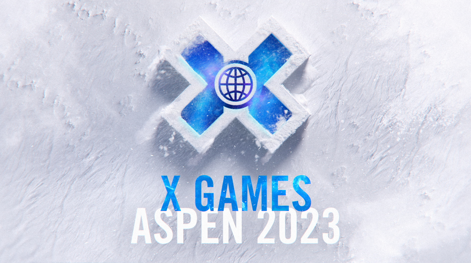
The digital snow blows off the surface of the logo with a combination of fine flakes and larger clumps.
Iterations on this look include animated reveals that start at various viewpoints from around the imaginary snowy 3D “X,” including the option to delve inside the outlines as a gust of wind blows powder off the surface.
The 3D “X” logo is complemented by an array of textured, flatter imagery and typography, which is set in Trade Gothic.
Many of these elements have the feel of ink drawn on rough paper, but this also mimics the overall textural motif of snow.
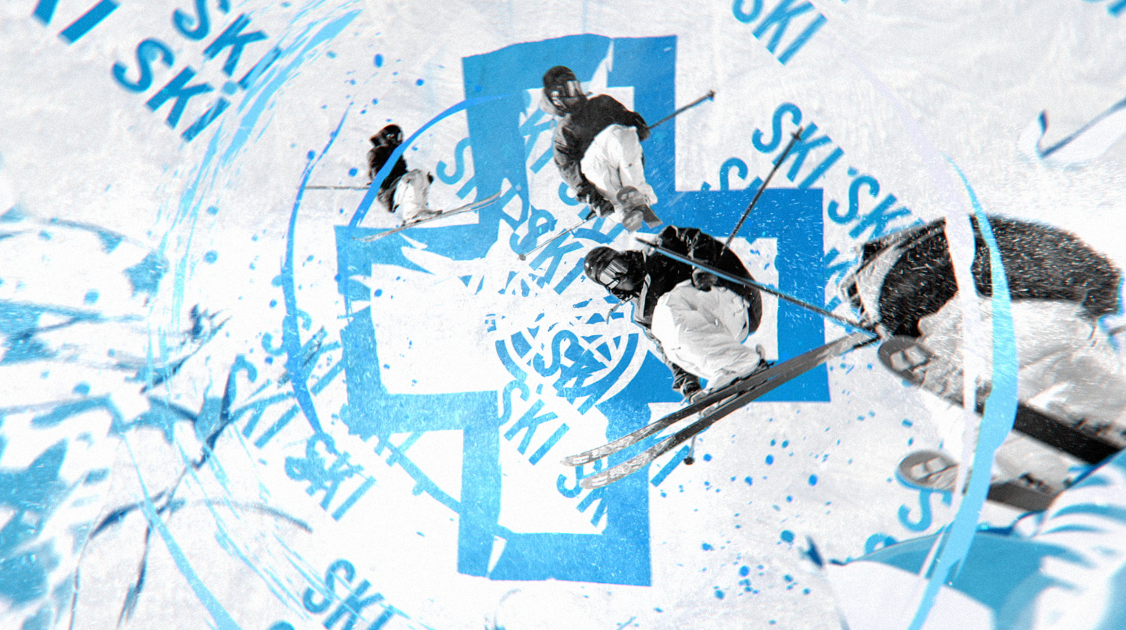
Key visuals in the open and rejoins include swirling rings, a concept that is repeated frequently in both the on-screen imagery and the movement of the viewport itself — and serves as a nod to the globe in the middle of the “X” as well as torrents of wind. Rippling and pulsating effects continue the theme of wind and other natural forces while jagged slashes of color reference cracked ice and rocky stone mountain ridges.
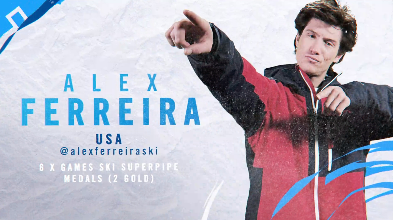
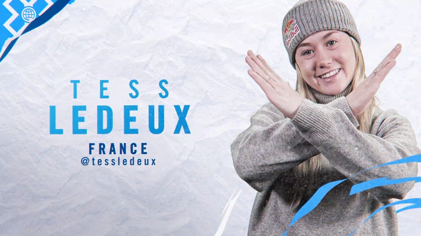
Various parts of the look include textural monochromatic photography, while full-color imagery is used to showcase athletes often with playful poses.
The look also leans heavily on simplified “X” icons and typography arranged in repeating matrices.
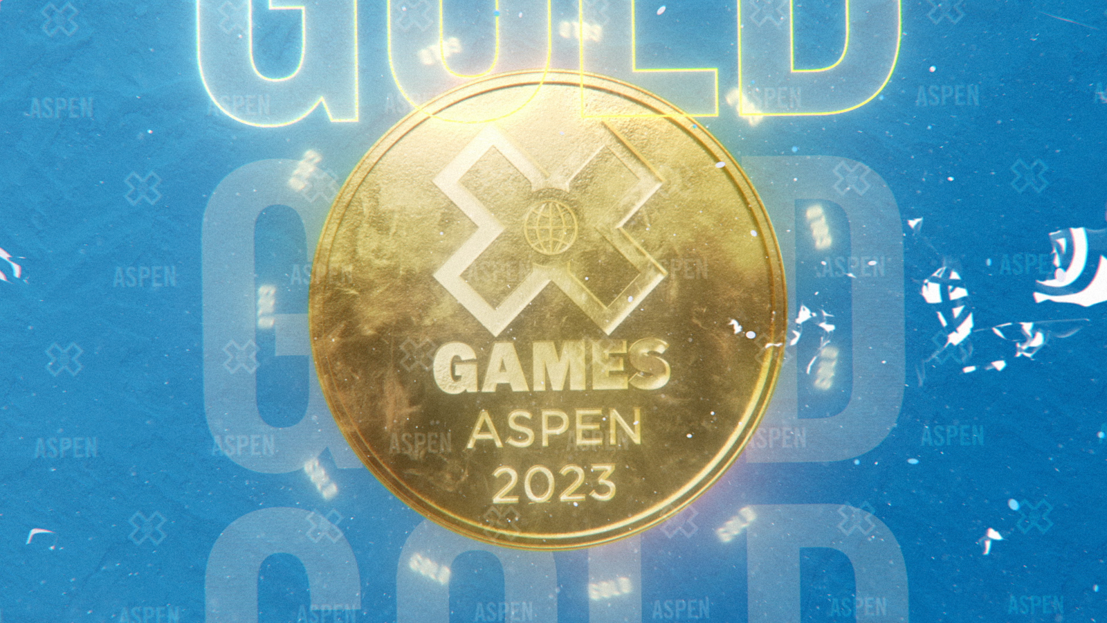
While most of the package remains on the cool side of the spectrum, brighter hues are included for sponsor interstitials – working in the brand’s specific colors from bright green for Monster Energy to warm hues for Chipotle.
Gameday also purposefully added in another 3D element through the use of interconnecting repeating diagonal lines that create the look of a woven pattern that forms peaked triangles, a shape that has been used in other winter-themed sports graphics and has visual connections to mountains, slopes and frozen fractals.
The X Games project is a reunion of sorts for Gameday and Steve Flisler, who previously collaborated on designs at Twitch. The X Games’ Neil Bandoni provided direction while Echo Entertainment’s Andrea Anderson helped keep the project organized and on-track
Subscribe to NCS for the latest news, project case studies and product announcements in broadcast technology, creative design and engineering delivered to your inbox.




tags
Adobe After Effects, Cinema 4D, ESPN, Gameday Creative, maxon cinema 4d, Redshift Rendering Technologies, Scott Flato, X Games
categories
Broadcast Design, Graphics, Heroes, Sports Broadcasting & Production