Grit gets updated look that blends western looks with modern spins
Subscribe to NCS for the latest news, project case studies and product announcements in broadcast technology, creative design and engineering delivered to your inbox.
Western-themed network Grit has launched a new on-air look.
The network, which is owned by E.W. Scripps‘ Katz Broadcasting, is mainly offered as a digital subchannel on stations’ signals across the country as well as streaming on FuboTV and Sling.
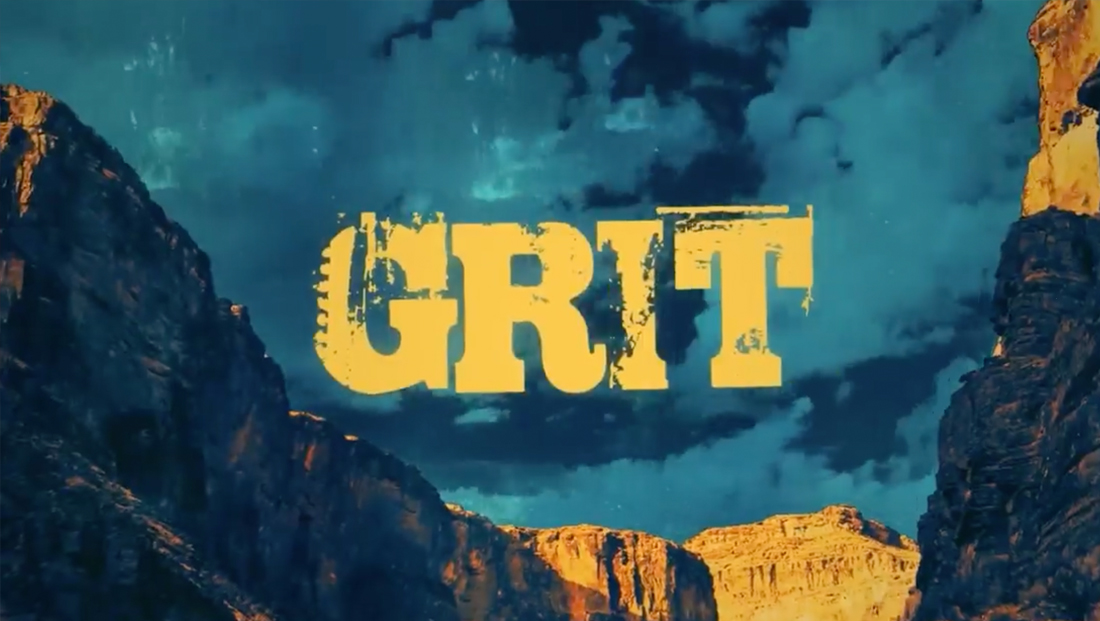
In keeping with its focus on western serials and films, the network retains a rough-and-tumble feel but with some modern takes on typography and color to prevent it from feeling too themed.
The network has retained its highly detailed logo, which is stylized to appear as rough-cut lettering with various purposeful imperfections, including, appropriately, a sawtooth-like element in the “G.”
However, the longtime practice of featuring the logo as an oversized 3D element inside western-themed scenes has been dropped in favor of inserting more realistically scaled logos into on-screen imagery.
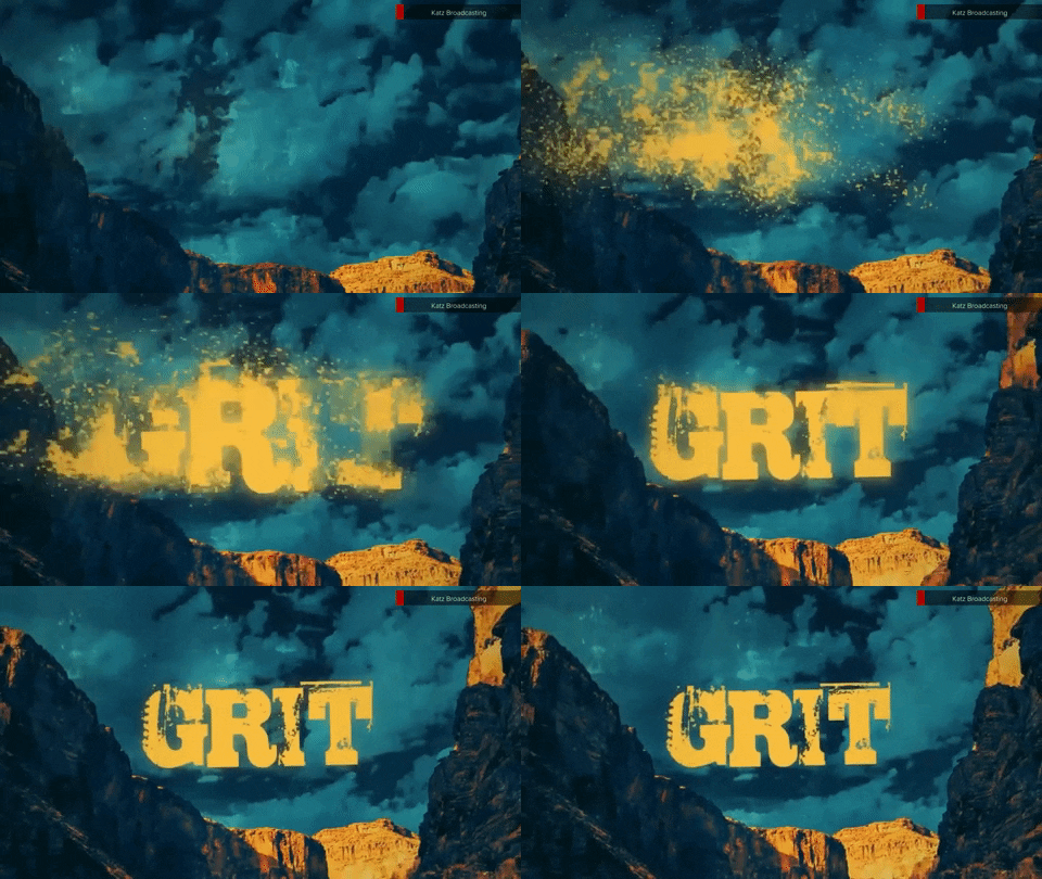
The design has also gotten a new color palette that largely draws on the earth tones one might expect in a western-themed design though many have been reimagined. It also works in distinct shades of blues and greens to add variety and flexibility — and possibly meant as nods to open skies and green cacti.
While promos do incorporate footage taken directly from the films and shows, the new branding also relies heavily on leveraging imagery that has been color-shifted or otherwise stylized to work within the updated palette designed by Scripps Creative Studio.
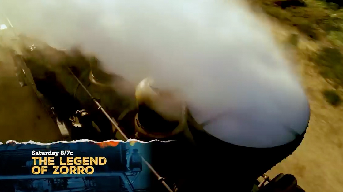
Like its logo and name, many of the on-screen visuals are highly textural — with options including grungy and rough mattes, frames, borders and edges inspired by brushstrokes, torn paper or natural elements including plants, geology and even the wind. Other elements include western landscapes and similar illustrations.
Much of the typography used in promos is highly textural as well, often featuring roughly smudge effects. There appear to be four typefaces used regularly — what appear the wide sans serif Nexa Rust Sans Black, the friendly, informal Museo Slab, the serif Fairplex and a bold, condensed textural typeface with a distinctive “R” and blocky serifs that could not immediately be identified.
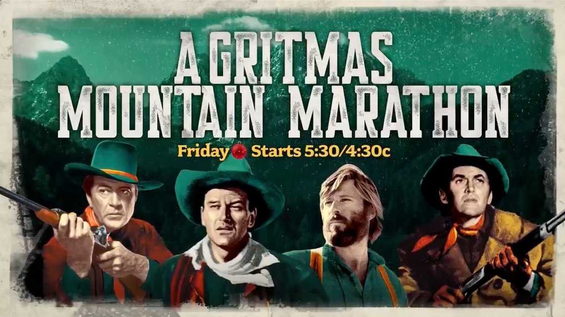
These typefaces have nods to fonts often associated with western-themed design, ranging from bold, wide ones with dramatic strokes inspired by hand-painted brush strokes to the narrow “wanted poster” style look. That said, they feature decidedly modern twists that, again, prevent the look from feeling too garish.
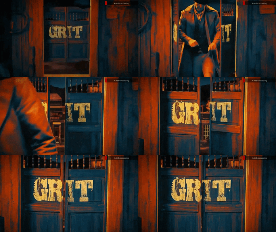
Network IDs now feature a variety of detailed miniature scenes — such as the logo shown on the iconic swinging doors of a saloon, on the side of a bottle next to shot glasses, on the front of a cowboy hat that’s tossed through the air or as a branding iron being seared into wood.
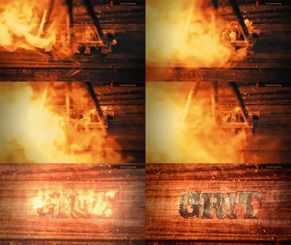
Along with these visuals, the network has also paid close attention to the audio elements of these idents, which can include a combination of twangy western-inspired music along with more subtle sounds such as squeaking hinges, cricket chirps or sizzles of wood being scorched.
The design was created by a team including Larry Morris, Dean Mellis, Debra Robey, Rich Klenk, B.J. Alden, Bill Kerner, Jesus Leyva, Robert C. Gural, Lindsey Wight, Jon Haight, Jessica Caravantes, Kelly Turner and Garrett Cook.
Subscribe to NCS for the latest news, project case studies and product announcements in broadcast technology, creative design and engineering delivered to your inbox.


tags
E.W. Scripps, Grit, Katz Broadcasting, Scripps Creative Studios
categories
Branding, Broadcast Design, Broadcast Industry News, Graphics, Heroes, Network Branding, Networks