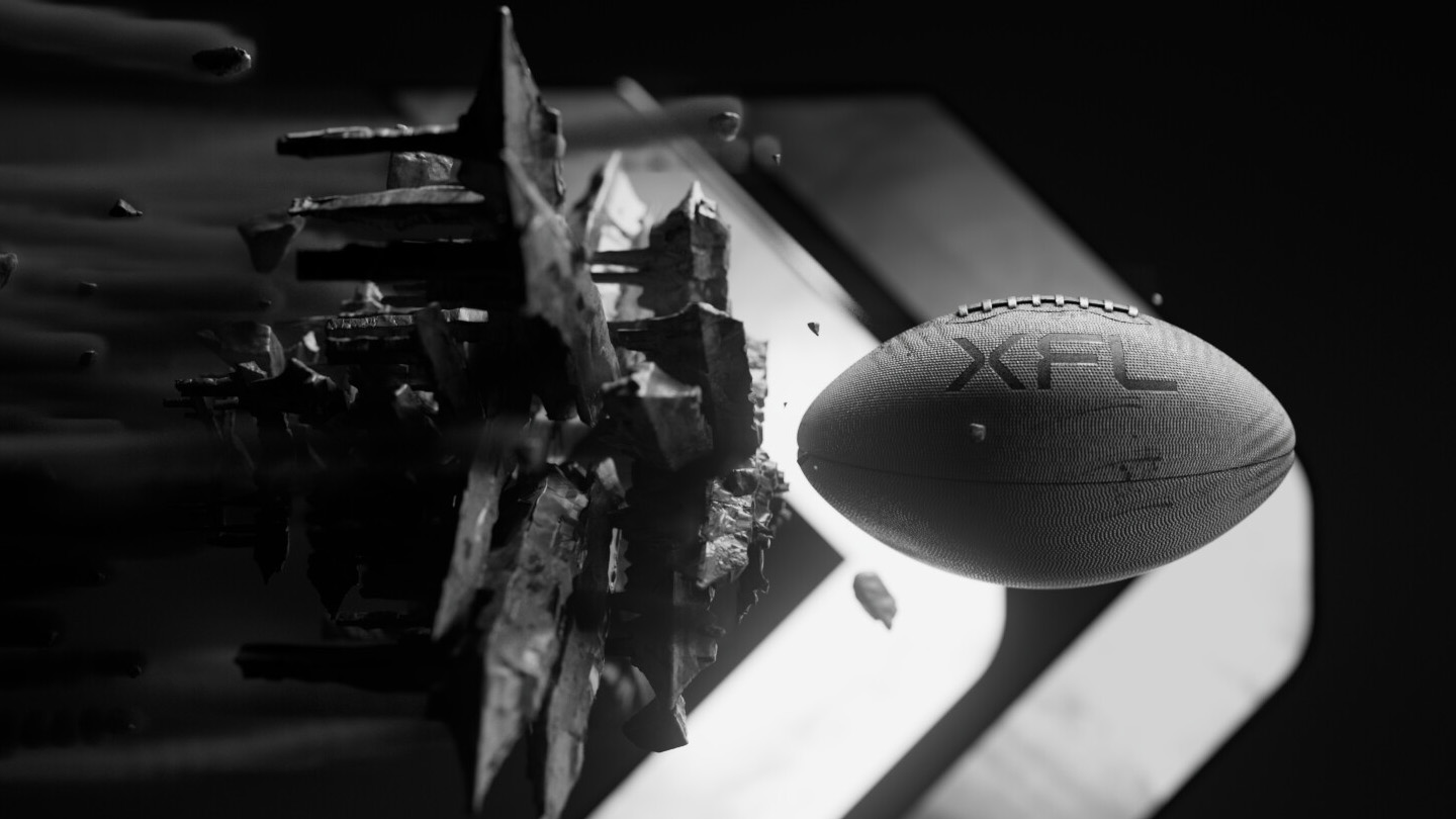
ESPN creates monochromatic, cinematic design for XFL coverage

Subscribe to NCS for the latest news, project case studies and product announcements in broadcast technology, creative design and engineering delivered to your inbox.
In an era of saturated colors and endless options in sports broadcasting, ESPN opted for a different approach to its design for the relaunched XFL.
“ESPN currently has two major football properties — college football and ‘Monday Night Football’ — and those have such unique looks and direction,” said Thomas Maloney, art director at ESPN Creative Studio. “One of the things we needed to keep in mind was just how do we differentiate it.”
Of course, the XFL already differentiates itself by its spring schedule, with the season following the Super Bowl and coming before most college football programs begin their spring training.
The league was originally founded by WWE’s Vince McMahon in 2001, with a new start in 2020 just as the pandemic began to sweep the world — leading to a quick demise mid-season.
This time around, the XFL is on better financial footing with ownership including Dwayne Johnson and Dany Garcia.


For the design, the team at ESPN looked to ensure the league would stand out amid a sea of colorful football programming while embracing the XFL’s new brand identity. A black-and-white foundation was crafted for the various XFL motion graphics and packaging, allowing the teams’ colors to shine through while maintaining a cohesive, cinematic aesthetic.
“You look at Fox, ‘Thursday Night Football,’ CBS, and everything is very colorful. That’s great because it really reflects the teams, but you get lost in the sauce a little bit if everything is very colorful, and we wanted XFL to stand out,” said Maloney.
The iconic “X” in the XFL logo was also central to the design process, with the creative team experimenting with various ways to emphasize the bold mark across the package.
Ultimately, they settled on an approach that conveyed strength without compromising the logo’s integrity. Working with agency Already Been Chewed, high-end visual effects sequences with the X in various treatments were created using Houdini.


Simulating various environmental effects, the X might be shown breaking rocks or surrounded by smoke, with its presence subtly affecting the surrounding scene.
These renders, which were paired with the items created by ESPN in Cinema 4D using RedShift and Octane, complemented the monochromatic foundation while adding a high-energy, futuristic element to the package.
Typographically, the package uses the Kuunari and TT Supermolot across various weights.
Maloney noted that while introducing new typefaces organically during the season was possible, it was essential not to overwhelm the viewer with too many elements right from the start.
The restrained use of typography combined with the bold black-and-white style creates a distinct visual identity for the XFL as the league reestablishes itself on the network and to the viewing public.
Subscribe to NCS for the latest news, project case studies and product announcements in broadcast technology, creative design and engineering delivered to your inbox.


tags
ESPN, ESPN Creative Studio, Sports, XFL, XFL on ESPN
categories
Broadcast Design, Graphics, Heroes, Sports Broadcasting & Production