
All three of Cavuto’s shows get new graphics

Weekly insights on the technology, production and business decisions shaping media and broadcast. Free to access. Independent coverage. Unsubscribe anytime.
Fox host Neil Cavuto debuted all-new looks for his three shows.
“Your World with Neil Cavuto,” which airs weekdays at 4 p.m. on Fox’s primary cable commentary channel, “Cavuto: Coast to Coast,” shown at noon on Fox Business, and “Cavuto Live,” running 10 a.m. to noon on Saturdays, all got updated opens and logos earlier in June 2023.
Cavuto stays busy appearing on three shows across two networks, and the use of his name in the titles is consistent, so it makes sense for all three programs to update their looks at once for consistently across the Cavuto “brand.”
All three dropped their more distinct, if not dated, logos in favor of the Futura-based typography that is used across many other shows on both networks.
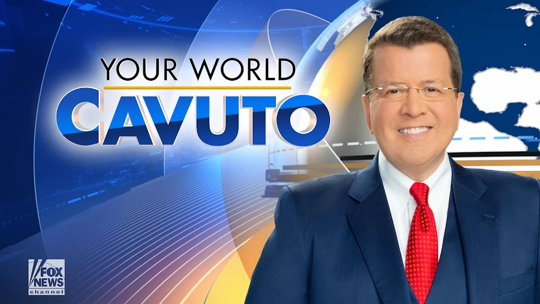
“Your World” switched to a two-tier logotype set in Futura, with the host name appearing larger and is small caps under a yellow underline. The design continues the practice of not including the word “with,” despite that being part of the official name.

The show open starts with, quite appropriately, the image of a globe with gold ring segments rotating around it. The globe zooms toward the camera and rotates, showing the segments as if they are hill-like paths. Meanwhile, red and green-fronted arrows fly by along with an image of New York and the U.S. Capitol, while elements such as 3D graph bars, flat version of graphs and charts and simulated stock tickers also appear.
A flash of light transitions to a view of the word “Your” curved along a ring above various global city names before “World” appears with a dark blue dotted background behind it.

Next, the red and green arrows fly toward each other as the letter “C” enters the scene, with the rest of the name popping up complete with an outline text overlay with a globe and various blue and gold curved elements behind it.
![]()
The show’s old logo was decidedly tired — it featured a thick serif typeface with noticeably faux small caps accented with a globe with square matrix representing landforms and both D.C. and business themed imagery. The logo felt much more in line with some of the old Fox looks that have been gradually replaced.
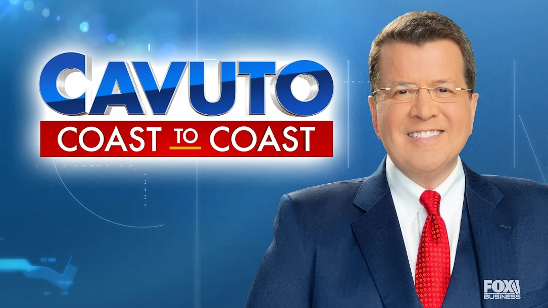
Over on Fox Business, “Cavuto: Coast to Coast” has an open that imagines the host’s name as letter-shaped sunken compartments with a variety of still and video imagery appearing on the inside faces of the characters. The logo continues to not include the color that is part of the name.
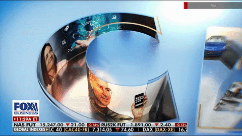
There’s a combination of topical and more evergreen imagery, including references to GM, Elon Musk and Lehman Brothers.
The opening animation has a total of three scenes of flying over the word “Cavuto” from various angles before a burst of light reveals the entire name as it zooms out to fit on the screen. It initially is most outlined with glass-like surfaces but fills in with blue to hide the imagery beneath.
The red box for “Coast to Coast” also enters in a side-to-side animation.
![]()
Previously, “Coast to Coast” had a logotype in a dynamic italic display font with a customized “C.” In many ways, it had the feel of a racing or aerospace logo and, while memorable, had also started to become somewhat dated. It also used two arrows, on facing left (or “west”) and one right (“east”) on either side of the word “to,” which was slightly smaller than the two instances of “Coast” on either side.
![]()
The “Cavuto Live” logo remains, in many ways, similar to its previous iteration. The fonts have been updated and the word “Cavuto” is now in all caps in a brighter blue and everything went from having rather tired 3D effects to more glassy, refined ones.

The angled red box around “Live” also remains, though with white type now instead of gray.

This show also works in some warmer, bold yellows, oranges and reds along with a circular, wedge and arrow motif.
The open starts with a “Main Street” scene inside what could be viewed as an off-axis view of the letter “C” with rotating colored segments. A bold blue arrow-like element transitions to a view of the Capitol set inside a chevron shape before another series of arrow-like animations switch the view to an exterior view of the N.Y. Stock Exchange building, likely meant to drive home the “Main Street to Wall Street” analogy (with a stop by D.C.).
There’s then a brief wide view of a circular, mesa-like form with a portion of the show logo visible on the side before a burst of light transitions the view to a view of the logo, set inside of a white area framed out by blue, red and yellow chevron-like shapes.
![]()
The old version used a title case sans serif and all-caps “Live” in rather dull colors.
While many Fox shows and other topical branding uses Futura and similar overall visual cues, some programming, such as “Hannity,” “The Story” and others still maintain unique logos, which are typically relegated to fullscreens and the “sliver” at the bottom of the screen.
Nearly all lower third insert graphics, however, are set in Futura.
tags
Cavuto Coast to Coast, Cavuto Live, fox business, Fox News, logo design, Your World with Neil Cavuto
categories
Branding, Broadcast Design, Broadcast Industry News, Graphics, Heroes