Danish newscast ‘TV Avisen’ gets bold on-air update

Weekly insights on the technology, production and business decisions shaping media and broadcast. Free to access. Independent coverage. Unsubscribe anytime.
The Danish Broadcasting Corporation’s “TV Avisen” program has debuted a clean and innovative new graphics package with some unique ways to display content on-screen, including bringing a new meaning to the phrase “pop up video.”
“TV Avisen” airs on DR1, one of three of the public broadcaster’s channels, representing the “DR” initialism that the broadcaster is commonly known by.
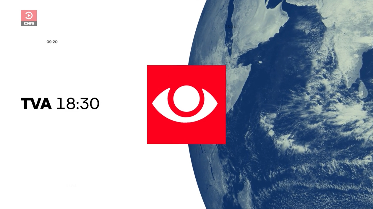
“TVA” uses a red eye-shaped logo with some visual similarities to U.S. network CBS’s logo.
The new look was designed to be digital-first but also serve as a bridge between TV and the web, according to the network.
The network’s trademark red color and oversized versions of the shapes inspired by the broadcast’s logo are used across the design, including in fullscreens and on-set graphics.
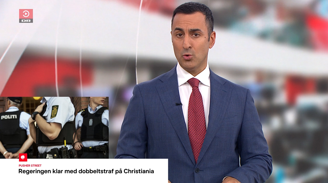
An anchor one-shot with a video pane in the lower corner above the lower third.
One hallmark of the design is an off-center anchor one-shot that appears to be meant to accommodate a “pop up” video pane that can appear in the lower left of the screen, typically above a lower third banner.
This element runs footage that would typically run under a traditional VO, but keeps both the anchor and the footage on-screen the entire time.

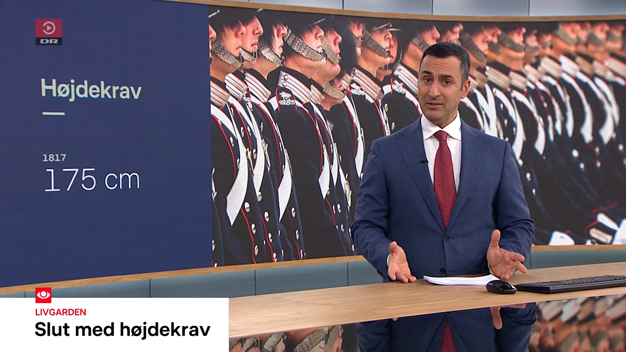
Other on-screen visuals include white lower-third banners tied to the screen’s lower left corner that never grow to full width.

The white banner can be topped with a small red box featuring an animated loop of the eye icon that can drop into the corner of the screen when a white banner isn’t being inserted.
In that way, it serves as both a bug and branding element that smoothly animates between its positions.
Those white banners have a quick red-accented entrance animation that is a nod to “popping up” as well. Banners can feature multiple lines of text, with a label set in smaller, red all-caps.
When the video pane is used, the headline shrinks down slightly and the clip element enters the screen using a similar entrance animation to the lower thirds.
While the package is heavily centered around the network’s trademark red and white, blue also plays a key role, including in the opening sequence where portions of the eye showcase a blue-tinted globe graphic, a change in the previous look that leaned more on a red-tinted world visual along with a lighter shade of blue.
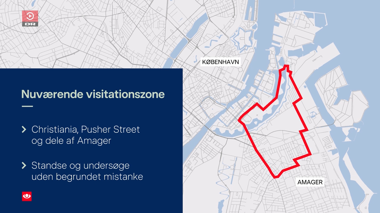
Solid versions of the new blue are used for elements such as fullscreen maps and a blue box added to the lower left of the screen used to showcase top stories.
Variations also exist across dayparts that feature other muted shades, such as a light sage green.
The look uses a suite of additional animations that include elements growing or shrinking in size to match the space needed for content, while leaning heavily on swipe-inspired transitions.
Like the small logo in the corner of the screen, the open is also stocked with rotation effects, including solid and outline versions of what would be the “white part” of the eye. The iris or lens of the eye ends up morphing into the globe element, which then grows in size to sit alongside the “TVA” name and time of broadcast with the logo positioned dead center over the border of the white background and blue globe.
Accenting the open are microtext elements featuring timestamps — though they are kept to a minimum. Also used are oversized typographic representations of the broadcast time and program name.

The broadcaster did not switch to a new set, but did update its default video wall graphics to feature a blurred version of the network’s newsroom.
The ultra-modern set’s video wall is so wide — it wraps around two entire walls — that a single representation of the newsroom doesn’t fit. Instead, there are several repeating visuals centered on the newsroom’s suspended LED ring that peek through simulated frosted shapes inspired by the logo.
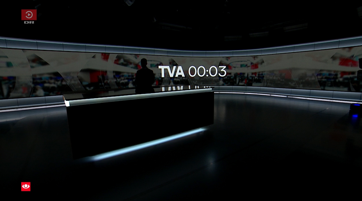
In a wide bump shot at the top of select broadcasts, the “TVA” logotype appears along with a countdown on the video wall with a subtle “flick”-style animation.
As the countdown hits zero, the newsroom disappears from view with a left-to-right red and white transition effect.
The element appears to be carefully timed to when the when the open animation enters from the far right of the screen, moving from right to left and completing an imaginary ring in the 3D space that exists between the video wall and outer auspices of the studio shown in the bump.
The video wall backgrounds are subtly animated to include flickering screens and people moving around, with the various layers of simulated frosted elements overlaid.
Other video wall options include topical graphics, mostly devoted to imagery from the story in question. The broadcast can also added colored boxes for key points alongside the images.

tags
Danish Broadcasting Corporation, TV Avisen, Video Walls
categories
Broadcast Design, Broadcast Industry News, Graphics, Heroes, TV News Graphics Design, TV News Graphics Package, TV News Motion Graphics Design