
CNN overhauls election graphics package for 2024
Weekly insights on the technology, production and business decisions shaping media and broadcast. Free to access. Independent coverage. Unsubscribe anytime.
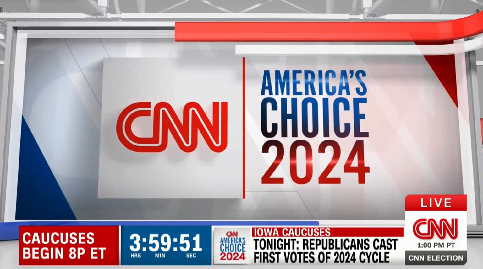
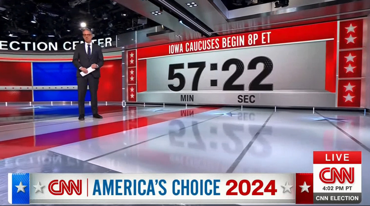
CNN introduced new election graphics during its live coverage of the Iowa Caucuses on Jan. 15, 2024. The package draws on elements from the previous design while moving the network closer in line with 3D looks introduced elsewhere.
The package made its full debut at 7 p.m. Eastern Time that Monday, though elements of it started showing up throughout the day in the baseline box and commercial squeezebacks.
The network’s old look, shown on the video wall behind the anchor desk, mixed with the new bottomline during the day Jan. 15, 2024.
The old look, which debuted ahead of the 2020 election, relied on a mix of angled elements and animations, 3D ribbons, stars, and monochromatic girders.
Another look at CNN’s old-style election open that aired earlier in the day on Monday, Jan. 15, 2024.
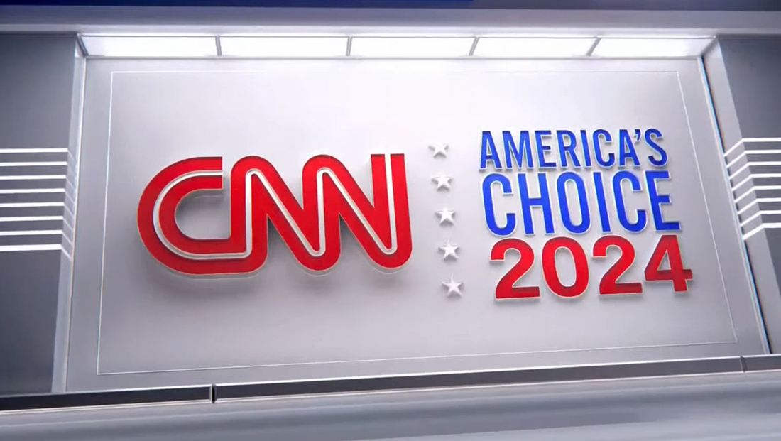
CNN has kept its “America’s Choice” branding and continues to display those two words in a condensed sans serif. The updated design, however, switches the “2024” below to a bolder, wider sans serif.
The new look, created with the help of Two Fresh Creative, retains hints of the old package but dials up the 3D glassy and metallic elements. It brings depth and dimension to the various studio video walls.
On Monday evening, CNN rolled an extended pre-produced cold open that used a series of darker graphics rendered to appear as if the viewport was within a large, sprawling dark space defined with rectangular and square structural elements.
The cold open retained the custom music composed by Stephen Arnold Music and CNN’s trademark election theme music.
![]()

Many of these scenes included various views of an imaginary wall with space to display a video clip inside a 3D alcove. The alcove was wrapped with a series of red, white and blue borders and bars in various thicknesses, including some strong red verticals.
On either side, the space featured walls with a repeating reveal line pattern, creating a linear texture of sorts.
The scenes spotlighted the 3D space’s shiny floor along with what appeared to be a riser with a red side sporting repeating stars.
The riser featured a thick glassy slab above and below, creating a prominent bevel effect, also found in 3D text used in the open alongside relevant imagery.
This text was displayed with a subtle 3D outline, creating an illusion that the faces of the letters were farther from the viewport than those borders. However, the outline could also be seen as falling behind the letters, more like a traditional bevel, creating a push-pull effect.
A diagonal motif was used in some of these screens, including a red fill overtaking white lettering and the text used in the lower left, which varied between a diamond-like pattern and thin diagonals.
After the meat of the cold open ran, a fully animated sequence appeared on screen, starting with a highly glassy 3D version of the CNN logo. This was followed with blue and red “24” panels that slid aside to reveal the America’s Choice logo, which appeared as dimensional lettering with a vertical line of stars installed on one of the walls of the same imaginary space featured in the open.
These animations also notably had a lighter feel, with more off-white and light gray.
A quick swing-around by the viewport revealed a wall with candidate portraits which then opened star-ship style into the ceiling and floor to reveal a second 3D space showcasing a silvery outline of Iowa along with the subtitle “Iowa Caucuses.”
This was then eclipsed by an elaborate sandwich of stepped stars accented with plenty of 3D metallic effects, beveled edges and blue and red faces featuring additional CNN logos and references to the caucuses. Both of these scenes can presumably be updated for other election-related coverage, such as the New Hampshire Primary.

Finally, the stack of stars begins separating, with the camera zooming through the opening to reveal live video — in this case the Iowa Capitol in Des Moines.
For on-set video walls, the 3D effect is most notably used to create quasi-virtual set extension looks that draw on the open’s idea of 3D alcoves.
Most of the on-set video wall graphics have 3D effects that attempt to blend in with the real scenery.
The actual 3D alcoves come in a variety of configurations and can also include matching 3D text that appears to be sitting on the bottom part of the alcove.
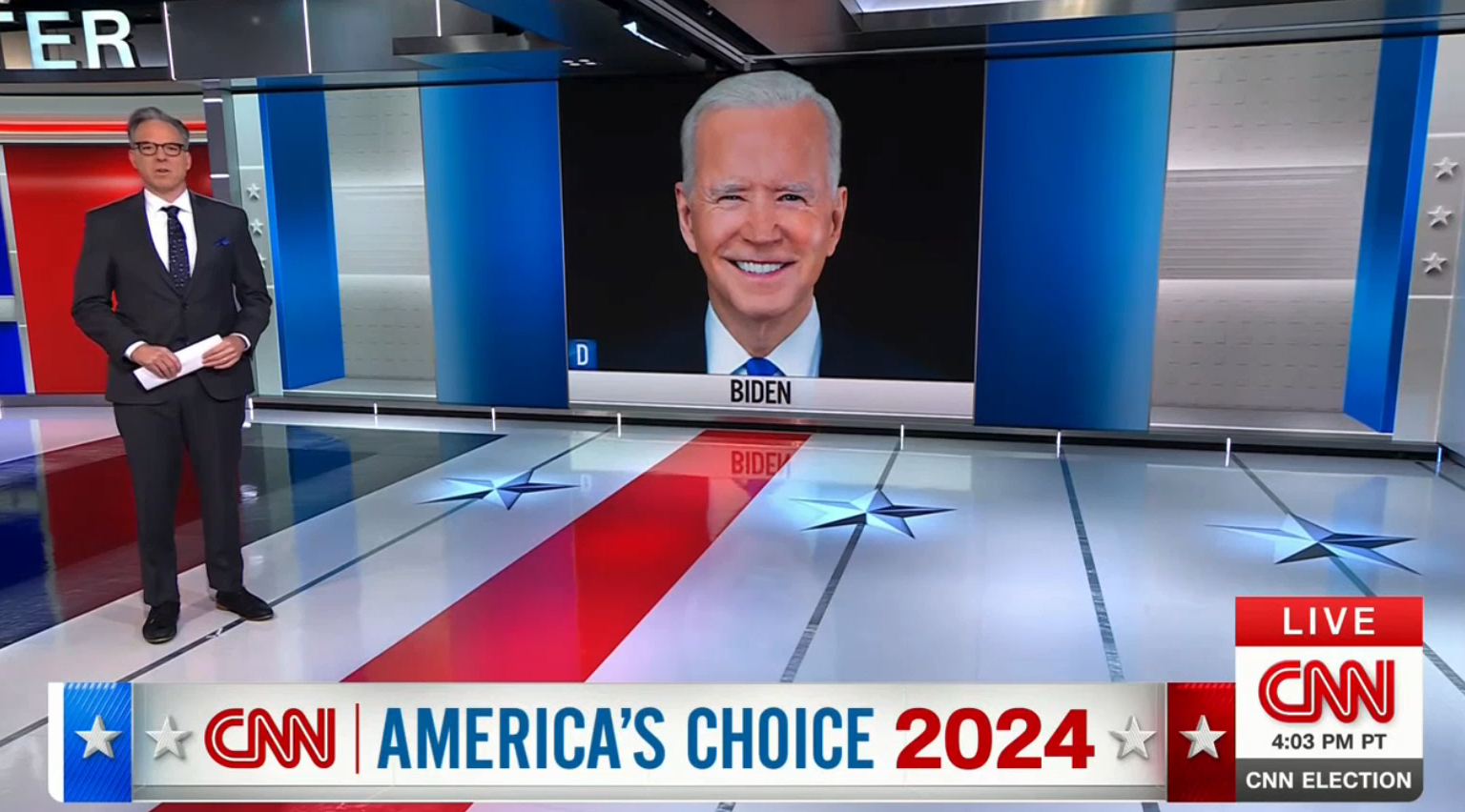
This variation includes blue accents to coordinate with Joe Biden’s party affiliation. Note the redesigned baseline banner with the diagonal line textures, blue space on the left and red bar on the right with the diamond texture in the background. The off-white space between showcases the updated ‘America’s Choice 2024’ look along with additional stars and a 3D ledge look along the bottom.
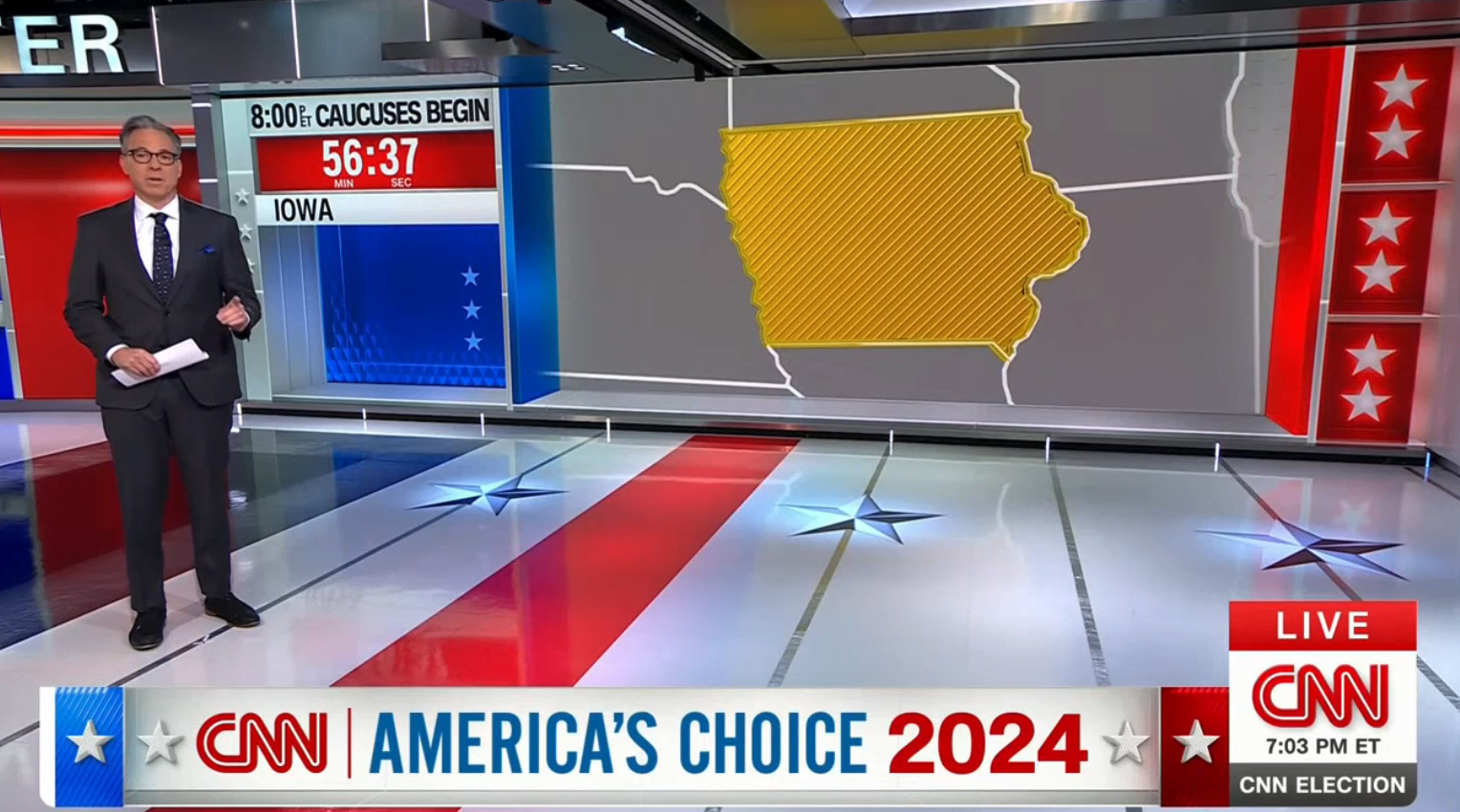
Here, the map of Iowa occupies one alcove, while additional text and a countdown sits in the upper left, with an empty blue space backed with the diamond texture and star accents sits empty, creating a a feel of some built-in furniture or cubby holes.
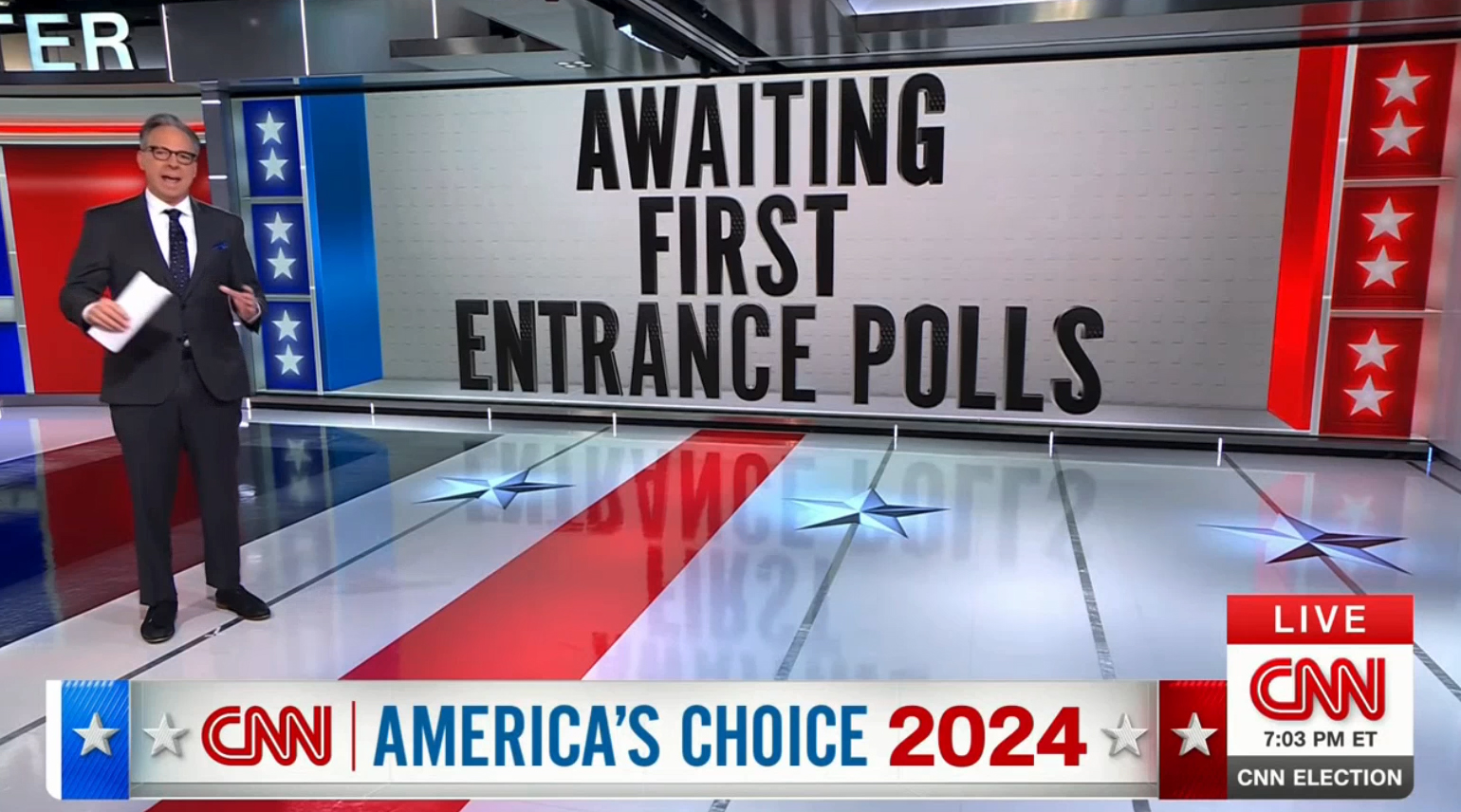
This version features three lines of text, though only the final one actually appears to sit on a the 3D surface. This example also showcases the stacked columns of stars with 3D mullion effects that are used on other video walls as well.
As CNN moves between video wall graphics, there are two distinct options.
The first option is a quick animated wipe featuring what appears to an oversized, softly embossed version of the CNN logo on a white background. This look, incidentally, appears to be at least part of the influence for graphics found in the network’s election-themed promos that have been airing since 2023.
Those promos, however, take the oversized CNN logo a step further with red and blue outlines peeking through. The text in these promos also uses mixed case in a wider, friendly version of CNN Sans, as opposed to the condensed all caps used throughout most of the updated election package.
![]()
The second option includes having the graphic slide up toward the ceiling, garage door-style, revealing the next look appearing to sit behind it.
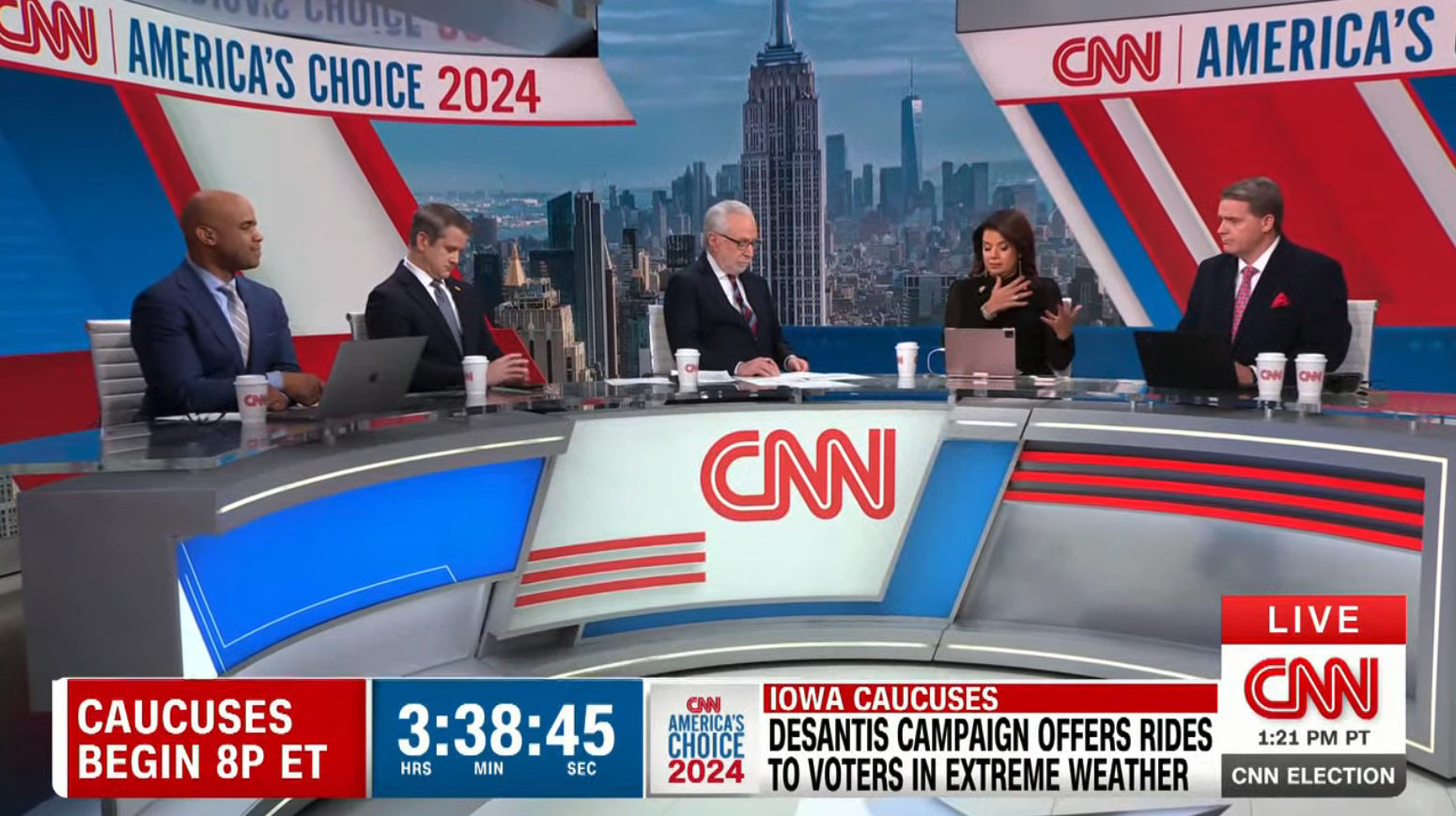
Throughout the evening, additional venues in both New York and Washington, D.C. were used, most with large swaths of seamless LED. The network added a variety of background options behind talent, including red and blue panels divided by simulated silvery columns with reveal lines or mullion-style frames, more star columns in red, blue and silver, and variations of the alcove look with a cityscape view fed to the opening.
The network continues its use of keeping a large banner running along the top of many video wall graphics, including the one behind the Washington, D.C., panel, that simulates the feel of a header installed over a window.
Many of these graphics can be considered virtual set extensions, at least to some degree, because they appear to suggest that there are additional 3D elements on the set — however believable this ends up being.
This approach has become common across CNN, including on its flagship dayside program “CNN NewsCentral” and much of its primetime programming, with various video wall graphics attempting to simulate the look of structural scenery.
For the most part, the election look has fewer of the issues found with CNN’s other attempts at this effect, including oddly-scaled textures and less-than-convincing 3D effects and shadows that look more like Photoshop bevel and emboss layer effects.
The effect is actually more convincing when the graphics being shown use only elements such as maps, cut-out portraits and labels because these blur the line between what’s supposed to be real or not, unlike the large 3D lettering that sits on the ledge of the alcove — which, while eye-catching, just feels like it had gone a bit too far.
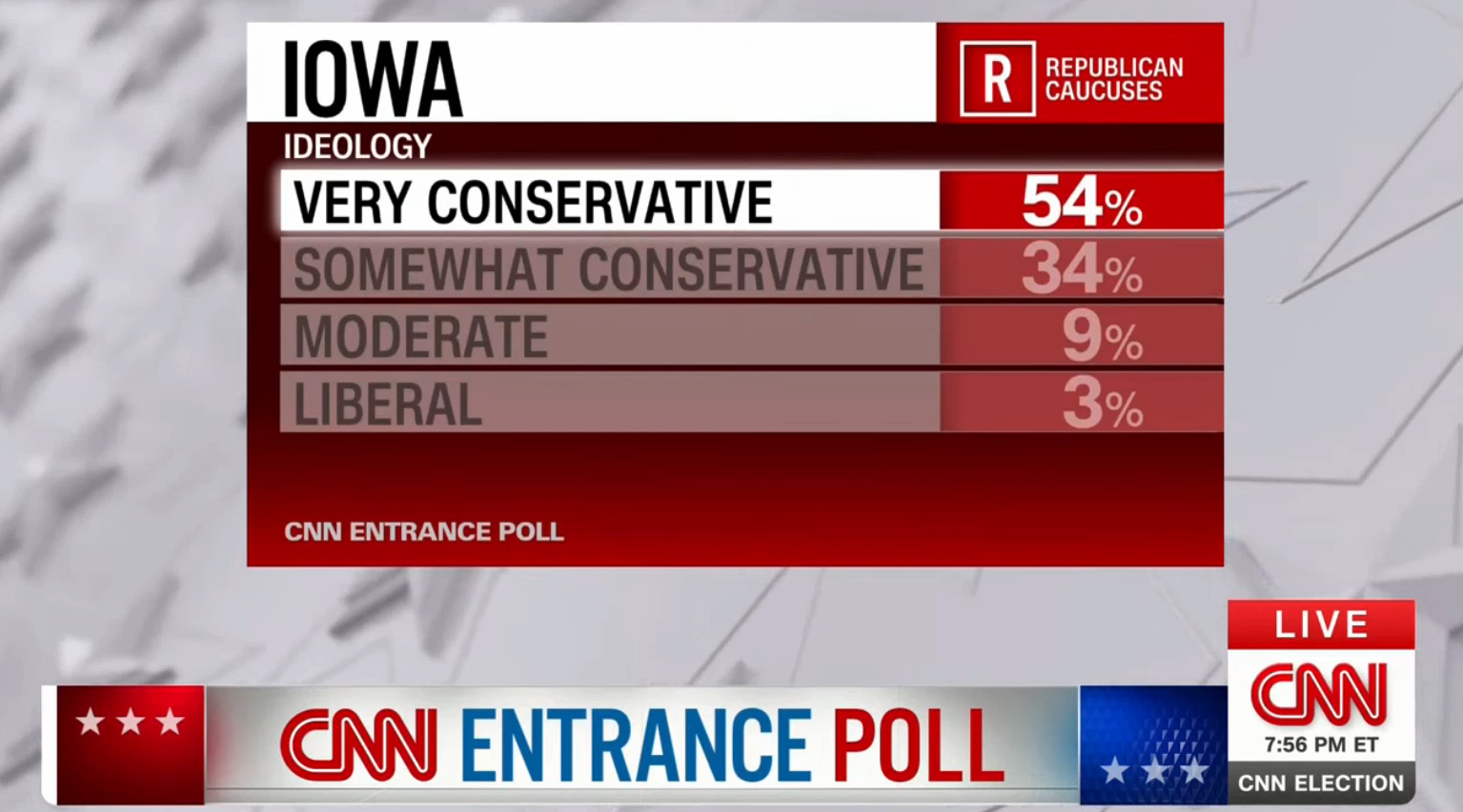
CNN also introduced an updated look for its fullscreen data graphics. These are often displayed against a looping gray background featuring blurred versions of 3D stars, with the look becoming flatter and more embossed as it moves from left to right.
These graphics have the advantage of being clear and easy to read. And, because they are set against the animated background, you don’t have to worry about the on-screen bug, bottom line, or other elements covering it.
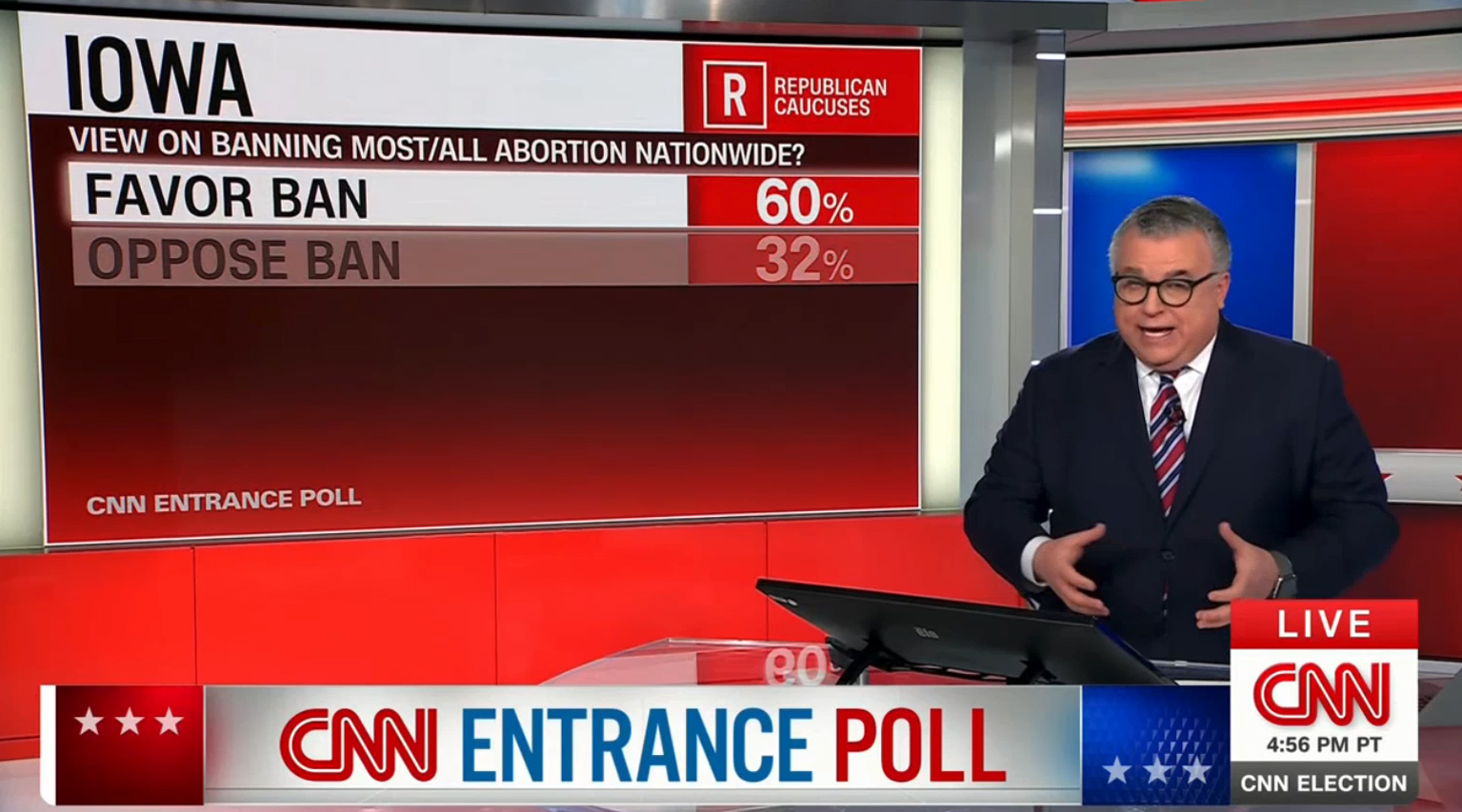
The approach also lets CNN use the same graphic, just without the white background, on on-set video walls behind talent — including being able to keep the graphics relatively the same size whether the control room takes it fullscreen or feeds it to a video wall.
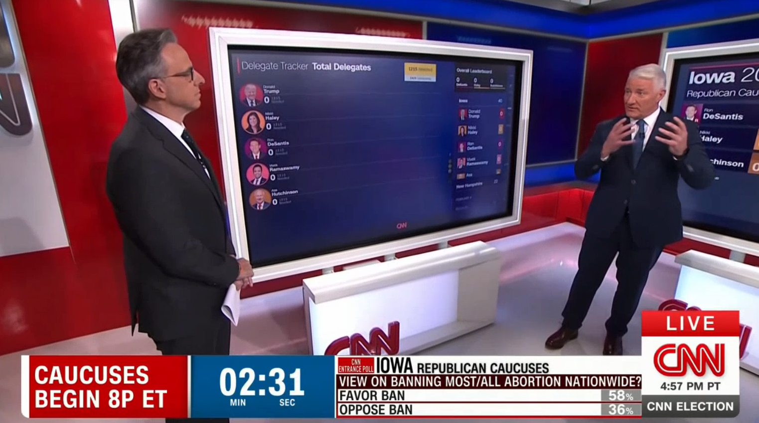
CNN’s trademark Magic Wall on-set touchscreens retain the previous look used during the last cycle.
Elsewhere on the network, some shows continue to use the old, angular election look as of Jan. 16, 2024.
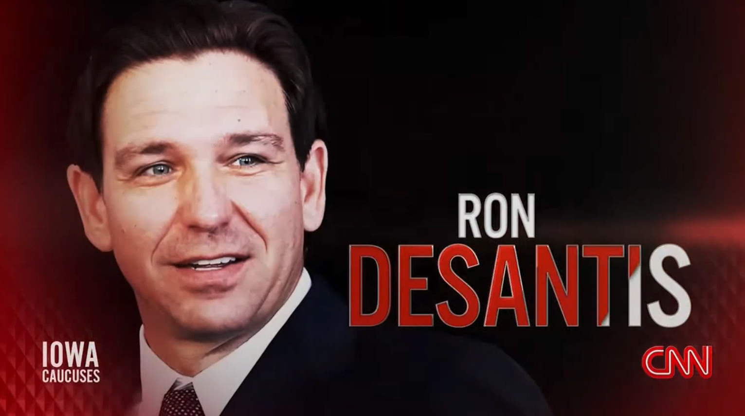
For the network’s New Hampshire town hall with Ron DeSantis, the new design was present in the stage design with updated banners.
The network’s heavier use of 3D and imaginary virtual spaces has connections to other looks used in broadcasting today. It’s hard not to see connections to CBS News’ election graphics look. There are also some similarities with the newly-debuted ABC-owned stations graphics package, including the implementation of 3D alcoves.

tags
2024 Election, CNN, cnn election, cnn elections, election, Two Fresh Creative
categories
Broadcast Design, Elections, Graphics, Heroes