
PBS gets updated election look for 2024
Weekly insights on the technology, production and business decisions shaping media and broadcast. Free to access. Independent coverage. Unsubscribe anytime.
“PBS” has updated its election coverage look with a new look from Vivid Zero that combines red and white striping that flow over the iconic “faces” in the PBS logo.
The design, introduced for coverage of the Iowa Caucuses Jan. 15, 2024, starts with a simple dark blue background with flowing red and white ribbons as the primary animated visual and is being used across the organization’s various news and public affairs programs, including “PBS NewsHour,” “Frontline,” “Washington Week,” “Firing Line” and “Amanpour & Co.”
Arranged in an alternating pattern, these ribbons appear to hit invisible bumps in many of their meanderings, cascading down briefly before continuing on.
That quick shift in direction was inspired by the PBS logo, which features the profile of three faces, meant as a nod to the viewers PBS serves. In its case study of the project, Vivid Zero notes that it the stripes “echo the interior profile faces.”
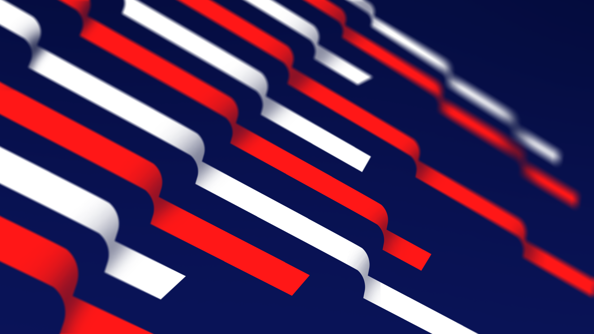
That echo can be repeated multiple times, forming a stair-like look.
![]()
The ribbon can also take a sharp, 90-degree turn in select instances.

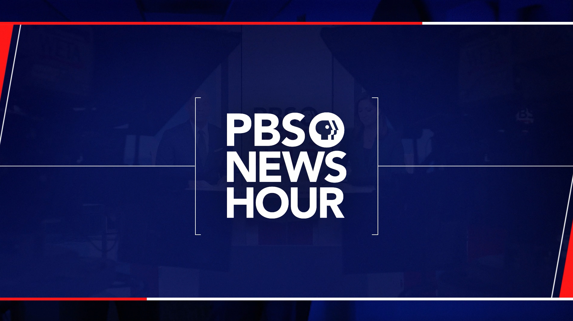
In this sequence, a trio of ribbons enters the screen from the left, flowing dramatically away from the viewer before that sharp bend that then takes one gentle step down before revealing the typography. The PBS shield and wordmark fade into view before the ribbons reach it, and the top red ribbon meets up with the logo and continues flowing right.
The middle white stripe and lower red one likewise flow through the “Vote 2024” lettering. All three lines continue going just past the far right of the year before taking another step down and ending.
The stripes are capped off on the right by an angle that is suggested by both the italic “Vote” logotype and the arrangement of the faces in the logo and, subsequently, how the ribbons flow away from the viewer.
Carefully attention has been paid to how typography enters, with the “V” and “O” animated as if they are being drawn on screen, including a clocklike spin on the latter.
However, the “T” and all glyphs after it appear as the stripes travel by in a sort of wipe-like motion. The upper bar of the “T” and three horizontal arms of the “E” are hinted at by the the two stripes as well as the addition of a series of smaller shapes that appear between the lower two ribbons.
At the very end of the logo animation, meanwhile, the stripes on the left continue their horizontal animation, ebbing into the final lockup, which only features stripes to the right of the PBS shield, wordmark and election branding.
Vivid Zero also produced a promo spot that reveals of the look is rounded out. The angular element is continued with both colors and matted out animations used to reveal a variety of imagery and graphics.
In most of these looks, the curved, flowing look in the stripes is dropped in exchange for cleaner, sharper angles and is further accented by horizontal bars of red and white along with thin white lines, an element that seems to be becoming a trademark of Vivid Zero, as well as bracket-like elements for showcasing show logos.
![]()
Previously, PBS used the “Vote (Year)” branding going back several cycles, typically with a geometric typeface. Recent iterations included three red stripes capped with a white star.
PBS lasted updated its overall look in November 2019, including a redraw of the longtime “profile” logo and updated wordmark.

tags
2024 Election, Amanpour and Company, Firing Line, Frontline, logo design, PBS, PBS News Hour, Vivid Zero, Washington Week with The Atlantic
categories
Branding, Broadcast Design, Broadcast Industry News, Elections, Graphics, Heroes, Networks