
MSNBC spotlights talent inside its tagline
Weekly insights on the technology, production and business decisions shaping media and broadcast. Free to access. Independent coverage. Unsubscribe anytime.
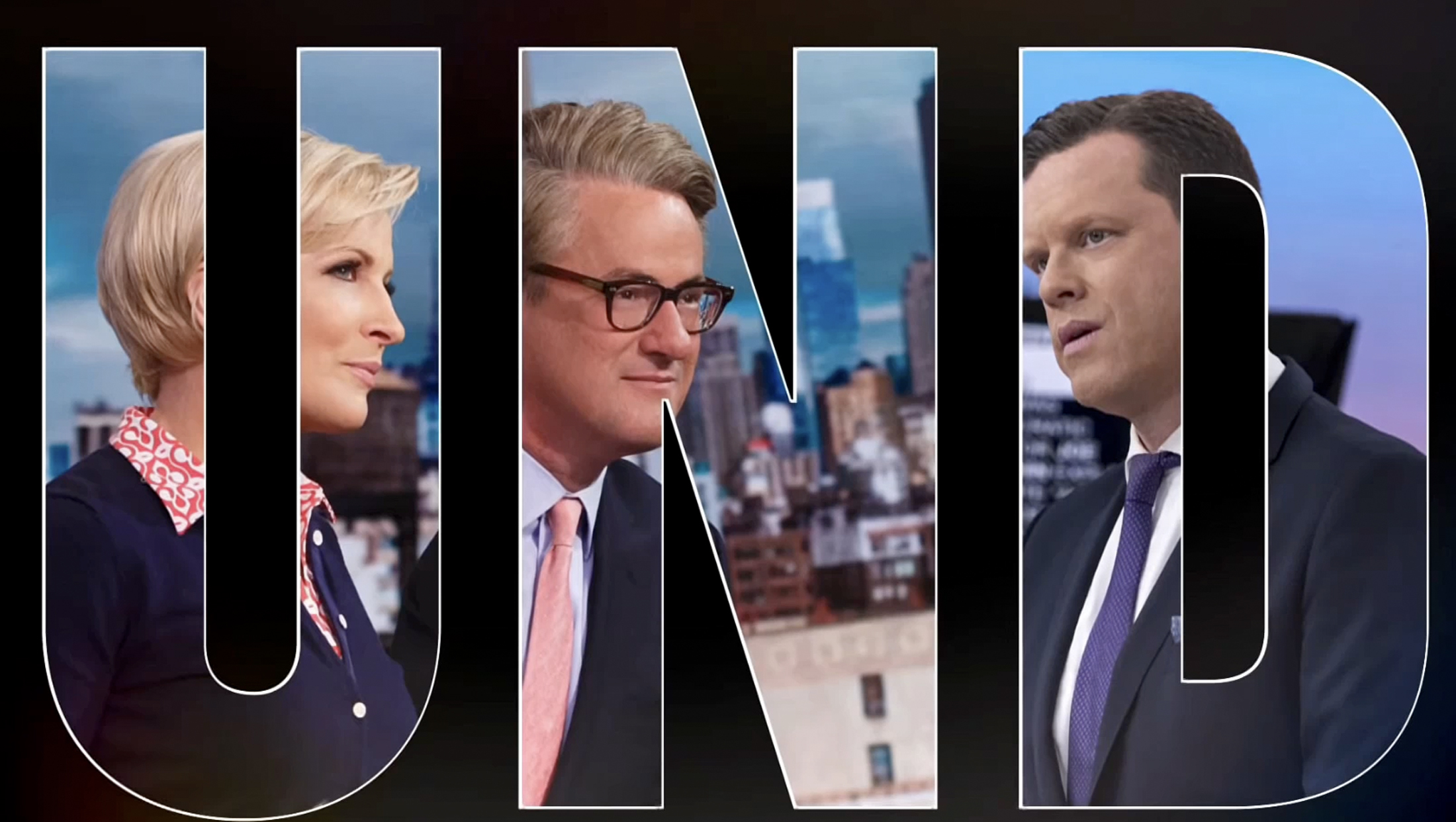
MSNBC is using a rather simple and straightforward approach to frame its talent and tagline.
This clean spot features oversized letters spelling out the network’s “Understand more” tagline spread across multiple screens, with each letter framing a photo of a specific anchor or host.
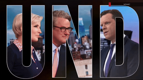
“UND” is first, with Mika Brzezinski, Joe Scarborough and Willie Geist, the core “Morning Joe” team, “ERS” frame out “Deadline: White House” anchor Nicolle Wallace, “The Beat” host Ari Melber and Joy Reid, who hosts “The ReidOut,” who appear in the late afternoon and early evening hours.
“AND” showcases “Inside” anchor Jen Psaki, Chris Hayes and Rachel Maddow (Psaki anchors Mondays in Hayes’ normal “All In” spot).
Next up is “MOR” featuring Alex Wagner, who anchors “Alex Wagner Tonight” Tuesday through Friday in the spot used for “The Rachel Maddow Show” Monday spot, “The Last Word” host Lawrence O’Donnell and Stephanie Ruhl, host of “The 11th Hour,” who fill out the rest of network’s primetime schedule.
The “T” and final “E” in the tagline do not fully appear in the larger text screens and are filled with generic imagery from a neighboring photo once the view switches to the entire lineup of faces inside of the complete tagline, which is centered on-screen.
The text then fades to white before the MSNBC logo appears below it.
There is also a version that showcases “MSNBC Reports” dayside anchors Ana Cabrera, José Díaz-Balart, Chris Jansing, Katy Tur, Alex Witt and Andrea Mitchell. This one is slightly different in that talent take up more than one letter and some even share a letter with another.

Mitchell actually gets the entire word “More” to herself.
Overall, the concept is fairly simple: It’s a way to showcase both a slogan and tagline and could likely adapt for a local campaign using a station’s news branding or slogan, depending on the number of talent being showcased.
Some planning was likely needed to pull off this promo, since each host needed to have a photo that would crop well within their assigned letter and in the order the network wanted them to appear. The photos needed to be able to not chop off a key part of someone’s face so they remained recognizable.
That, combined with the fact all of the photos appear to be a similar style and not the network’s official headshots of anchors, means it’s likely they were snapped especially for this promo (though they may go on to have other uses).
It’s easy to see how photographs might have been given a rough outline of the letter shape each photo needed to fit it, as well as which ones needed extra spacing to fill out the extra two letters not filled with talent photos.
MSNBC wisely selected a thick narrow typeface that both allowed adequate room for photos and fit well in the roughly three-letter-per-screen approach while also integrating well with portrait style-photos.
The promo would also be fairly easy to update in the event of talent changes, though for continuity any new photos would need to be commissioned in the same style. Timeslot changes either with or without talent changes could prove more of a challenge because it might not be as simple as moving someone from one letter to another given how well they are framed.
MSNBC previously used the “This is who we are” tagline in two distinct variations, with the tagline also spreading to NBC News as a whole for some spots.

tags
Alex Wagner, Alex Wagner Tonight, Alex Witt, Ana Cabrera, Andrea Mitchell, Ari Melber, chris hayes, chris jansing, Deadline: White House, Inside with Jen Psaki, Jen Psaki, joe scarborough, José Díaz-Balart, joy reid, katy tur, lawrence odonnell, Mika Brzezinski, MSNBC, MSNBC Reports, News Promos, Nicolle Wallace, promos, rachel maddow, Stephanie Ruhl, The 11th Hour, The Beat, the last word, the rachel maddow show, The ReidOut, TV Promos, willie geist
categories
Broadcast Design, Cable News, Featured, News Promos and Sports Promos