‘A’ for effort? The L.A. Olympics don’t have a single official logo — but why?
Subscribe to NCS for the latest news, project case studies and product announcements in broadcast technology, creative design and engineering delivered to your inbox.
Although the 2028 Summer Olympics are still about four years off, it’s never too early to start talking logo design for the next games, right?
Los Angeles 2028’s organizing committee had previously announced that it wouldn’t have just one logo for its iteration of the games.
(Before continuing, it’s worth noting that the designs covered in the first part of this post may or may not be used by broadcast networks by the time 2028 rolls around. As discussed below, these designs are often done separately, as are logos developed during the bidding process.)
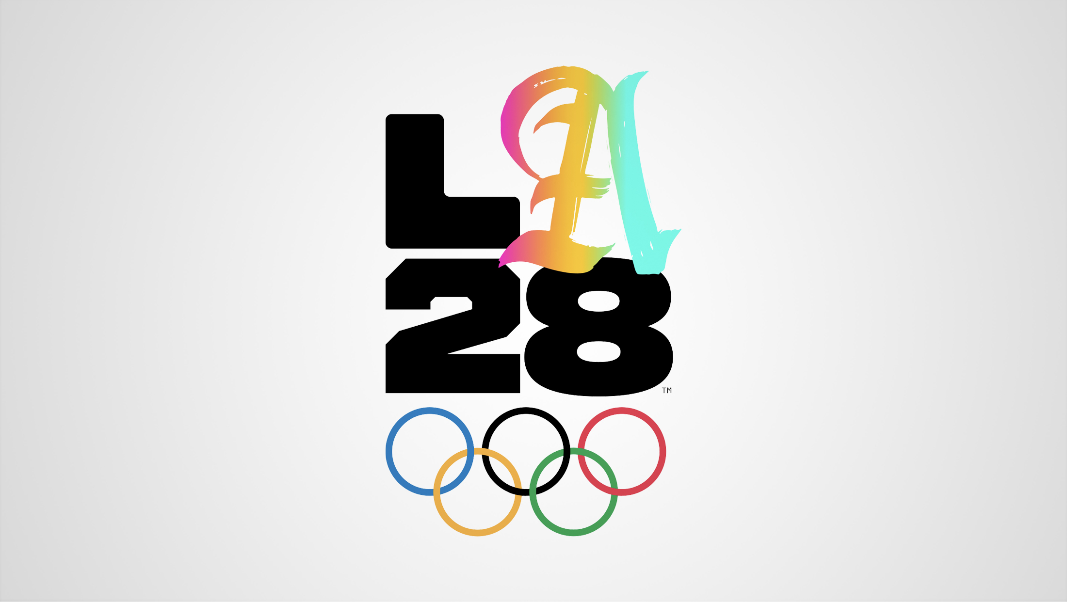
Each version follows the same basic principle: The number “28” in a wide, bold font with an “L” above the “2.” There’s then a blank space above the “8” where any number of “As” can be dropped in.
The Olympic rings are placed below.
To be clear, there is no single “official” or “default” logo as one might expect. There’s not even a version with the “A” displaying as matching the letter “L” and numbers “2” and “8” in the lockup.
Not having a single, “official” version is a bit odd — for example, if someone needs a general, all-purpose image to represent the games, should they just pick one a random? There could also be challenges with what version appears in the Olympic Broadcasting Services open that many networks around the world air.
The multiple logo concept would like work better, however, in applications such as venue signage, since various iterations could be used in patterns along with other design elements.
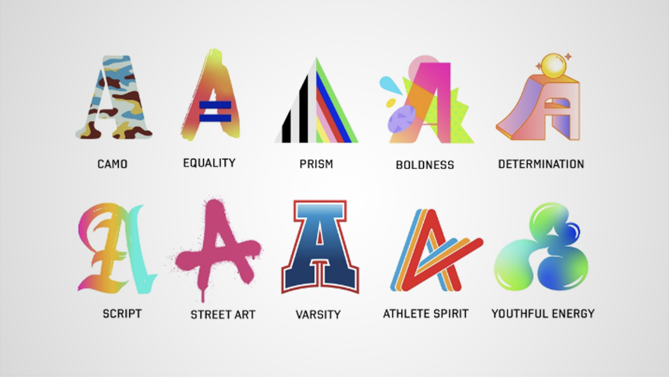
Meanwhile, the exact number of “As” available to be part of the Los Angeles Olympics logo keeps growing. As of this writing, it’s sitting at over 40, which is up from the 35 originally released.
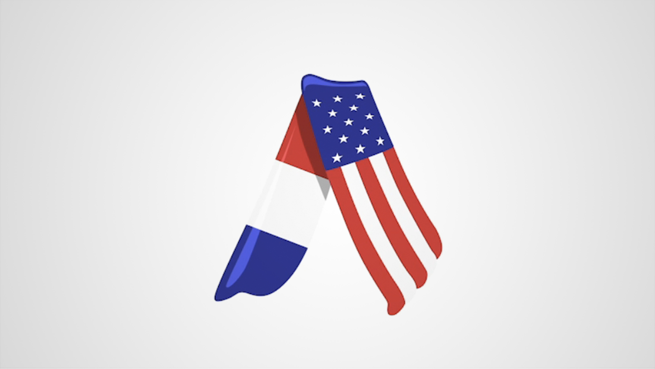
In fact, a “handover” version was introduced as the Paris games were wrapping up — its features an upside-down “V” that seems suggestive of the Eiffel Tower with a French flag motif on the left and U.S. flag one on the right.
Designs come from athletes, creators, artists and other sources. There are versions inspired by celebrities and other prominent names, including Snoop Dogg and Billie Eilish, though all are supposed to “showcase the breadth of themes and stories from Southern California’s beauty to diversity,” according to the Los Angeles 2028 site.
Each variation also comes with an animated version. To see clips and browse the collection of As (including ones released in the future), the LA 2028 site has a section devoted to the logos.
The concept also serves as a cautionary tale of trying to replace letters with shapes. In most cases, the LA28 logos used a design that’s very clearly an “A,” though some designs require a bit more imagination and interpretation.
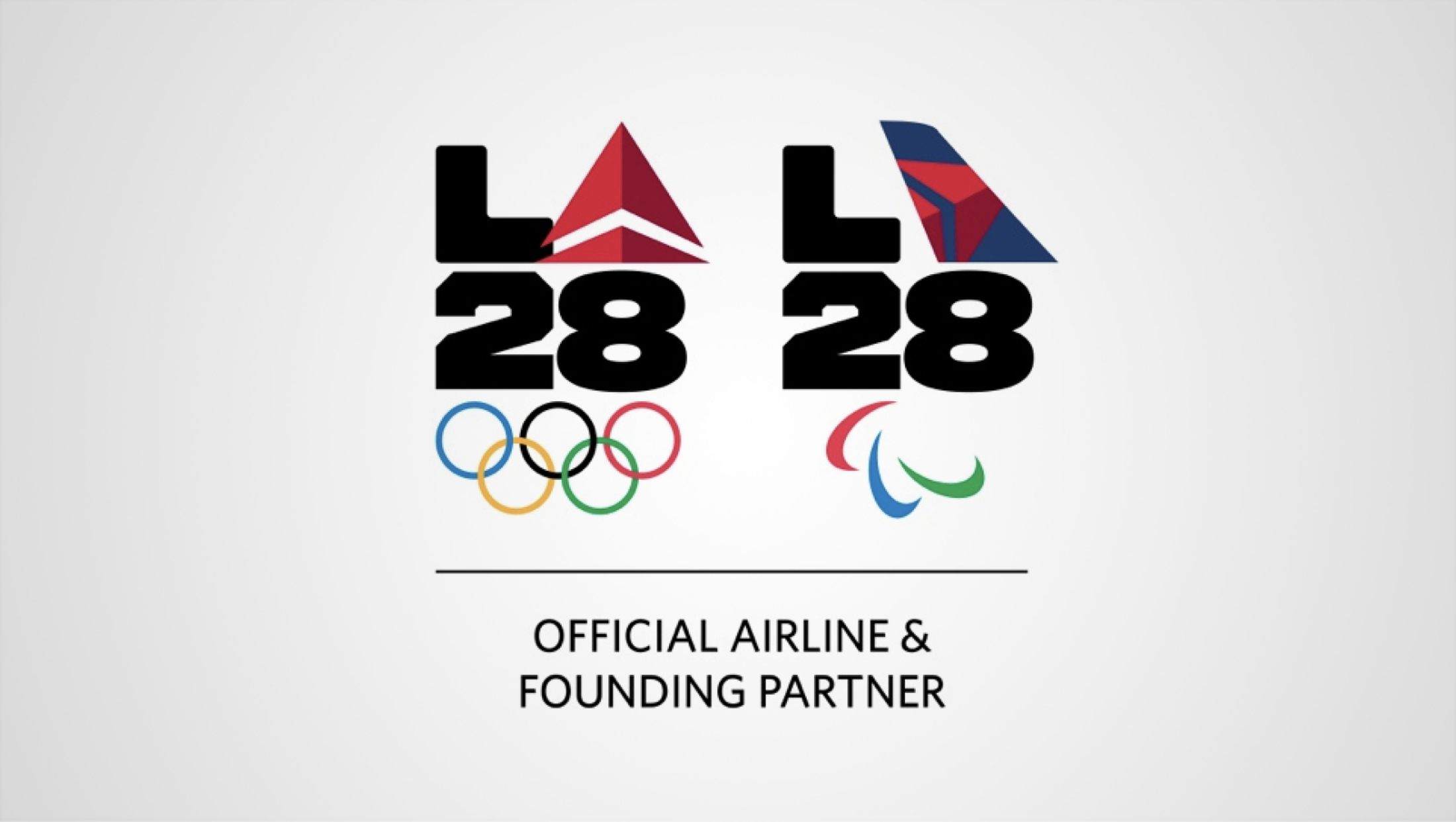
The L.A. organizers are even allowing at least one sponsor to customize the logo, announcing a deal with Delta Airlines to include its triangular “delta” emblem and rendition of a plane tail in its version.
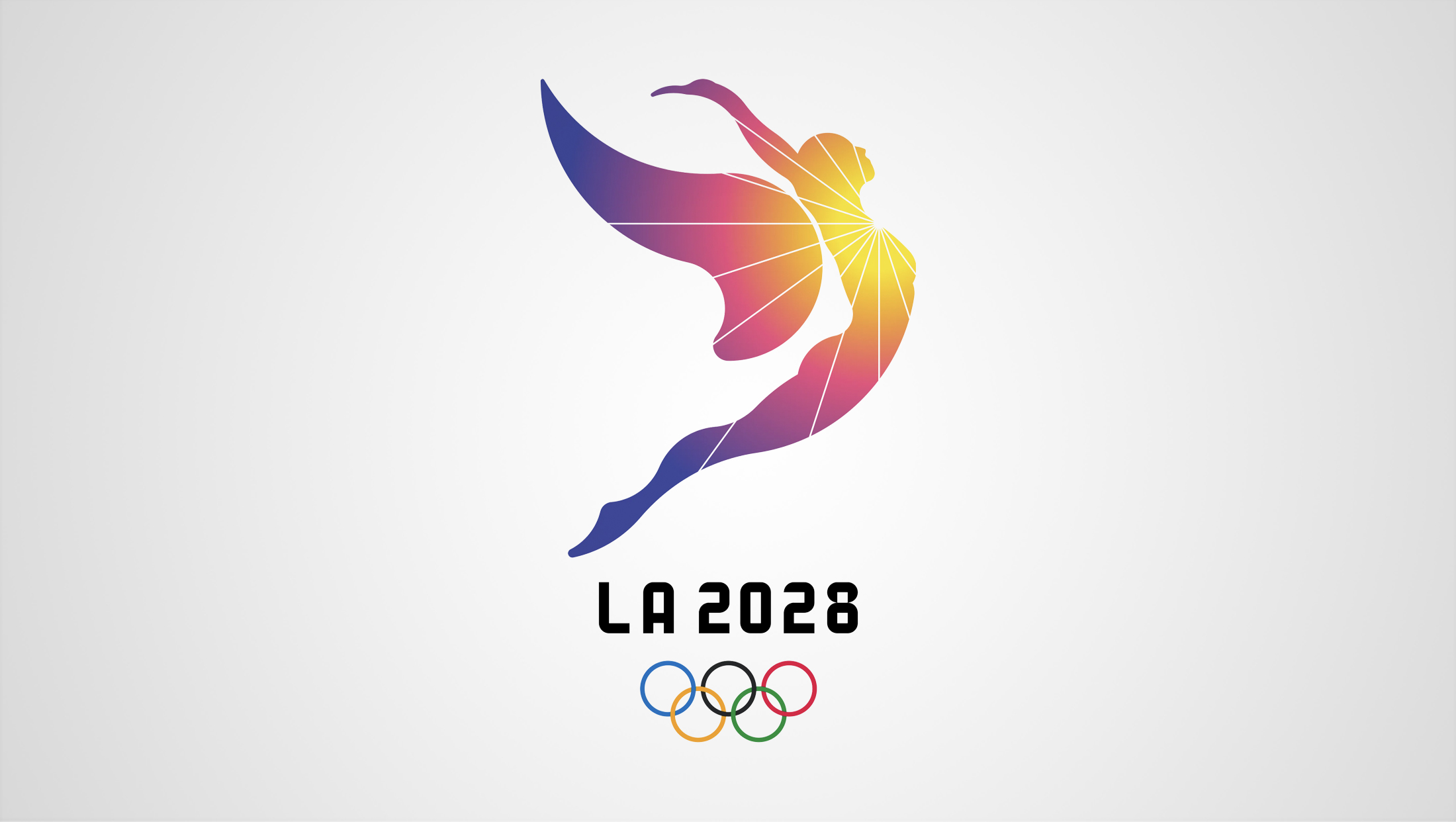
There is also another “LA 2028” logo that’s been released featuring an angel-like figure seemingly flying through the air.
This logo was an early version used by the committee as it prepared its bid to bring the Olympics to Los Angeles. The angel figure, which easily doubles as a leaping athlete, is meant as a nod to the “City of Angles” moniker.
Most committees release an initial logo and then change it once the games are awarded to the city, so the “angel” version of the LA 2028 is no longer an official logo and it’s unlikely to be used on any official designs ahead of or during the 2028 Summer Olympics.

Paris, for example, released its final logo in 2019. The design was widely mocked — with people saying it reminded them of everything from the omnipresent “I want to see the manager” “Karen” to Rachel from “Friends” to the Grinch to the aforementioned Billie Eilish (how often do you get to mention Eilish twice in a logo article?).
In reality, the design was meant to represent a gold medal and flame along with Marianne, a personification of the French Republic. Unfortunately, the Marianne concept isn’t widely known outside of Europe, so the design lost at least some of its meaning.
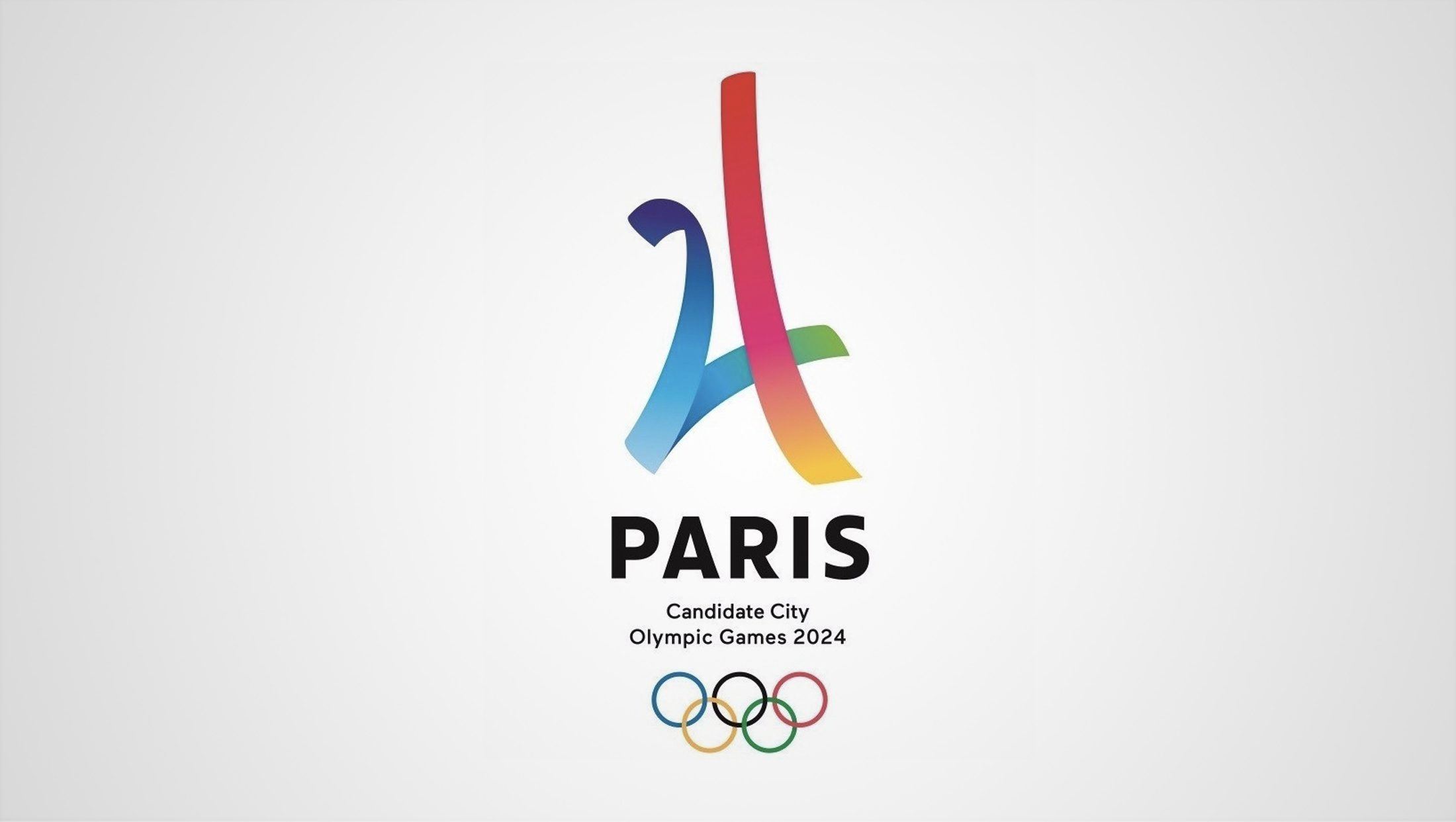
Prior to winning the games, Paris used another logo — a design that used two rainbow ribbons intersecting in a way that suggested both the Eiffel Tower and “24.” Many within the design community actually preferred this logo over the Marianne one.
Meanwhile, no major rights holding broadcaster has released their 2028 logos yet, including the U.S.’s NBC.
Broadcasters including NBC typically releases its own logo that’s used within its programming, marketing and other applications. The trend in recent years has been to focus more on a wordmark or logotype paired with the NBC peacock and Olympic rings along with the year.
There have been rumblings that the International Olympic Committee is looking to streamline the looks of the Olympic across its partner broadcasters (which, had the potential rule been in effect during the 2024 games, would have meant the Marianne logo would have been used in the U.S.).
If the rule is more widely enforced for 2028, network’s might at leave have the luxury of picking on of the “A” variations that looks best with their other branding objectives unless the organizers designated a single one as the official iteration for this type of application.
That said, it’s not clear if or when the IOC might enforce the rule and if some broadcasters might be able to opt-out.
NBC introduced its Paris 2024 logo in January of 2023. Assuming it follows a similar release schedule, we might not see the Los Angeles 2028 logo until January 2027.
Subscribe to NCS for the latest news, project case studies and product announcements in broadcast technology, creative design and engineering delivered to your inbox.


tags
2028 Summer Olympics, logo design, NBC, NBC Olympics
categories
Branding, Olympics