
Drew Barrymore gets Pantone color named for her
Weekly insights on the technology, production and business decisions shaping media and broadcast. Free to access. Independent coverage. Unsubscribe anytime.
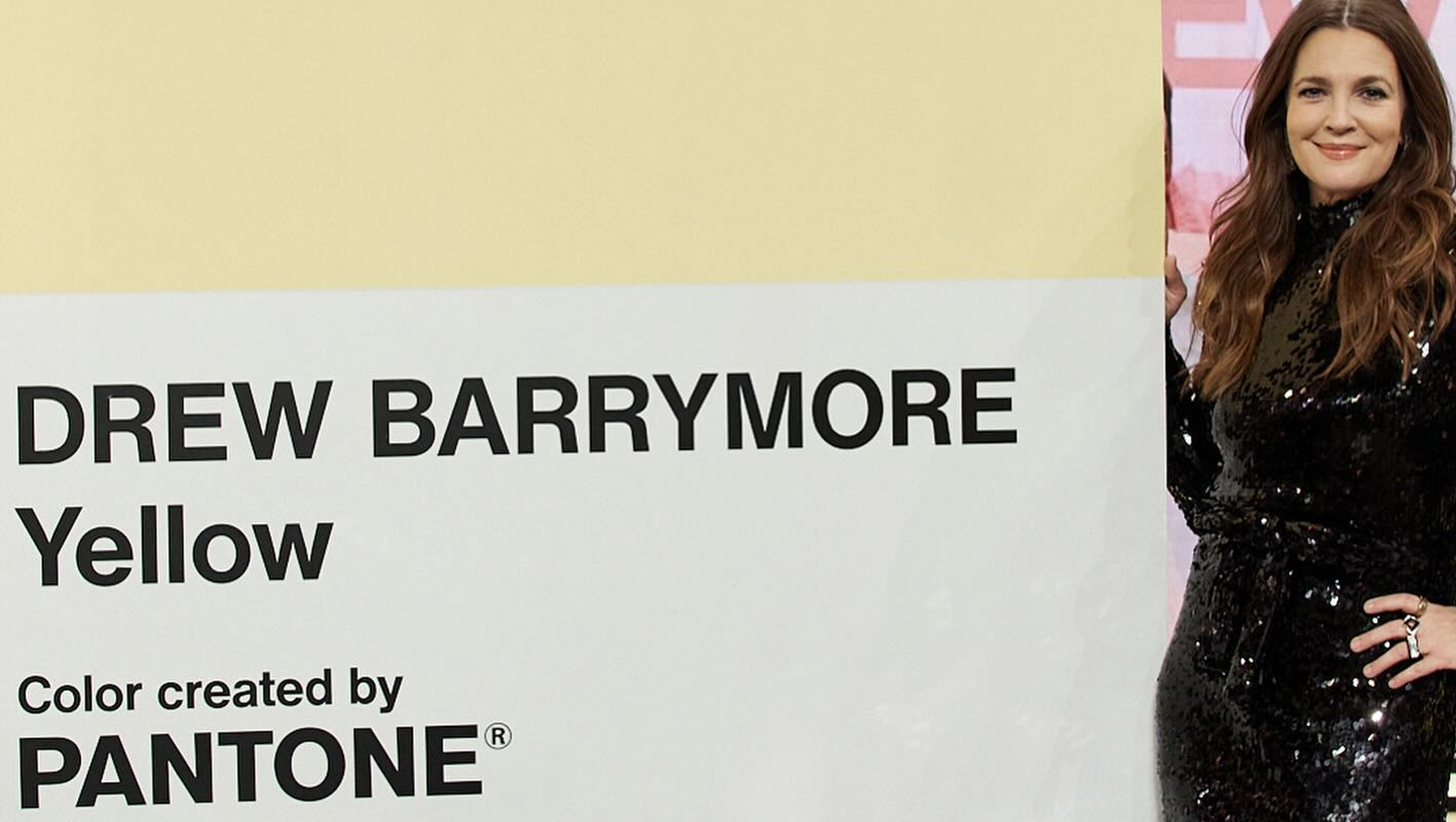
Talk show host Drew Barrymore got a colorful — if not unique — birthday gift: Her own Pantone color.
“Drew Barrymore Yellow” was released, not surprisingly, on “The Drew Barrymore Show” Friday, Feb. 21, 2025. Barrymore turns 50 on Feb. 22, 2025, which is a Saturday and the syndicated talker does not produce new shows for weekends, so the celebration was held the day before.
Pantone describes the color as a “warm and soft golden yellow” that is meant to convey the feeling of a “welcoming space.”
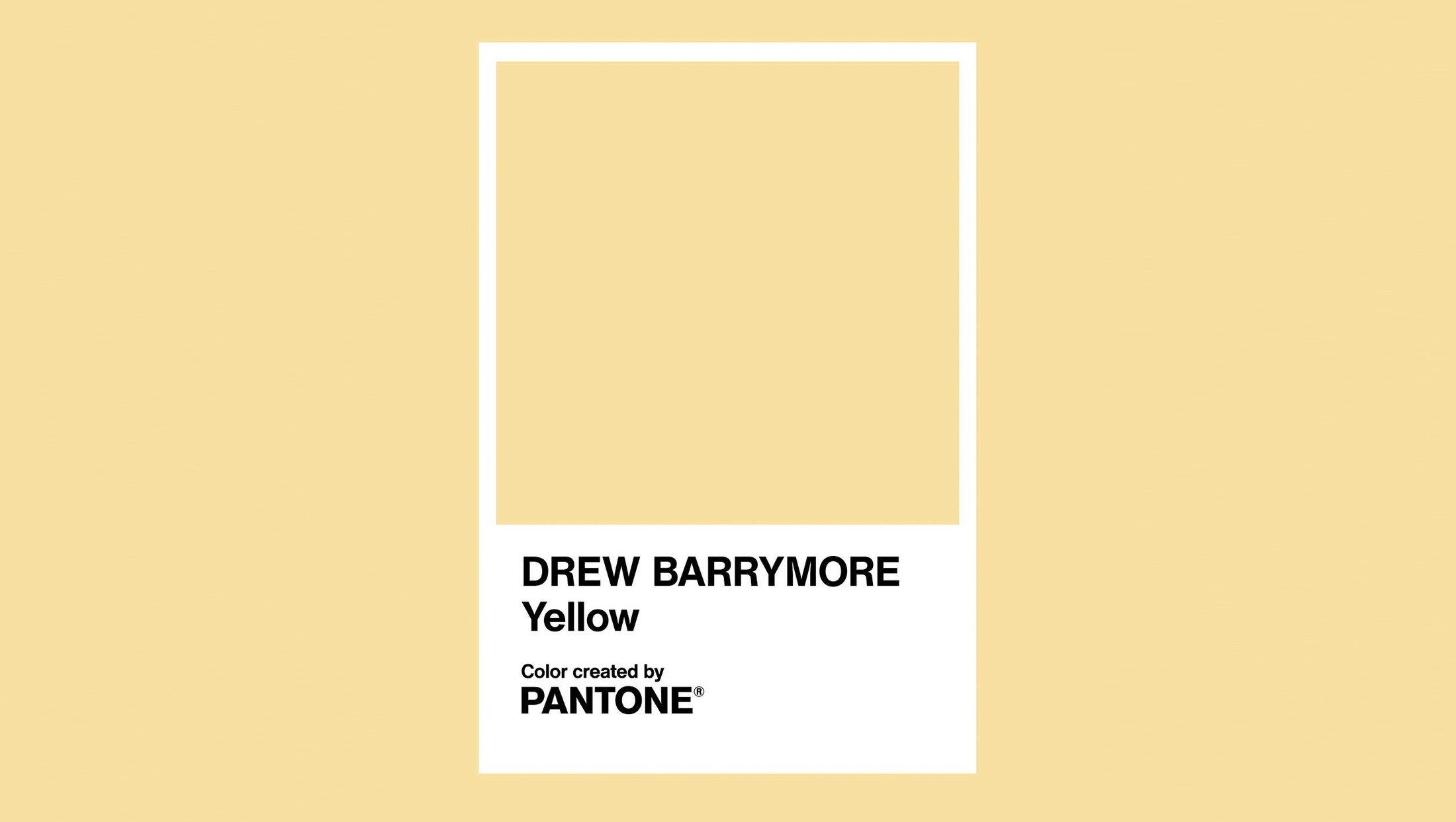
Barrymore is known for her love of yellow, and the color is used in her show’s graphics and set design in various shades, though some graphics do have shades that appear to be a close match.
Pantone, also known as “PMS,” is a color-matching system that aims to create consistency in color on everything from printing to plastics and fabric. The company sells both digital and printed versions of its color collections in swatch books and chip collections. Typically colors have a number and, in the case of key common colors, a generic name, such as “Pantone Blue.”
The company also collaborates with brands to create distinctive colors that they can “own.” For example, Pantone created the famous Tiffany Blue for the jewelry store, which also holds trademark protection for the color, which is numbered “1837,” a number picked to represent the year of the store’s founding. McDonald’s and John Deere also have custom Pantone colors.
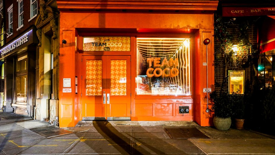

This isn’t the first time Pantone has collaborated with a TV show; back in 2019, Conan O’Brien’s TBS show unveiled “Team Coco Orange,” a reference to a colloquial name for the show’s fans and his bright orange-ish hair as well as the show palette’s dominant color.

Pantone, which was once relegated to the design and production world, has made significant steps to become more mainstream, including its annual “Color of the Year,” selling branded products and high-profile and well-publicized collaborations with everything from the musician Prince’s estate to the Minions franchise.
In the case of television, having a Pantone color doesn’t necessarily have any significant benefit since no color can be displayed consistently on the myriad of screens that captivate the world today. It could be used on printed materials such as posters, billboards and business cards, however. It is not immediately clear if “Drew” will use its new Pantone color on any printed item.
The color was not shown consistently on TV or publicity photos released by the show. In some cases, for example, it appears grayer, likely due to a combination of the studio lighting and camera or device used to snap the photos, though, at least in theory, white balancing could have been used.
The white area below the color that traditionally houses the Pantone logo, color name and number, also did not appear to be true white, though this could be due to specific camera shading and variations on the what is considered “white” on the poster’s material.
The cameras may also have been configured to avoid showing true white, which can often have an overwhelming effect on screen. Some productions also white balance cameras against a shade that purposefully off-white in order to achieve a specific look, though any intricacies of the “Drew” technical setup have not been confirmed.

tags
Drew Barrymore, Pantone, syndication, Talk Shows
categories
Branding, Broadcast Industry News, Featured, Syndication