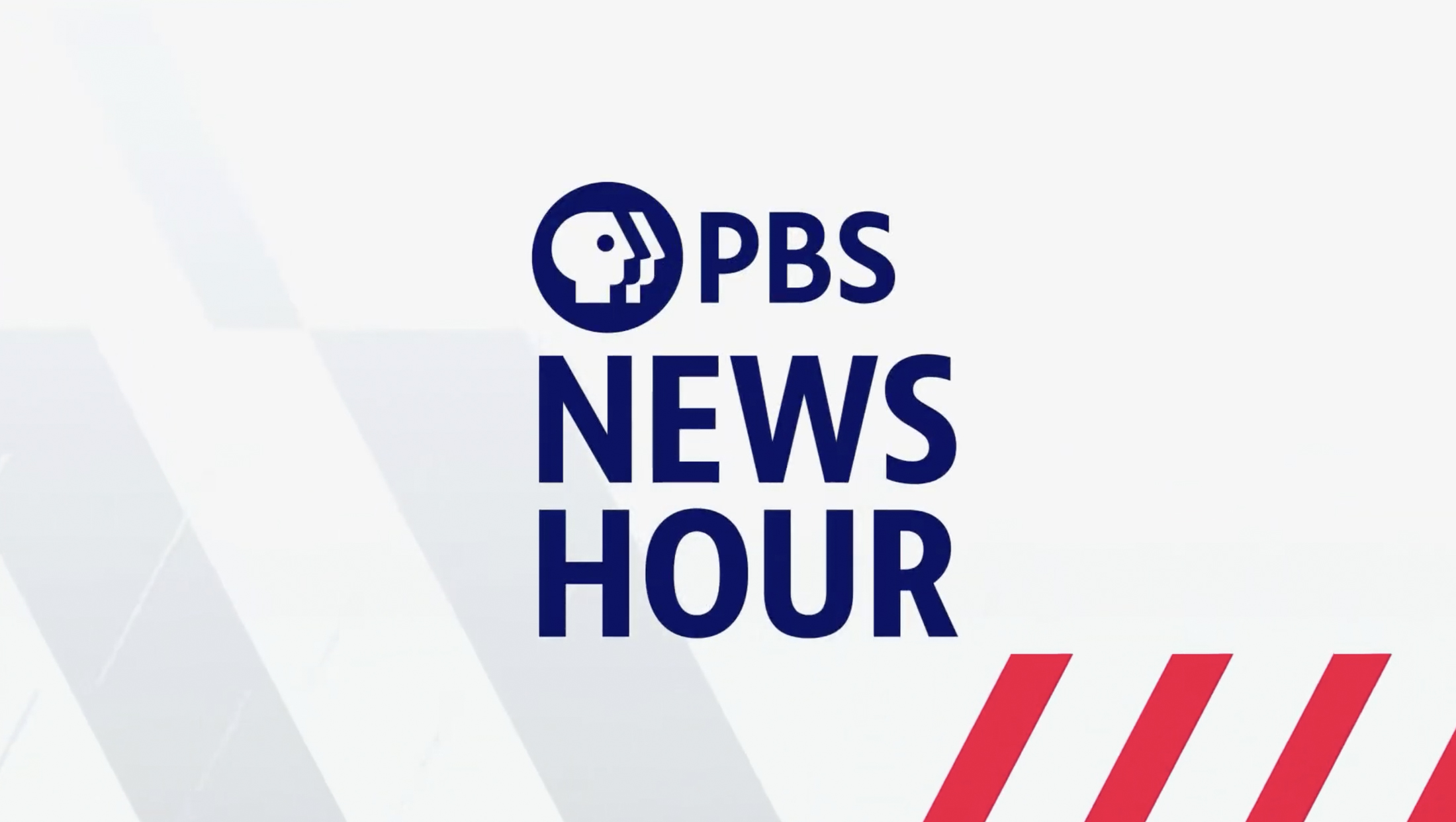
‘PBS News Hour’ graphics put focus on perspectives, breadth and journalistic tenets
Subscribe to NCS for the latest news, project case studies and product announcements in broadcast technology, creative design and engineering delivered to your inbox.
The new “PBS News Hour” graphics package centers around the concept of “field of vision,” a theme meant to showcase how the broadcast offers a variety of perspectives in a busy world.
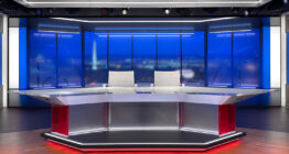
“PBS News Hour” launched the new graphics along with a new studio, set and production facilities June 10, 2024. The date also marked the first step in the transition to the digital brand “PBS News.”
“The overall approach was to create consistency for our broadcast and digital content,” PBS News’ creative director for digital Kojo Boateng told NewscastStudio.
The PBS News team worked with Lippencott, who created the 2019 PBS brand overhaul, to conduct extensive quantitative and qualitative research before the design process started. This included discussions with internal teams who ultimately are responsible for translating the “look” into actual graphics on a daily basis.
Boateng’s team also worked with PBS’s brand team to pick out a distinctive navy for the PBS News and PBS News Hour logos, both of which are now set in the proprietary PBS Sans Condensed typeface developed by Lippencott with the Monotype foundry.
In the end, the range of blues used in the graphics aligns the brand more closely with PBS. However, “News Hour” opted to retain its distinct red accent color so it could still remain a distinct brand on its own (incidentally, the broadcast also kept its familiar “question and answer” theme music).
Those decisions provided the jumping off point to begin the actual design process, which also involved ensuring there is alignment between the visuals of the new set, digital graphics, opening titles and information graphics, all while giving each of these a degree of creative flexibility specific to their platform or area.

“I think it’s important to be consistent, but not to homogenize,” explained Boateng. “Much of what we learned from this process informed the initial phases of design discovery and helped us work with the team at Lippincott. By extension our choice of colors, typography and brand expression have been informed by this crucial early work in understanding what our outcomes could be,” he added.
Another familiar element is the use of angled elements, which are inspired by the nose on the profile of the PBS logo “everyman” icon.
“It seemed to make sense to explore all of the ways we could use this shape as a creative device,” said Boateng.

The team also noted that similar shapes appeared on the original sets for “The MacNeil/Lehrer Report.”
Design firm Adolescent helped the PBS News team further refine that “field of vision” concept, including infusing the show open with it.
“The concept took a sophisticated yet welcoming approach to how we think about the ‘PBS News Hour.’ Symbolically, the disjointed diagonal bars unite to form a strong single bar moving across the screen. This movement motif represents the way that PBS News Hour provides a variety of perspectives in uncertain times,” said Boateng.
The previous design package had fairly simple linear motion, so Boateng recognized that as a key area of improvement with the new look, with a goal of keeping the screen lively with “near constant motion.”
“Television audiences skew older, but we have an ever increasing younger audience on YouTube and social media platforms like Instagram and TikTok, so it was important to also serve those folks who are much more used to more complex motion language. We are trying to strike a balance without alienating our audiences,” explained Boateng.
The animation in the new look was the result of multiple rounds of research and development, but ultimately the goal was to be much more bold and modern in the use of motion.
The old title sequence showcased words such as “trust,” “credibility” and “honesty,” designed to distill the broadcast’s fore values in a visual way. Research showed that viewers were also invested in these values and saw them as “News Hour” strengths, so it was important for Boateng to “amplify” these visually within the open.
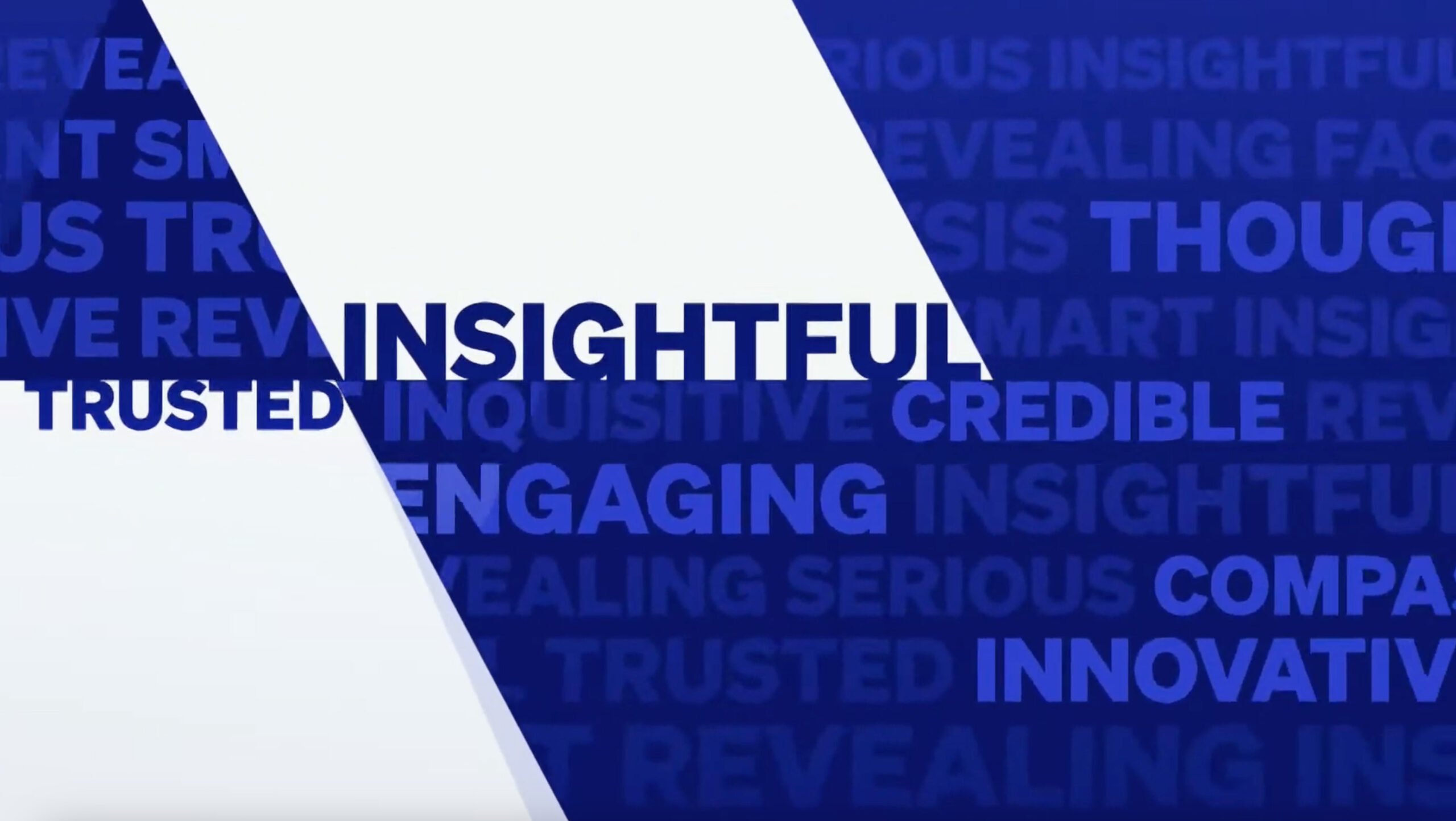
Boateng’s team also added a collection of words representing the topics the broadcast covers — ranging form politics, health, education and culture.
“Within the first 10 seconds of our open, you get a snapshot of the sheer depth and breadth of our coverage,” explained Boateng.
Typography plays a key role in other areas of the new look.
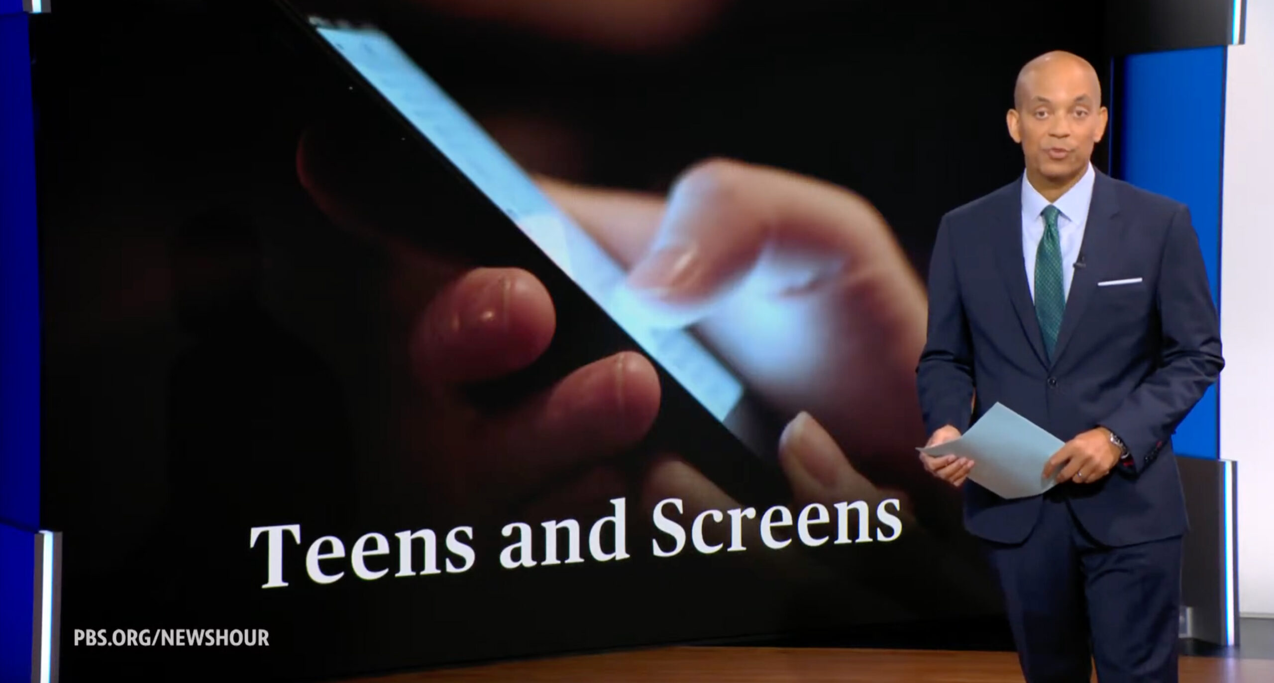
Serif font Publico in use on a video wall standup graphic.
PBS News is also undergoing a redesign of its website, which will debut in the coming months, but opted to incorporate the elegant serif Publico, which has been used in site headers for years, into the motion graphics package’s headline sequence and select topical looks.
“It’s fairly uncommon for news organizations to use a serif font in such a bold way, but I feel it provides a point of distinction whilst further aligning our visual package,” said Boateng.
The opening titles and graphic package were ultimately created in Adobe After Effects.
Boateng also explained that, overall, the new design pays homage to the previous design in subtle ways while also building upon the newscast’s legacy.
The broadcast migrated from Chyron Mosaic to Ross Xpression and Ross Streamline to run the graphics during broadcasts, with Marty Dormany from The Academy of Lower Thirds serving as a key partner in implementing the final designs into Xpression.
“News Hour” now has access to new transition logic-powered workflows in Xpression to adapt to hybrid work environments and improve its ability to respond to breaking news on linear TV and on its social profiles and digital offerings.
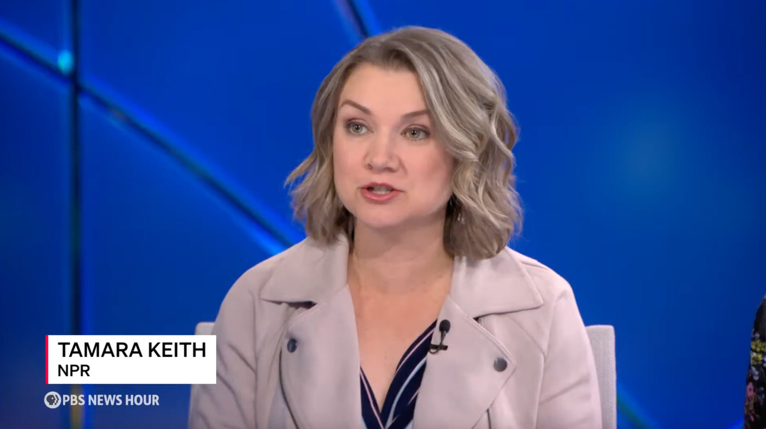
The broadcast has retained its clean and elegant approach to fullscreen and insert graphics, transitioning to the sans serif font Söhne, from Klim Type Foundry. Graphics remain laser-focused on conveying information clearly and concisely throughout each broadcast to ultimately deliver, when combined with the new set, studio and underlying technical infrastructure, the quality storytelling “News Hour” is known for.
Subscribe to NCS for the latest news, project case studies and product announcements in broadcast technology, creative design and engineering delivered to your inbox.

tags
Adobe After Effects, Chyron Mosaic, fonts, Jeff Lippencott, Kojo Boateng, Lippencott, logo design, Marty Dormany, PBS, PBS News, PBS News Hour, Ross Streamline MAM, Ross Xpression, The Academy of Lower Thirds
categories
Branding, Broadcast Design, Broadcast Industry News, Graphics, Heroes, Network Newscast, TV News Graphics Design, TV News Graphics Package, TV News Motion Graphics Design