
CNN.com shrinks header nav bar
Subscribe to NCS for the latest news, project case studies and product announcements in broadcast technology, creative design and engineering delivered to your inbox.
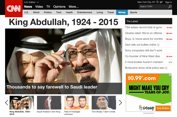
After just under a month on its new design, CNN.com has tweaked the header to take up a bit less screen real estate.
The new navigation bar condenses the weather, search box, main navigation and subnavigation bars to be just a bit shorter.
The red CNN logo box, however, remains approximately the same size and now “hangs” beyond the bottom of the header, whereas it used to be flush with the bottom of the lighter gray navigation bar.
The result of the logo not changing size with the rest of the header is a bit of a jarring look as the logo now juts out over content on the page. One could certainly argue the effect does draw the eye to it — in perhaps an effort to increase the prominence of the site’s branding.
Most of the space-saving was accomplished by tweaking text size and spacing, which results in everything feeling a bit more cramped.
Subscribe to NCS for the latest news, project case studies and product announcements in broadcast technology, creative design and engineering delivered to your inbox.

tags
CNN, cnn.com, header, logo, navigation, website
categories
Cable News, Featured, Online and Digital Production