CNN.com relaunches

Subscribe to NCS for the latest news, project case studies and product announcements in broadcast technology, creative design and engineering delivered to your inbox.
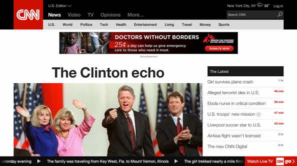
CNN has taken the wraps off its new website look — over a year after it was scheduled to debut.
CNN announced in August 2013 that it would launch a new look that November, even offering up previews of the new design at a press event in New York City.
That site featured a dark blue and red color scheme mixed with large photographic backgrounds and featured images — but it never debuted.

The network remained quiet about its plans but word of yet another design began to surface late last year. This look traded the dark blue look for black backgrounds and removed the photo-based backgrounds.
The new site largely matches the images that were released at that time, though the dark background is gone, replaced with clean white.
The site now features clean, tightly spaced typography and a large rotating photo with additional headlines running down the right side.
One key addition, meanwhile, is a scrolling ticker that runs along the bottom of the page with a large red button linking to the network’s streaming offering CNNgo.
The ticker, like its on air counterpart, features a mix of standalone headlines as well as multipart scrapes that give more detail on specific stories. Interestingly, the ticker doesn’t follow the user from page to page, instead only remaining on the homepage.
Farther down the page, a hodgepodge of photo thumbnails and text-only headlines are mixed with a dark background that spotlights video content.
The site’s navigation bar now shrinks when a user scrolls down the page, with subnavigation that changes based on the top level option selected. In addition, dropdown megamenu includes show logos and story thumbnails and headlines.
The new site’s category pages include oddly-toned textural backgrounds in a blend of green, blue and violet.
Story pages, meanwhile, include large typographic headlines with large photos and the story content running down the right side of the page. Two columns to the left feature thumbnails to additional content.
The new design is also responsive, meaning it conforms to a wide variety of screen sizes seamlessly.
Overall, the new look ends up taking up more space to present the same amount of information. The new design isn’t terribly revolutionary, with the possible exception of the ticker, and ends up coming across as a bit cluttered and disorganized.
Subscribe to NCS for the latest news, project case studies and product announcements in broadcast technology, creative design and engineering delivered to your inbox.


tags
CNN, cnn.com, CNNgo
categories
Cable News, Online and Digital Production