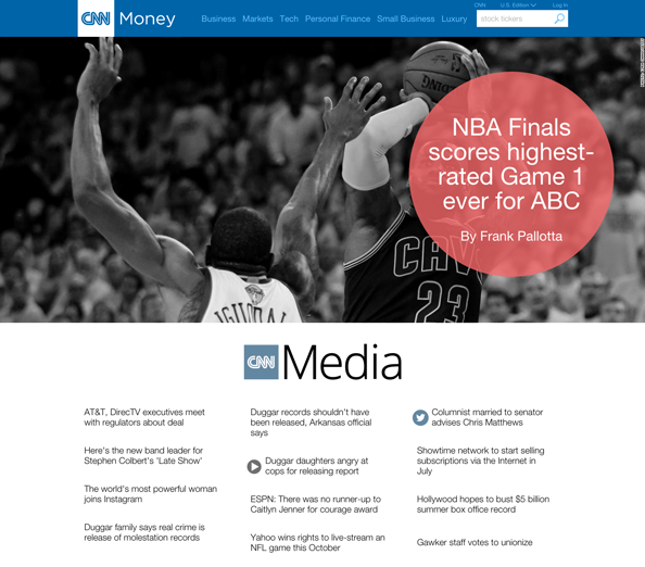
CNN Money revamps media front

Subscribe to NCS for the latest news, project case studies and product announcements in broadcast technology, creative design and engineering delivered to your inbox.
The media sub-section front of CNN.com‘s Money section got a new look this week.
The CNN “Money” section, which covers financial and business news, was itself the subject of a major revamp in July 2014.
The new media section front, meanwhile, includes a large featured story photo displayed in black and white with a red, semi-transparent circle housing the headline and author’s name.
Below this is a rather random logotype utilizing a typeface inconsistent with the rest of the site. This logo perches above three columns of headlines.
Following this are three boxes showing ratings data and then Twitter feeds from CNN’s media correspondents. Additional content is linked to using photos and text below this.
Overall, the new design is simple if not uninspiring. The three column headline area seems almost unfinished, an effect that’s probably compounded by the off-brand logo above it.
The use of the circle for the lead story headline, while creative, is inconsistent with CNN’s more square oriented online look of late.
Subscribe to NCS for the latest news, project case studies and product announcements in broadcast technology, creative design and engineering delivered to your inbox.


tags
CNN, cnn.com
categories
Branding, Cable News, Featured, Online and Digital Production