
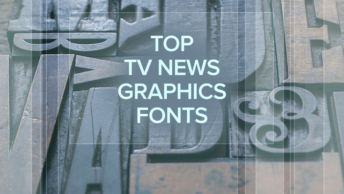
6 fonts TV news graphics packages love to use — plus a bonus one
Subscribe to NCS for the latest news, project case studies and product announcements in broadcast technology, creative design and engineering delivered to your inbox.
Fonts are as a big as a part of TV news graphics packages as the 3D graphics, light bursts and animation.
Here are some of the most popular fonts in TV news graphics.

Arguably one of the most widely used and classic fonts of all time (in any medium), it’s no surprise that Helvetica — and its close cousins Helvetica Neue, Helvetica Condensed as well as the lookalikes Arial and Swiss — are also immensely popular in TV News graphics.
Not only does the family over numerous weights and styles, but it’s also clear and easy to read. Condensed versions help make it easy to get larger amount of text in small spaces, which especially helpful in lower third banners and tickers.

Initially rising to prominence when selected as the primary font for Barack Obama’s presidential campaign, Gotham has become popular in many TV news graphics packages. Not only does it pack the clarity of Helvetica, but its relatively high “x-height” (the height of a lowercase “x”) makes it easy to read even at far distances or smaller sizes.
The font also comes a variety of weights and styles, and although CBS O&Os tend to use a variation of the font that’s bit too bold and tightly spaced, it’s still a clear and straightforward font choice.


Proxima and Proxima Nova, has many similarities to Gotham, so it’s another popular font used in TV news graphics packages.

Pill Gothic, as well as similar typefaces, is a blockier and unique typeface has emerged as a popular font in TV news graphics. It’s relatively condensed already, making it possible to get more characters in tighter spaces and also gives off a more modern and “techie” look and feel.
Subscribe to NCS for the latest news, project case studies and product announcements in broadcast technology, creative design and engineering delivered to your inbox.

tags
CNN, font, fonts
categories
Broadcast Design, Featured, Heroes