
NewscastStudio at 15: A look back at 2013
Subscribe to NCS for the latest news, project case studies and product announcements in broadcast technology, creative design and engineering delivered to your inbox.
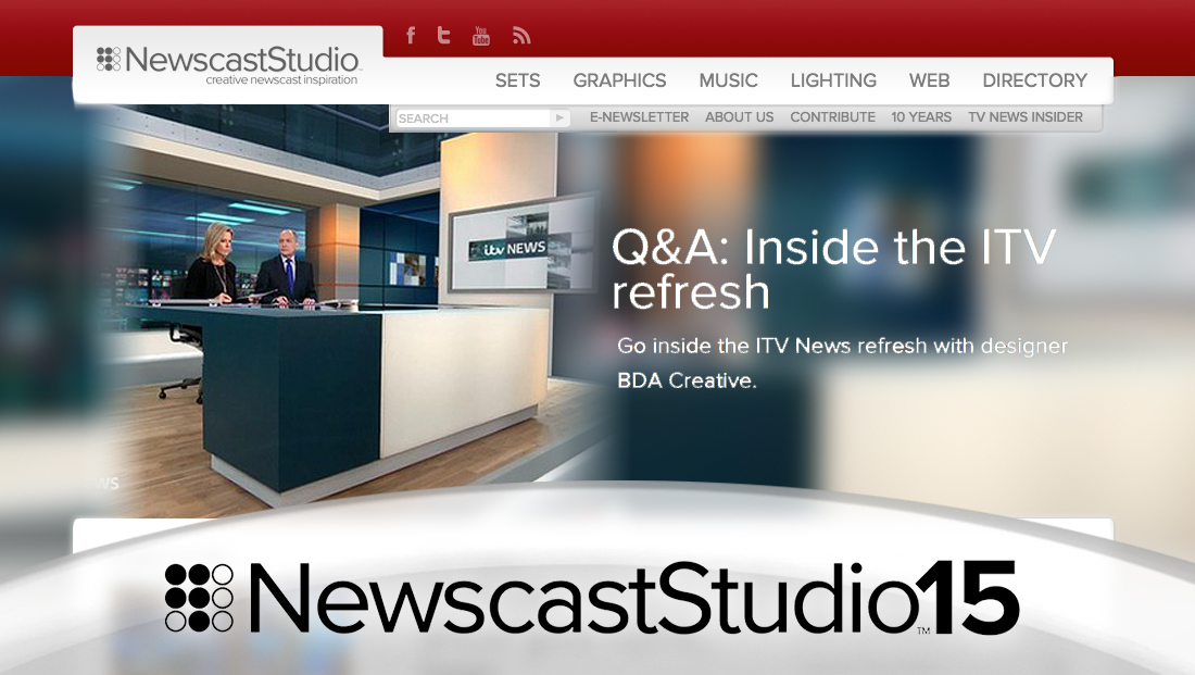
In 2013, NewscastStudio introduced a major redesign, completely overhauling the design it had used since 2009.
The new look lightened things up a bit by switching to a light gray background and white containers, but keeping the site’s trademark red in the header and as an accent color.
With this new look, the site switched back to using a large slider element that combined an oversized, blurred version of each image along with a text headline.

The new look also dropped perfectly squared corners in favor of slightly rounded ones with a subtle shadow effect.
At this time, NewscastStudio also switched to using Proxima Nova as its body font and added a vertical column of gallery thumbnails down the left side of the homepage.
Also with the new design, NewscastStudio officially added additional topics beyond just sets and graphics — to include technology, lighting and more.

Subscribe to NCS for the latest news, project case studies and product announcements in broadcast technology, creative design and engineering delivered to your inbox.

tags
newscaststudio
categories
Featured, Site Updates