
Australia adds new color to WX maps
Weekly insights on the technology, production and business decisions shaping media and broadcast. Free to access. Independent coverage. Unsubscribe anytime.
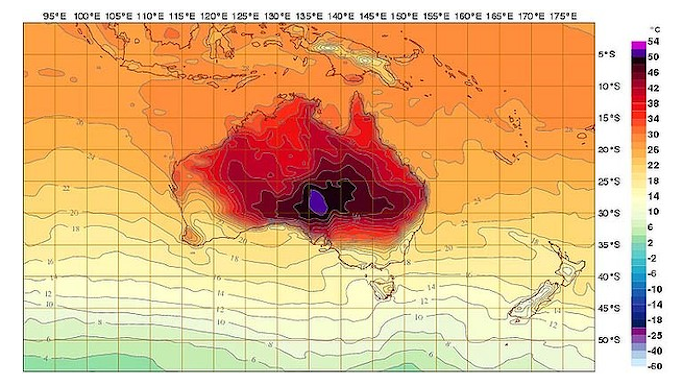
Australia is apparently in the midst of a heat wave that’s so extreme, the country’s weather bureau has actually had to add a new color to the maps.
The purple splotch in the middle of the country, shown above, represents a temperature of 129.2 degrees Fahrenheit, heat that’s so unusual for the region that it wasn’t assigned a color previously. The previous record, 123 degrees, was assigned the deep red tones that surround the purple area, according to The Atlantic Wire.
The color red, in the United States and elsewhere, is typically reserved for the hottest temperatures, with oranges and yellows used for warm levels.
Purple is typically found lower in the color coding than red and, in fact, depending on whose color scheme you use, can represent quite cold temperatures.
In color theory, purple, is a mix of red and blue — with red being considered a “warm” color and blue being a “cool” one. Weather maps typically follow the “warm” v. “cool” color scheme pretty closely.
It’s worth noting that Australia uses the metric system, so the maps used actually in Celsius (we’ve provided the U.S. conversions in this post).


tags
Australia, color
categories
Graphics, Weather