
‘The Lead’ debuts on CNN with energy and color
Weekly insights on the technology, production and business decisions shaping media and broadcast. Free to access. Independent coverage. Unsubscribe anytime.
CNN’s “The Lead” debuted today with a splashy graphics package emphasizing color and fast movement.
It was a welcome change for CNN, a network trying to find its voice and viewership.

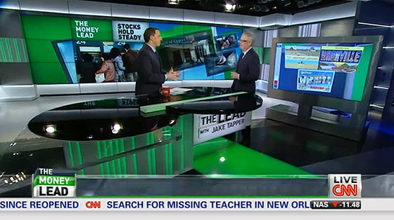
Taking a page out of Gannett’s USA Today, the shows graphics color code each section of the show: green = money, red = politics, yellow = pop culture. To avoid any legal issues, the colors don’t exactly line up with Gannett, but it’s a concept we’ve seen before.

The graphics uses 3D squares as the dominate element with floating colored angles, matching the color coding system.


Some of the tease graphics also match the shows scenic elements with the silver/white headers and fake monitor wall look.

CNN has modified its Washington, D.C. studio, covering some backlit panels with new elements reflecting the shows branding.

A new desk also debuted that seems to move after every segment.
We’ll see if this fast paced changing stays with the show, or like other CNN shows, is lost in the name of cost saving and time.


Overall, the new look is interesting and has a good deal of depth on air. The vertical lines are interesting, but don’t match the shows graphics.


The color changing gimmick is nice, especially for the ADD generation, but it is just a gimmick… the stories still have to be good.
The desk is a strong point of the overall look, as wide shots are used throughout the broadcast. Our only issue is why a circular top? There is nothing else circular in the studio and it just seems to stick out like a sore kidney bean.

tags
CNN, color changing, jake tapper, lead, Set Design, the lead, Washington, D.C.
categories
Branding, Cable News, Set Design