
FoxNews.com politics section using alternate design
Weekly insights on the technology, production and business decisions shaping media and broadcast. Free to access. Independent coverage. Unsubscribe anytime.
We noticed that FoxNews.com has started using an alternate design for its politics section.
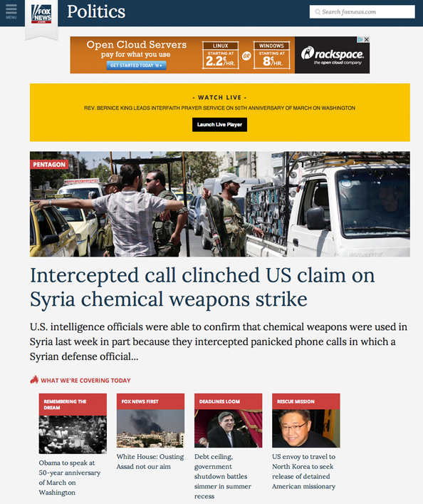
The design uses a simple blue bar running across the top with a collapsable menu on the left side. The Fox News logo is positioned within a light gray, tapered ribbon with the word “Politics” appearing in large type next to it. The bar also includes a search box.
Below this, the section front includes a large photo and text for the lead story, with smaller boxes below for secondary stories.
Farther down the page, text-only headline scrapes lead to additional content, four column thumbnails link to video clips and a two column layout with circular mug shots links to personality driven content and social media profiles.
Clicking the menu icon in the upper left spawns a slide out panel that offers links to subtopics.
Story pages, meanwhile, use a two column layout with large, easy to read text. The main column also includes links to additional content, while the second column links to related videos and trending topics.
Below both columns is comment section that stretches the entire width of the page, and includes animated effects that make comments appear to be filtering in in realtime.
This new design is only being used on the Politics section, but could it be indicative of a new sitewide design coming soon? With the redesigned NBCNews.com and CNN.com launching this fall, could Fox be prepping its own website revamp?

It’s interesting to note that the new page design has many visual similarities to the new NBCNews.com pages that surfaced earlier this summer, with its simplified navigation bar, heavily topic based navigation and organization, emphasis on the section name rather than logo and overall cleaner, boxy look.

tags
CNN, cnn.com, Fox News, foxnews.com, NBC, NBC News, nbcnews.com
categories
Cable News, Featured, Online and Digital Production