‘Face the Nation’ updates look for anniversary

Subscribe to NCS for the latest news, project case studies and product announcements in broadcast technology, creative design and engineering delivered to your inbox.
CBS News debuted an updated look for its long running Sunday talker, “Face the Nation.”
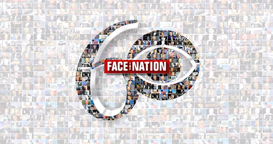
Entering its 60th year, the show moved away from its previous curvy look in favor of clean lines and a new logo.
The new logo, using a font similar to Impact, looks very similar to the logo of PBS’s “Frontline,” with its red box and compressed lettering.

The shows set was also updated, with the new logo added to background camera left.

The shows graphics remain minimal, when compared to competitors like “Meet the Press.” No extra pop ups appear with facts and tidbits.
Previous Title Card:

New Open:
The new open pays homage to the previous looks and title cards of the show, all combing to form a special 60th anniversary graphic (using the CBS eye for the 0 in the 60).
Compared to the previous look, the new design is very clean and simple. Nothing extra about it.
Subscribe to NCS for the latest news, project case studies and product announcements in broadcast technology, creative design and engineering delivered to your inbox.


tags
Branding, CBS, CBS News, Face the Nation, logo, logo design, opening titles
categories
Branding, Featured, Graphics, Networks