
Illinois Nexstar station gets mishmashed makeover
Weekly insights on the technology, production and business decisions shaping media and broadcast. Free to access. Independent coverage. Unsubscribe anytime.
WHBF-TV, Nexstar‘s CBS affiliate serving the Quad Cities market, has unveiled a hodgepodge of a makeover.
In addition to a new set and graphics, the station is also sporting a new logo and brand.
Now being billed as “Local 4 News” (although there’s no connection, it’s interesting to note that KPRC-TV in Houston dropped its “Local” branding just about a month ago), the station shed its dark blue circular logo in favor of a bold red square shaped logo.
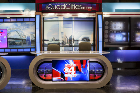
The station also debuted a new set that’s a mishmash of the sets seen at other Nexstar stations, with a bunch of other elements thrown in (see more photos here from the local newspaper).
Perhaps the most eye-catching part of the new set are the pill shaped frames affixed to the front of the desks that provide a backdrop for some printed graphics a video display. It certainly is an interesting look — and it’s hard to really describe exactly what the end result looks like, but the desk’s thick frame seems to draw visual weight to itself.
The pill shaped frames also draw comparisons to a game show set or even a retro diner or jukebox (all that’s missing is some neon strips).
Overall, the rest of the set comes across looking very disjointed.
The curved lines found in the desks don’t show up elsewhere on the set and much of the rest of the design seems to be pulled from many different set styles and even eras.

There’s the segmented, internally lit columns that were so popular on sets of the 1990s and 2000s and a standup area with halftone-inspired graphics reminiscent of pop art.
Then, the beveled laminate walls switch to diagonals in places — a look that makes us think of a 1970s basement rumpus room.
The visual clutter continues with a rather overbearing printed header with the station’s website branding and oddly mismatched camera left and right backgrounds — one a blurred monitor wall and the other a bright dura with chunky colored segments along the top and bottom.
The weather center is the set’s one bright spot — likely because of its comparatively simple design that makes use of printed duras and monitors. The aforementioned area between the anchor area and weather set with the colored segments is also an interesting and cleaner look that perhaps could have been made more prominent in the design.
In addition to the new set, the station also switched over to new graphics, similar to the ones seen at other Nexstar properties, including WBRE-TV in Scranton/Wilkes-Barre, Pa. The package, which is a bit cluttered on its own, features stretched 3D blocks and glassy effects.
Combined with the new set, the visuals being used here are almost overwhelming. The station also throws on a script “You” to some iterations of its logo (to create the phrase “Local 4 You”), which just adds to the clutter.

tags
quad cities, whbf, whbf-tv
categories
Featured, Local News, Set Design