‘Today’ retools teases, open
Subscribe to NCS for the latest news, project case studies and product announcements in broadcast technology, creative design and engineering delivered to your inbox.
NBC News has rolled out a new look and feel for its teases and open for the “Today Show” that departs drastically from its other graphics.
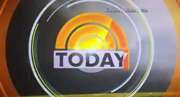
At the very beginning of teases, a series of rotating circles and lines reveal the “Today” logo before transitioning to square-shaped graphics.
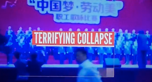
A “key word” appearing in the new “Today” teases.
The new teases place more emphasis on “key words” that are read by both the anchor reading the tease and appear briefly in the center of the screen before animating to the lower left corner.

The “key words” as they appear when they move to the lower left corner.
The more prominent on-screen placement, use of a sound effect and the anchor’s intonation of the words all combine to place great weight on these words and also have some similarities to how “NBC Nightly News” handles its teases.
In addition, an undertone of music attempts to add a sense of urgency, while the familiar “Today” signature remains at both the beginning of the teases and show open.
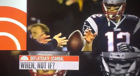
An example of the “grid” layout used in the new “Today” teases.
The new look also mixes in seemingly random flashes on colored boxes while images are also displayed on screen in various sectioned configurations and also include effects that mimic film being loaded into a projector.
One of the most notable changes in the opens is that the wider, clean font used in the other “Today” graphics is gone, in favor of a condensed typeface somewhat reminiscent of that used in the “CBS Evening News” and “Face the Nation” logos and graphics.
Above each key phrase a colored bar features words such as “Breaking Overnight,” “New This Morning,” “New Developments” or, in some cases, just a topical title.
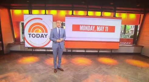
Matt Lauer at the end of the new “Today” teases.
At the end of the series of teases, the show now cuts to a wide shot of the host standing in front of Studio 1A‘s production area with the show’s logo and date appearing on the large video panels, which are divided into two unequal sizes that mirror the “sectored” look of the new teases.
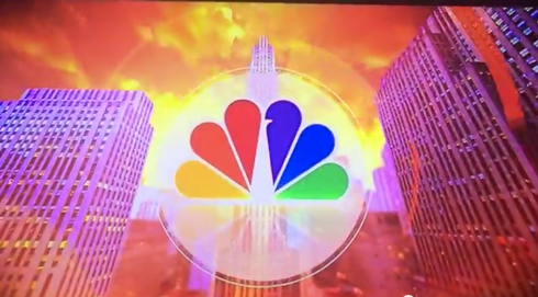
Part of the new “Today” open that features Rockefeller Plaza
After the camera closes in on the date, the open begins, again using the series of circles and lines to transition to a stylized image of 3o Rock.
The announcer’s pacing is been changed slightly — no longer is such an emphasis placed on the show’s name — and the anchor names are read a bit faster. The voiceover also placed less emphasis on the word “live” but retains the mention of Studio 1A before cutting to a wide show of the studio exterior.
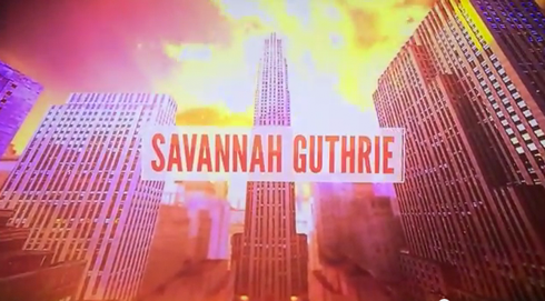
Savannah Guthrie’s name in the new “Today” open
The anchor’s names also receive similar graphical treatment to the key words in the teases.
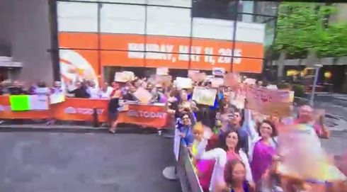
The exterior of Studio 1A with the new graphics appearing on the video panels.
The large video panels facing Rockefeller Plaza now display a look that matches the new teases and open — with the date again appearing in the more condensed typeface.
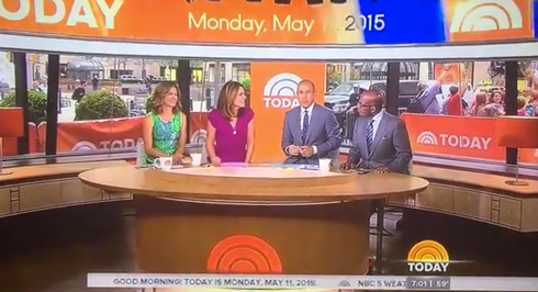
The “Today” anchors at the desk.
Viewers then see the “Today” anchors, who, in another change, no longer have the studio sofa area behind them. Instead, the corner windows are used as the backdrop, returning to a longtime tradition that was discontinued when the 2013 version of Studio 1A debuted.
However, it’s worth noting the window background allows viewers to see the crowd outside the studio, whereas the show would typically begin with the windows covered by a drop-down background with a tiled collage of the show logo.
That said, the branded crowd control barriers set up in front of the windows accomplish, to some degree, that same effect.
In addition, the show appears to be rather obsessed with the date now — with the video ribbon above the anchor desk used to show the date (as it had been used previously during other parts of the show).
Meanwhile, “Today” has continued to use its normal graphics package, which, with its wide font and cleaner lines, is quite different from the look used in the new teases and open — a move that could indicate a new graphics package is on its way.
Perhaps NBC is slowly “easing in” a new look?
The graphics used in the new open, in addition to the aforementioned similarities to some CBS graphics, also have some connections to the package “Today” used after its “spa” studio redo with its boxy elements and bolder colors.
It’s also worth noting that the new format has some rather thinly veiled attempts to mimic “Good Morning America” — in particular the urgent clattering underbed, emphasis on key words and video effects.
However, the pacing still seems slow and lacks the energy and enthusiasm heard over at “GMA” — though the voiceover in the open is faster, but still is a bit lacking in energy and friendliness. In some ways, the teases now seem to go on almost too long and, while the arrogance of the giving some much emphasis to the show and anchor names is gone, the announced doesn’t seem overly excited to be intro-ing the show.
Subscribe to NCS for the latest news, project case studies and product announcements in broadcast technology, creative design and engineering delivered to your inbox.


tags
Announcer, Good Morning America, intro, NBC News, open, teases, Today, Today Show, Voiceover
categories
Branding, Graphics, Networks